Role
Led design strategy and execution. User interface and prototyping.
Type
Responsive website
Timeline
Mar 2024 - Jul 2024
Status
Development
OVERVIEW
The outdated SEPES website raised concerns about its performance and compatibility with modern devices.
Quattro IDCP chose me to lead this project, recognising my expertise in revamping legacy systems and modernising digital platforms.
WHAT IS THIS DESIGN ABOUT
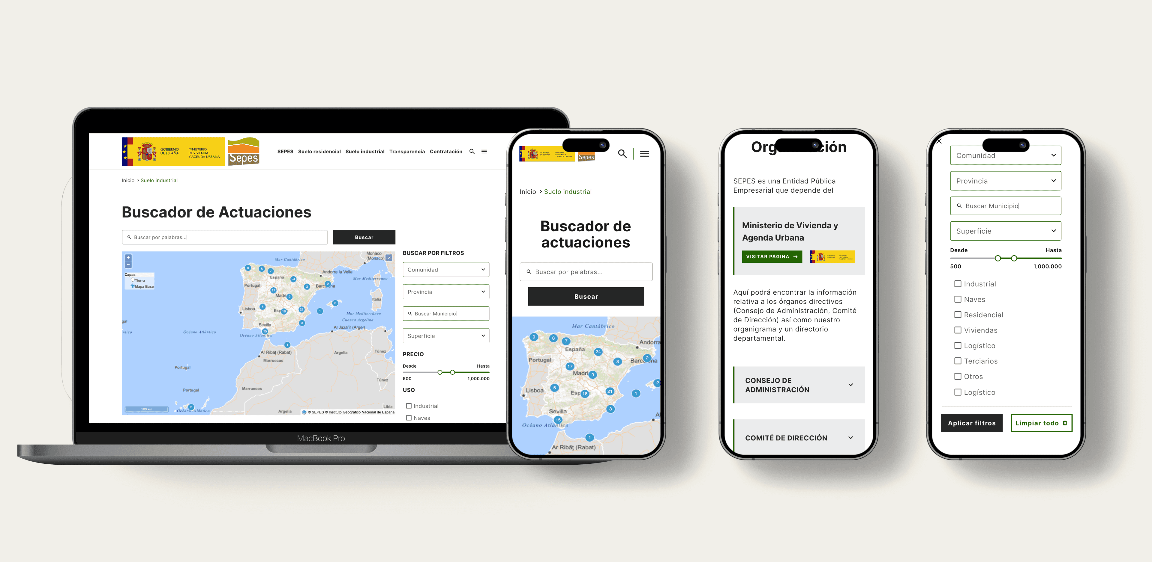
Responsive website: Platform for a governmental public entity that manages land development in Spain.
The end user: Mainly Citizens and Business and Real state developers.
PROBLEMS TO SOLVE
Develop a new design using the existing content, including text, images, and components such as buttons and links.
Improve the user experience in mobile devices.
SEPES’s new branding is difficult to apply to the current website and does not meet accessibility standards.

SOLUTION
Designed a responsive, easy to navigate with a minimal use of the color.

DESIGN IMPACT
Designed an accessible and cohesive branding system for digital products.
Created a reusable Figma design system to support future scalability.
Introduced an improved handoff process, streamlining collaboration across the team.
BUSINESS GOALS
Boost conversion rates while streamlining land searches and acquisitions and comply with AAA WCAG 2.2 standards.
KICKOFF
“Before I joined, the Project Manager had already defined the new information architecture, while the development team identified the search engine as the most critical feature. ”
RESEARCH
HOW WELL DOES THE CURRENT WEBSITE SERVE ITS USERS?
Method UX UI Audit
Repetitive content and cluttered layout.
It's difficult for users to find relevant information quickly.

WHAT SHOULD WE PRIORITISE ON THE WEBSITE?
Methods Competitive analysis
Unclear information on product detail pages.
Product detail pages had unclear structures, making it hard for users to understand important details about available land, hindering informed decisions.

3.WHAT IS THE TYPICAL USER JOURNEY WHEN SEARCHING AND
APPLYING FILTERS?
Methods Flow chart - Information Arquitecture
Ineffective search and filters
Inefficient search functionality and limited filters made the process time-consuming, especially on mobile devices, complicating the search experience.

DISCOVERY INSIGHT
To make the content easier to scan and find, I will need to improve the design foundation and propose a new colour palette for the design system.
Mobile first mind set
Improve image quality
New Type family need it
DEFINITION - DESIGN PRINCIPLES
Before jumping into solution mode I set a foundations principles that connect the Business goals whit the discovery insights.
Visual consistency
A style guide to ensure cohesive design across all platforms.
Enhanced visual appeal
Use high-quality, graphics and pictures.
Optimised scannability
Enabling users to locate relevant information.
GETTING THE FIRST FEEDBACK
My Product Manager and I set a goal to get approval for the new colour palette and design system proposal during the first meeting.
The proposal was approved.

First design proposal (Home screen)

New design system proposal
PERSONAL NOTE
“This project included many screens and a lot of content. The further we progressed, the harder it would be to make fundamental changes to colours and typography, as they would structurally impact the screens. ”
DEVELOPMENT - REFINING THE LOOK AND FEEL + PATTERNS
I defined the design system foundation with a mobile-first mindset while adapting the process to meet the client’s needs.
ITERATIONS
Although the design followed a mobile-first approach, I had to prioritize the web-based home screen design because the client found it difficult to make decisions based solely on the mobile version.
Home screen: Establishing the foundation for the website’s design was crucial, making the home screen a top priority to ensure progress.

DESIGN SYSTEM
Components were designed with a mobile-first mindset, ensuring proper contrast and accessibility standards.

SOLUTION - MAJOR IMPROVEMENTS
NAVBAR AND NAVIGATION
Exposing key data and actionable insights – effectively:
Designed for: Highlighting essential data and actionable insights in a user-friendly way.
Dynamic sidebar: An expandable sidebar to address space constraints and avoid recreating previous usability issues.
Reduced errors: Created task-focused paths with clear guidance, effective feedback, and minimized reliance on modal/dialogue screens.

APPLYING FILTERS
Filtering and parsing data:
Improved: Ease of finding and applying data filters by prioritizing and organizing them based on user tasks.
Reduced time and steps: Simplified workflows by presenting default filters in an “edit mode” sidebar.
Enhanced status clarity: Clear feedback and visible filter states for a better user experience.


DELIVERY
HANDOFF
From chaotic scannability to clear, structures design:
Increased: Overall readability by introducing a clean typography system, better text alignment, and more generous spacing between rows, among other adjustments.
Reduced: Cognitive load by organizing tasks into clear, logical clusters.
Improved: Interactivity with identifiable states for components.


TAKEAWAY
Value of interactive prototypes
I realised how crucial interactive prototypes are for spotting gaps, especially in situations where user testing isn’t possible.
Commitment to improvement
I wish I had more time to keep refining how I approach error messages and improve accessibility.

B2B | HEALTHCARE | PART 1
6 min read
How do we redesign a medical legacy system to fit a new screen format?
B2B | HEALTHCARE | PART 2
5 min read
