
Role
Led design strategy and execution. User interface and prototyping.
Type
Internal application
Timeline
Oct 2023 - Apr 2024
Status
Implemented
OVERVIEW
The Basque Health Service software, untouched for over two decades, struggled to meet user needs and maintain performance.
Ayesa, the IT company managing it, led the redesign but turned to Quattro IDCP an advertiseing and marketing company, a frequent collaborator, for support.
Drawing on my experience with Quattro, the Project Manager enlisted my help to tackle this complex challenge.
WHAT IS THIS DESIGN ABOUT
Medication Management software: A system for prescribing and managing medications.
The end user: Doctors, nurses, and pharmacists.
PROBLEM
Old design incompatible with new screen formats
Initially planned as a straightforward update of components to a modern UI, the project quickly escalated when the existing components failed to adapt to the new screen formats.

SOLUTION
Designed a intuitive pattern with no learning curve, reducing errors and making tasks easier to complete.

DESIGN IMPACT
Resolved a key decision-making block, enabling the project to move forward seamlessly.
Developed a scalable Figma design system for future growth and consistency.
BUSINESS GOALS
Secure owner approval to advance and execute the redesign for the remainder of the project.
Screen compatibility
Ensure compatibility with contemporary screen formats and devices.
Minimise user errors
Minimise user errors through an intuitive, user-friendly interface.
Reducing steps
Optimise task completion time by reducing unnecessary steps and simplifying processes.
THE PROCESS
“Whit no design resources and no room for deep-dive user research or testing, I adapt my process and methodologies to the project budget and time-frame.”
DISCOVERY
Without direct access to the actual software,
I relied on the following assets:
Video Tutorials
Documentation
Design System no Figma files available
No flowchart or information architecture available
DESIGN AUDIT
Approaching the project with fresh eyes allowed me to uncover new areas for improvement beyond the layout and evaluate the ongoing redesign efforts.

UNDERSTANDING THE HEALTHCARE INTERFACE INDUSTRY
I discovered that healthcare interfaces are often overloaded with data tables, complex controls, and information dense screens, with little use of imagery. In this environment, reducing errors is absolutely critical.

THE USER AND THE CONTEXT
“Healthcare is a highly interruptive environment where professionals are often conversing with patients while they attempt to complete a complex task”
DISCOVERY INSIGHT
The layout required a complete redesign, with enhanced data visualisation to ensure clearer and more easily interpretable information.
Components states
It’s difficult to identify which components are interactive.
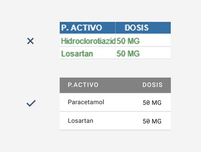
Cell readability
Text is hard to read due to the colour coding.
Reducing steps
Too many small tasks rely on floating modals.
DEFINITION - DESIGN PRINCIPLES
Before jumping into solution mode I set a foundations principles that connect the Business goals whit the discovery insights.
Familiarity
Align with Users’ Mental Models.
Productivitty
Minimise unnecessary steps.
Security
Focus on error prevention.
UX STRATEGY
I based my UX strategy in Jakob’s Law:
users spend most of their time on other sites, so they expect ours to feel familiar.

GETTING THE DEVELOPERS APPROVAL BEFORE MOVING FORWARE
Developed a low-fidelity wireframe and organised a team meeting to confirm the feasibility of the proposal. The proposal was approved.
One of the biggest challenges I faced was presenting a completely new design proposal to developers who had been working on the existing software for years.

DESIGN AS A CRAFT
Like a puzzle I have to find all the pieces to and fit them together into a layout.


Step 4
GETTING THE FIRST FEEDBACK
Next, I worked on securing approval from the stakeholders to move the design to the refinement stage. The result?
Everyone embraced the new approach.

DEVELOPMENT - DESIGN MINOR IMPROVEMENTS
I tackled complex design aspects by breaking them into manageable pieces for refirement.
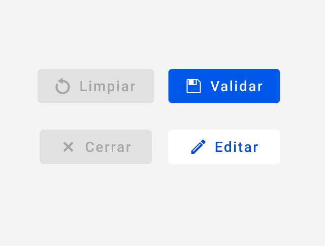
Meaningful calls to action

Text colours for labels
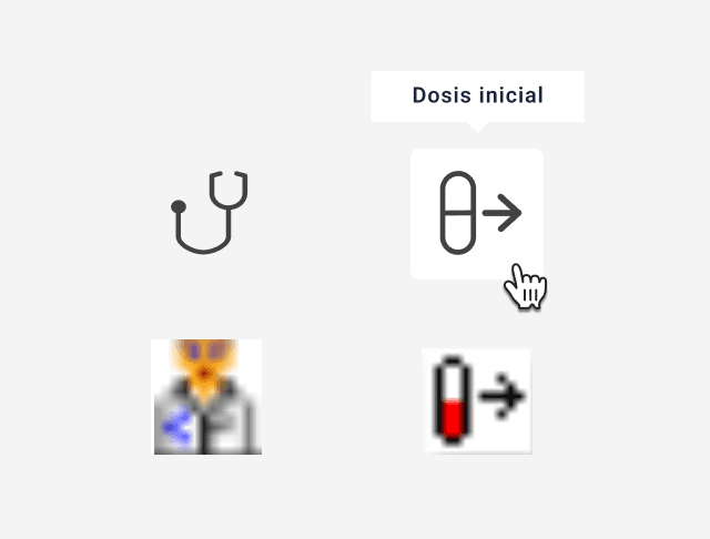
Icons redesign

Disambiguation 0
Text alignment

Text hierarchies redesign

Ease of interaction

Consistent states

Well define text fields
SOLUTION - MAJOR IMPROVEMENTS
A DINAMIC DASHBORAD
Exposing key data and actionable insights – effectively:
Designed for: Highlighting essential data and actionable insights in a user-friendly way.
Dynamic sidebar: An expandable sidebar to address space constraints and avoid recreating previous usability issues.
Reduced errors: Created task-focused paths with clear guidance, effective feedback, and minimized reliance on modal/dialogue screens.

SIDEBAR
Filtering and parsing data:
Improved: Ease of finding and applying data filters by prioritizing and organizing them based on user tasks.
Reduced time and steps: Simplified workflows by presenting default filters in an “edit mode” sidebar.
Enhanced status clarity: Clear feedback and visible filter states for a better user experience.


DELIVERY
DESIGN SYSTEM
Establishing the Figma design system foundation.
No Figma file existed: I take the opportunity to lay the foundations for the design system file.
Adapted a pre-existing file based in Angular Material: To sabe time and customised the content.

TAKEAWAY
Value of interactive prototypes
I realised how crucial interactive prototypes are for spotting gaps, especially in situations where user testing isn’t possible.
Commitment to improvement
I wish I had more time to keep refining how I approach error messages and improve accessibility.

B2B | HEALTHCARE | PART 2
5 min read
How can we add features while keeping the user flow simple?
B2B | REAL STATE |
5 min read