Role
Led design strategy and execution. User interface and prototyping.
Type
Internal application
Timeline
Apr 2024 - Juli 2024
Status
Implemented
OVERVIEW
Continuing the collaboration with The Basque Health Service software redesign, a new team at Ayesa brought me on board alongside Quattro IDCP.
This time, I was tasked with redesigning a key screen to help the Ayesa team overcome their design challenges.
WHAT IS THIS DESIGN ABOUT
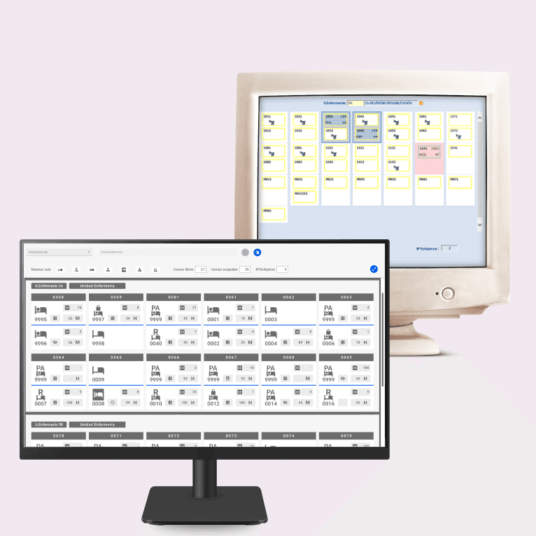
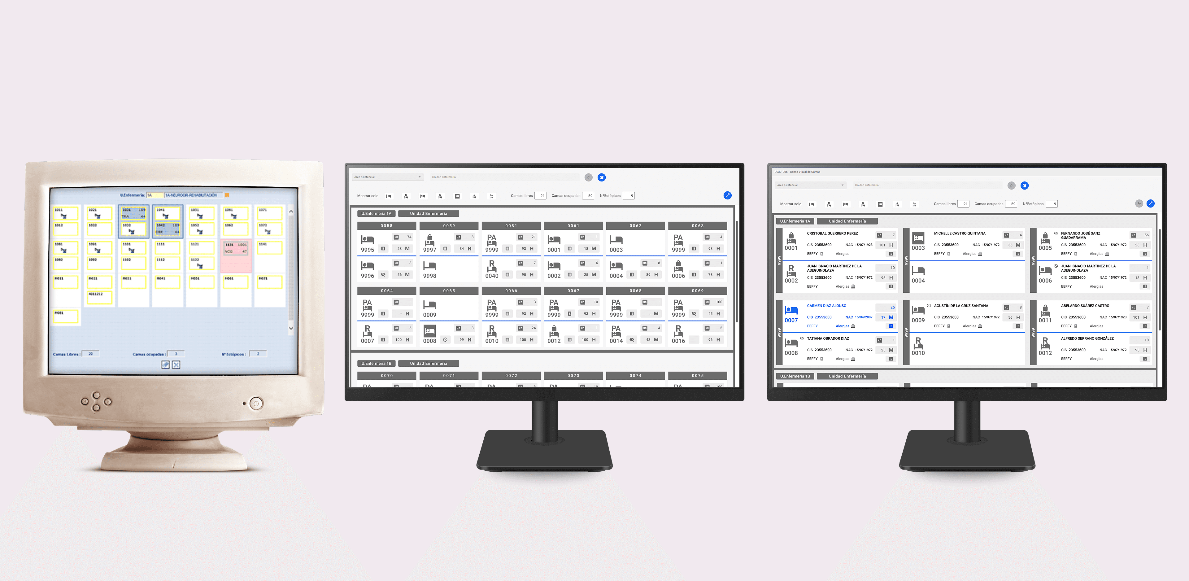
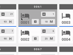
Census Management software: A tool for managing and visualizing the bed census of a Nursing Unit.
The end user: Administrative staff.
PROBLEM TO SOLVE
Design a new layout and add new categories without increasing the complexity of the user flow.
Despite multiple redesign attempts, the team struggled to deliver a solution that met the client’s expectations and requirements.

SOLUTION
Created a high-contrast solution to reduce cognitive load, enhance readability, and ensure an error-free experience with clear room and floor categories.

BUSINESS GOALS
Secure the long-overdue design approval from the administrative staff.
In addition, the other goals focused on:
Keep it simple
Avoid adding unnecessary steps.
Maximize screen usage
Incorporate a full-screen view for optimal space utilization.
Enhance data visualization
Improve readability for clearer insights.
THE PROCESS
“Whit no scope room for research or user testing, I adapted my process to fit project budget and timeline.”
DISCOVERY
Clear communication with the Project Manager and developer was essential to understanding the owner’s needs, despite limited resources.
Documentation: A few screenshots of the product.
A design system: I had established during the previous project.
Missing resources: No flowchart or information architecture available.
PRODUCT ANALISIS
I team up remotely with the developer to walk me through the project vision and understand the product behavior.
Interactive Components: Increase the componentes states.
Icons: Redesign for a better clarity and ease of understanding.
Toolbar: Need to be improved and more efficient.

VISUALIZING REQUIREMENTS WITH A MINDMAP
I created a Mindmap from the list of new feature requirements to determine their placement.
Gray: Represented existing components
Blue: Indicated new components and flow extensions
Result: This method helped me clearly identify the missing elements.

PERSONAL NOTE
“Healthcare is a highly interruptive environment where professionals are often conversing with patients while they attempt to complete a complex task”
DISCOVERY INSIGHT
To create the new categories, I’ll need to add a few extra screens to the flow while ensuring the design remains as intuitive and simple as possible.
Full screen need it
Improve categories
Refine tool bar filters
DEFINITION - DESIGN PRINCIPLES
I set a foundations principles that to the Business goals whit the discovery insights.
Keep it simple
Optimize the deign pattern.
Efficiency
Minimise unnecessary steps.
Provide feedback
When users take action.
UX STRATEGY
I based my UX strategy around an Atomics design Sytem: creating clear categories to translate the real world into a flat, interactive environment..

FOLLOWING THE STEPS, FILLING THE GAPS
Following the principles of this system, the visual design of the floor view component emerged naturally by applying logic.

Result

GETTING THE FIRST FEEDBACK
To confirm the design direction, I prepared a meeting for the stakeholders. The result?
The new approach received approval.
Key feedback: The main requests was to remove the use of colors and work exclusively with a grayscale palette by one shade of blue.

DEVELOPMENT - DESIGN MINOR IMPROVEMENTS
I used my keen eye for detail to identify areas for improvement, refining the design into manageable parts.
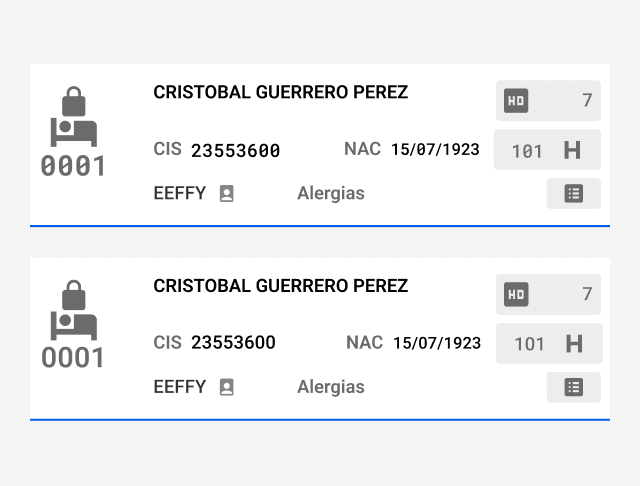
These adjustments, aimed at improving readability through increased size and contrast, significantly enhance the user experience by clarifying and simplifying data interpretation.

Visual hierarchies
No use of disambiguation 0
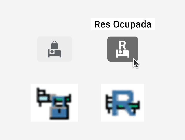
Icons redesign
No use of disambiguation 0
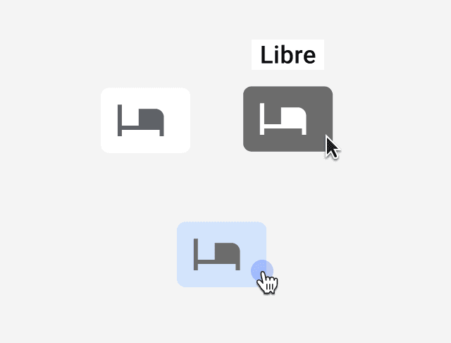
Consistent states

Text hierarchies redesign
SOLUTION - MAJOR IMPROVEMENTS
TOOLBAR
Intuitive filters for effortless data interaction:
Improved Filtering Experience: Introduced intuitive icon-based filters for quick and clear selection.
Simplified Workflows: Streamlined the process by instantly updating content based on applied filters, reducing steps and effort.
Visual Feedback: Designed clear filter states to provide immediate feedback and improve user confidence in their selections.

TOOLTIP
A Tooltip that helps to take better and fasted user decisions:
Give user more control:
Tooltips should not appear on hover but only when the user clicks on the component.
This approach prevents overcrowding the screen with potentially confusing information and ensures a more deliberate interaction

DELIVERY
DESIGN SYSTEM
Scaling the Figma design system for rapid development:
Leveraged Existing Framework: Built upon the previously established design system ensuring consistency across components.

TAKEAWAY
Clear communication with Developer
I learned the importance of maintaining open and consistent communication with the developer, which was essential for aligning on goals and ensuring a smooth, efficient workflow.
Creativity within constraints
Working with limited resources pushed me to think outside the box, proving that great design solutions can emerge from tight budgets and timelines.

B2B | HEALTHCARE | PART 1
6 min read
How do we redesign a medical legacy system to fit a new screen format?
B2B | REAL STATE |
5 min read