ifly

How can we help the users feel more confident during the flight booking experience?

Project Overview

Ifly is a fictional airline app that aims to deliver a smooth booking experience. This case study was my graduation project for the UX design institute. Throughout this project I performed both the research and design processes in order to achieve the professional diploma.

Project By

UX Design Institute and the Glasgow Caledonian University

My Role

UX Designer

Duration

20 Weeks

Key tools

Google docs - Figma

The problem

Booking a flight through a mobile app can be a complex experience. Through this case study I propose a booking flow with a friction free experience.

My Role

This case study was my graduation project for the UX design institute. Throughout this project I performed both the research and design process in order to achieve the professional diploma.

The Solution

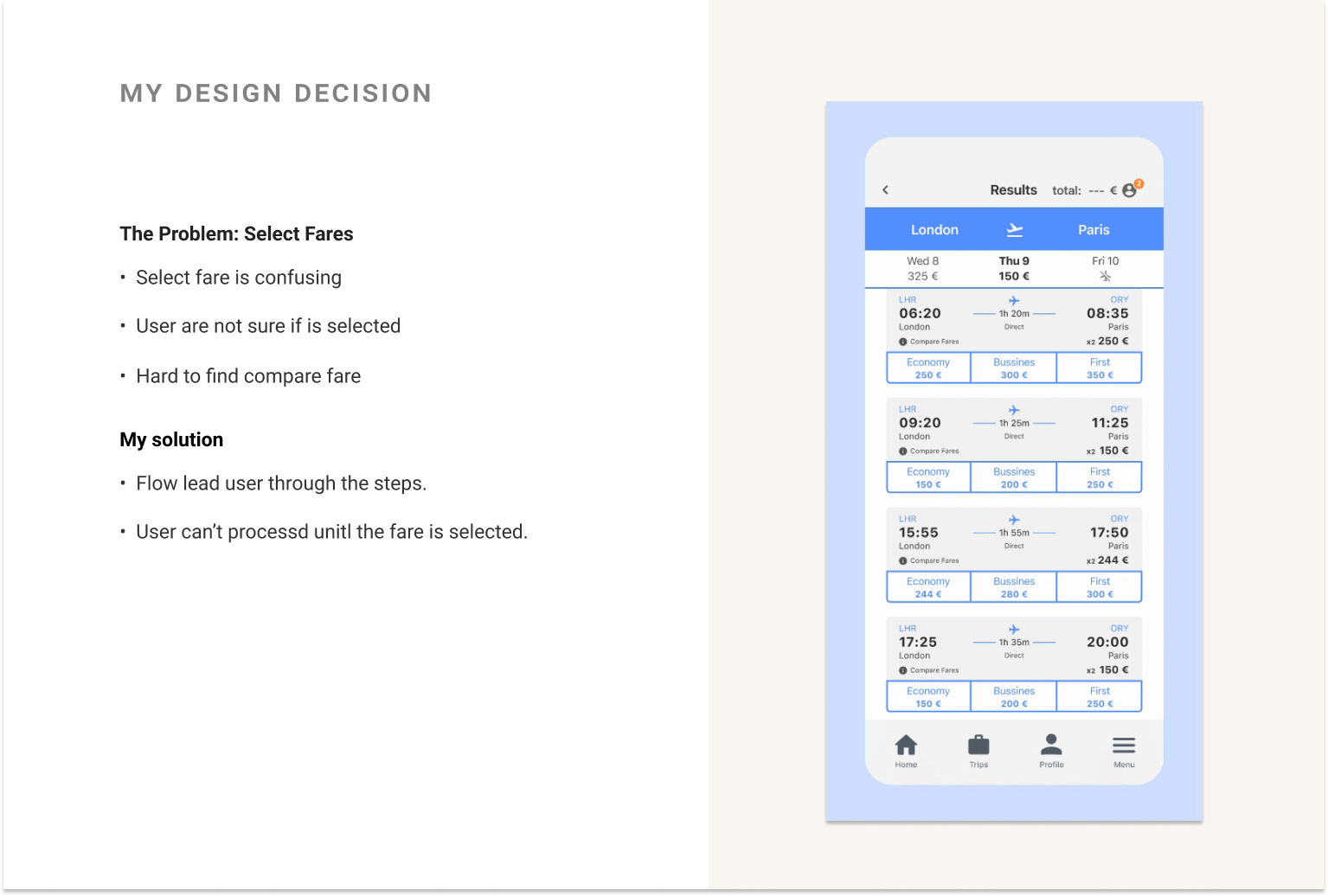
To streamline the fare and flights selection I added a clear button selection and strong visual feedback. To ensure the user get all the information that need in each stage.

Learnings

This project gave me valuable insight into the UX process and what is required of them. Also taught me the correct methodology and the right mindset needed to be a thoughtful user advocate, and I have learned how to build something usable and desirable, that creates a positive experience for the user.

Study Case Goals

1

The user

Learning and applying the UX process.

2

The product

Enhance the process of booking a flight.

3

Personal

Apply the UX methodology to find a solution that improves the User Experience.

About Ifly

What is Ifly?

The simplest part of planning a trip is deciding the destination. A lot of users have problems during the booking process on an airline’s mobile app, in order to book a flight is required to complete a set of tasks in order to successfully book a flight. Ifly is a User center airline app designed to deliver a smooth booking experience.

What I'm doing in this project?

This was the main project to be completed in order to obtain my Diploma in UX Design from the UX Design Institute.

What is the product I worked on?

The product is a mobile App for an Airline. The Project is focus on the Booking Process, so will go throughout these stages: App Landing - Home - Flight Search - Flight Selection - Passenger Information - Summary - Select seats.

Defining the project:

Goal

To keep the user feeling confident throughout the whole booking process.

Challenge

Understanding industry conventions and develop a smooth friction-free booking process.

Constraints

Improve the booking flow but also maintain the user’s mental model throughout the process.

UX process plan

How I'm going to work

What process I will follow

Throughout this project I follow the process that was designed by the UX Design Institute course. As a UX designer I added:

  • My Solution section, in order to further expand my reasoning for the final solution.
  • And Problem Statement to create a better base and understanding.

My design thinking process

Research

Using empathy to understand the user's problem

Competitive Benchmark

Why I used this methodology

To compare and evaluate the current airlines’ apps by using metrics relative to the performance and to understand the industry standards.

Process

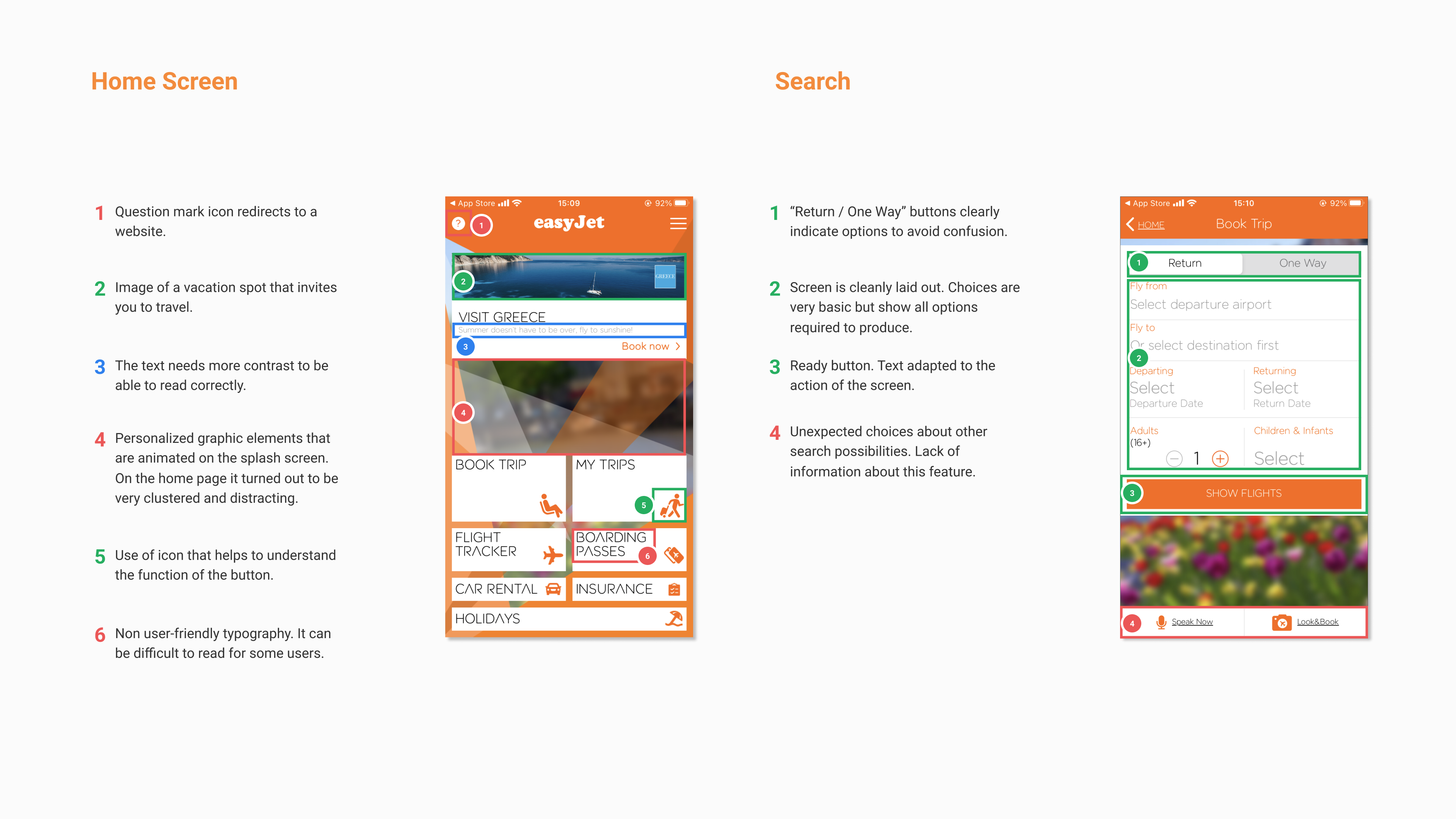
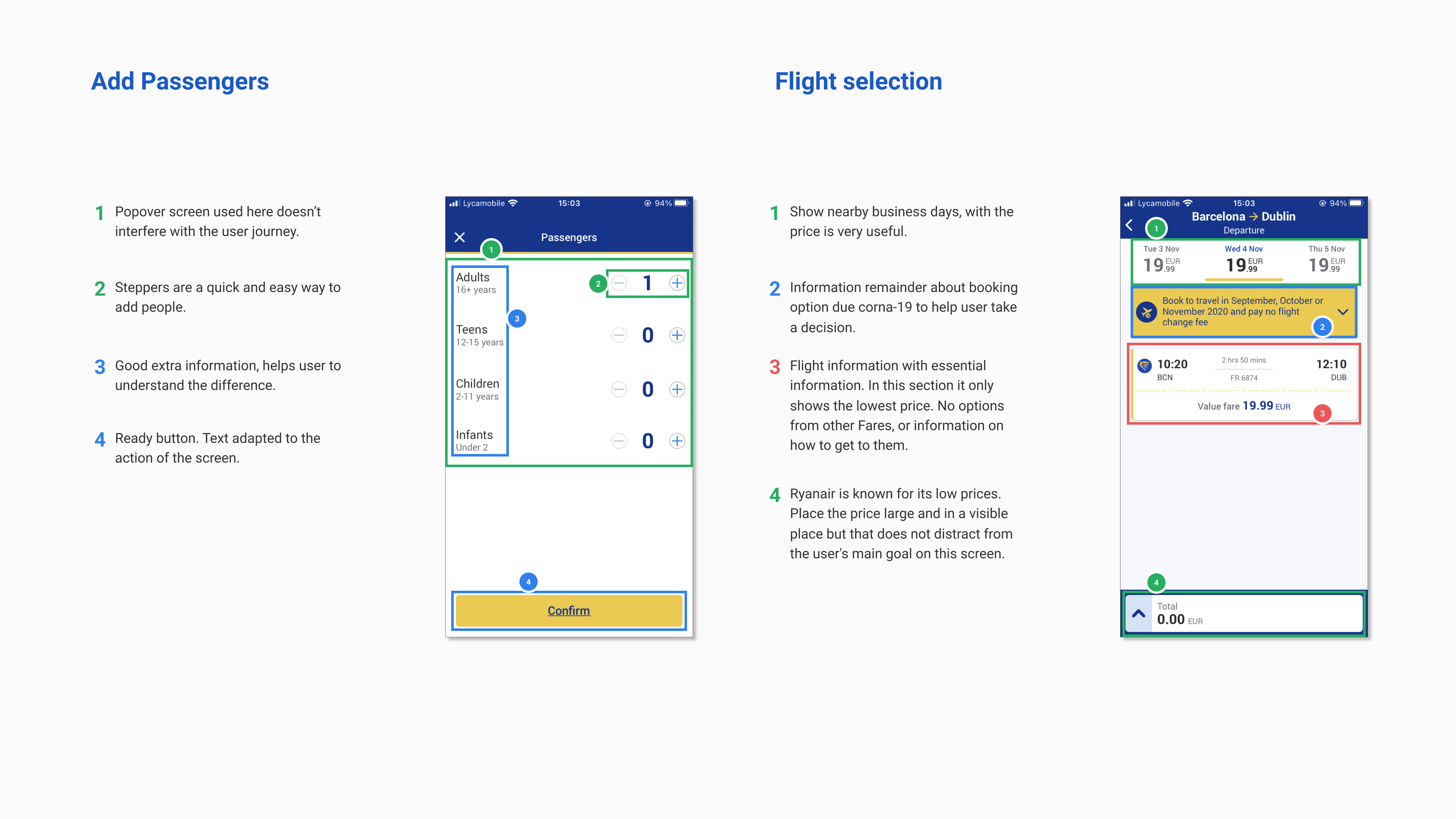
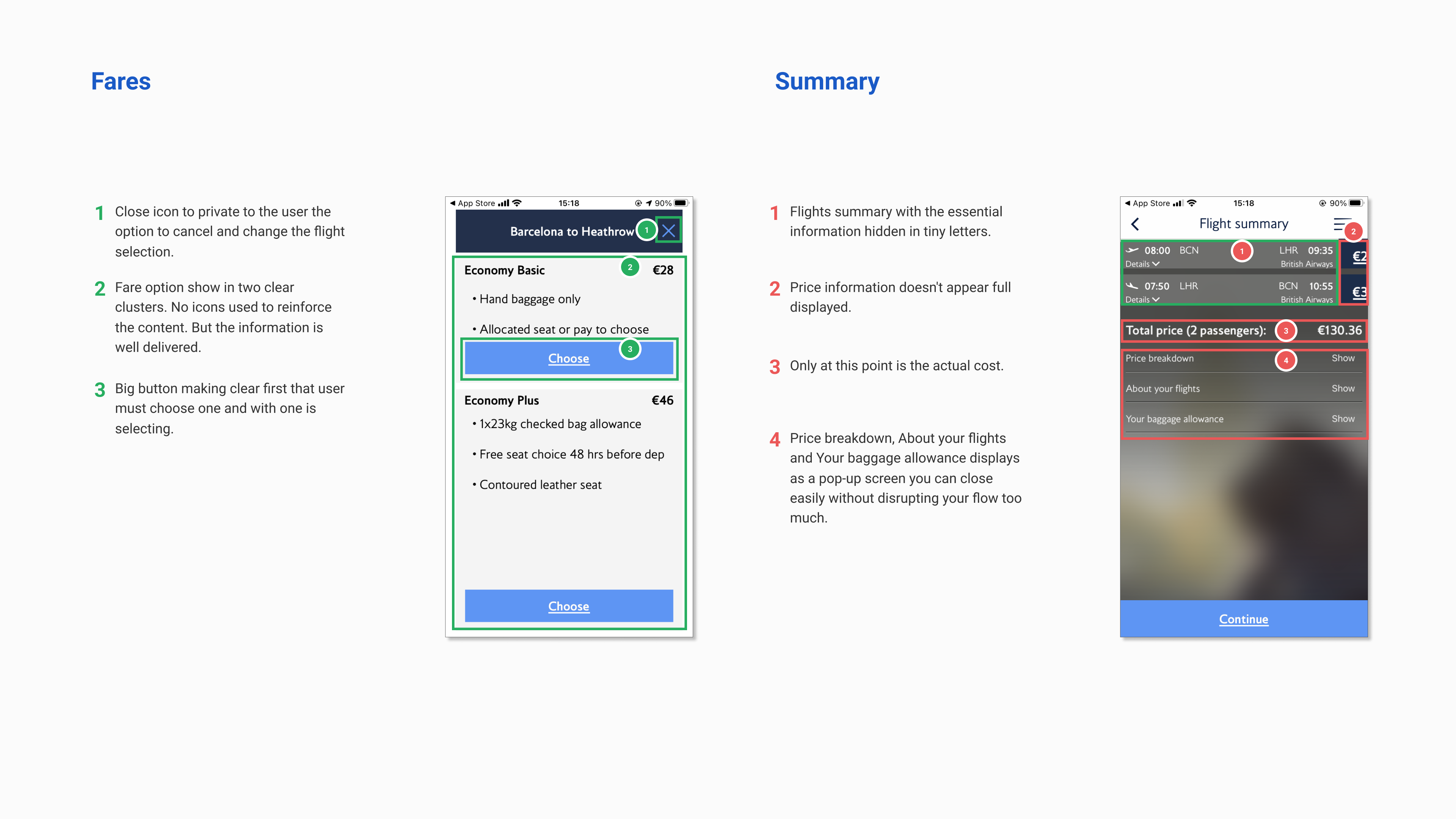
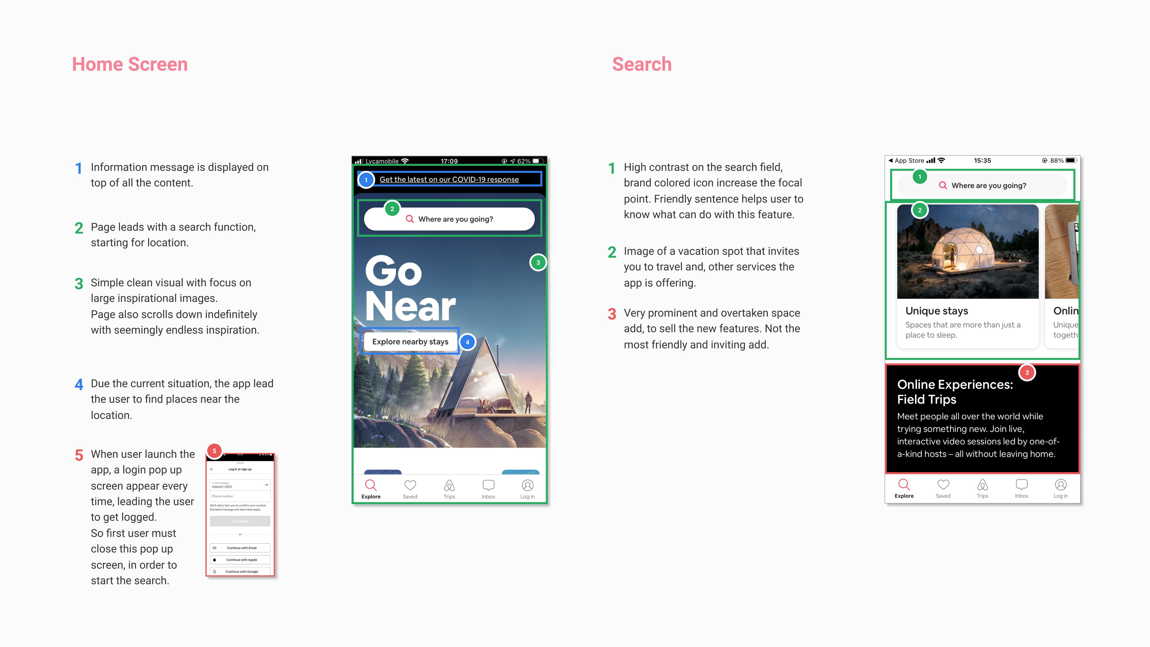
The first step in the process is to analyse how competitors are solving the booking process. I focused on three European airlines, two of which were short haul carriers and the other was a long haul carrier. I also analysed AirBnB as a travel related competitor.

Findings

  • Booking a flight is a highly structured process, where the user steps through a series of screens.
  • Throughout these steps the user is required to complete specific tasks such as selecting dates and filling out passenger forms.

My hypothesis

Across the airline industry there is a well-defined process for booking flights, so breaking that convention could backfire.

Go to full Benchmark
Why I used this tool:
Google Drive: To organize my files (text, images, links, etc).
Figma: To create a template and to easily edit. Easy to search for the file
Online Survey

Why I used this methodology

It’s an easy way to gather a lot of user data, its cheap and relatively fast .

Process

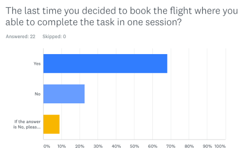
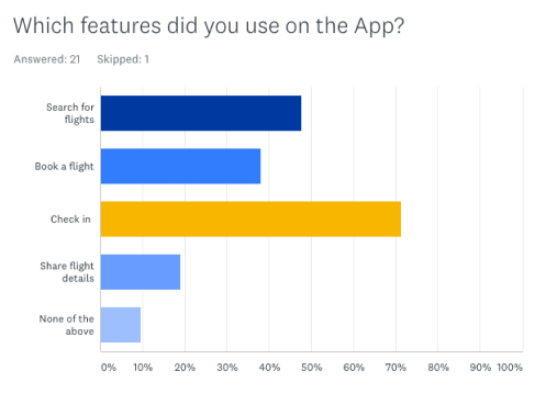
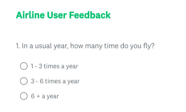
In order to acquire more quantitative and qualitative data about the project, I ran an online survey. Using both closed-ended and open-ended questions I was able to collect useful data about user behaviour.

Findings

  • Users prefer searching for flights on airline websites.
  • Mobile apps are typically used for checking-in.
  • Most users make short-distance trips.
  • Users associate their travel experience with the in-app experience.

    My hypothesis

    This process has helped me gain insight into how users use these types of apps.

Why I used this tool:
Survey Monkey: Was the recommended at that moment, and I found it intuitive and easy to use.
What the users said

In your opinion, which airline had the worst flight booking experience and why?

Survey Answer

“Wizzair. Lack of clarity, bad design, bad translations, intrusive advertising”

Survey Answer

“Ryanair, the process becomes too long with all the adverts.”

Survey Answer

“Jet Airways, the UI was really clunky and confusing”

Remote usability test

Why I used this methodology

To learn about the user context, goals, behaviours. Also, to upskill how to conduct interviews and draw insights from the users.

Process

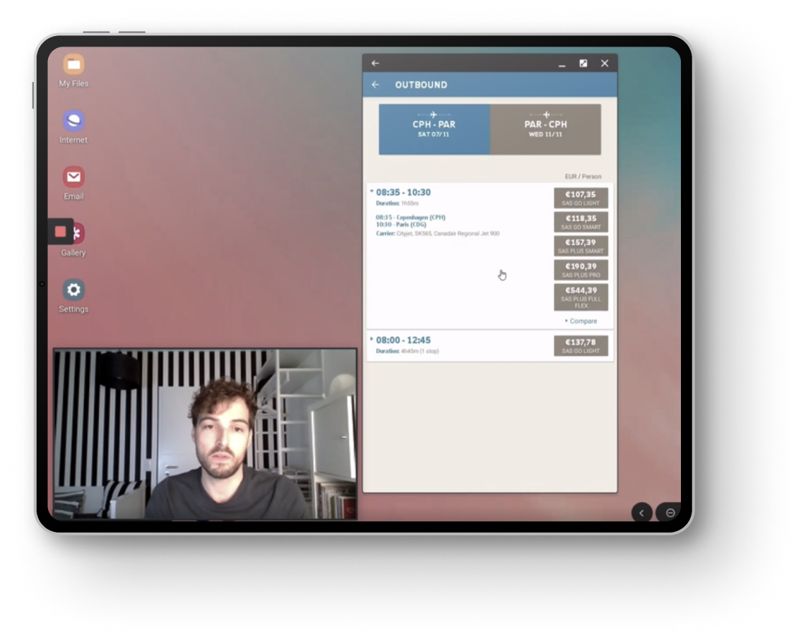
The next logical step was to perform a usability test. To achieve this, I recruited a friend who travels by air on a regular basis and books their flight online. I conducted the test remotely.

Since I did not have an existing product but was researching for a new one, I decided to use two existing competitor apps instead. They were SAS and Norwegian apps. I prepared an in depth interview and test to be completed within one hour.

Tasks to complete:

Book a flight for a City break. Fly from Copenhagen to Paris from November 9th to 11th but flexible with departure dates. The trip is for two people. The flow stops before the seat selection.

What did I find?

  • The SAS interface was less cluttered and that prevented the flow from being interrupted.

  • In the Norwegian app test, it was more challenging for the user to book a flight. There was confusion on selecting the flight and the fares, which were not clear. The user was getting lost at different points in the flow.

My hypothesis

The user had never used the SAS or Norwegian app before. But they still knew how to navigate through them. This confirms that industry conventions are well known.

Go to remote usability test
Why I used this tool:
Google docs: To prepare the script.
Zoom: Easy to share screen and performance is good.
Note-taking

Why I used this methodology

To take notes to highlight the key insights observed, during the session and watching the recording. Also to create a bank of insights for the next stages.

Process

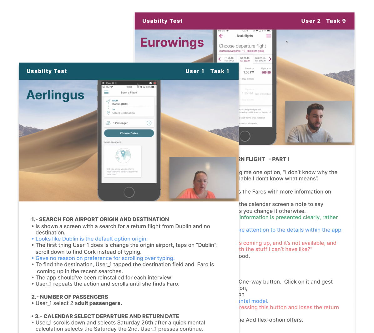
During this phase, I reviewed the usability test I recorded. My mission was take the most detailed notes a possible, focusing on, built the user empathy detecting the:

  • Needs, emotions, thougts,motivations, what said and what do.

And also the user’s:

  • Goals, behaviour, pain points and mental models.

    Findings

  • What they are unable to find on your site.
  • What is missing from your site.
  • What is unclear or vague.
  • What is causing friction or preventing them from converting.

    My hypothesis

    The selection of both the flight and the type of fare is a major pain point for the user.

Why I used this tool:
Google docs: Easy to edit and check spellings

User test 1

Aerlingus app Fare selection

“But that has now moved me onto the 2nd of November for some reason. I don’t know why that would happen. Because I want, I don’t know why that has happened.”

User test 2

Eurowings app Fare selection

“I didn’t like the fact that… unless you’re familiar with the app, you wouldn’t know to click on it for other options.”

User test 3

Norwegian app Selecting Flights

“The select button didn’t actually pop out visually because it is the same colours as the other menus, so that is maybe why I miss it. I didn’t realize I had to do an extra step to select my flights.”

Journey map

Why I used this methodology

To crystallize where customers get stuck or frustrated on their path to purchase and beyond. It’s a visual representation that synthesizes data on personas and user behaviour.

Process

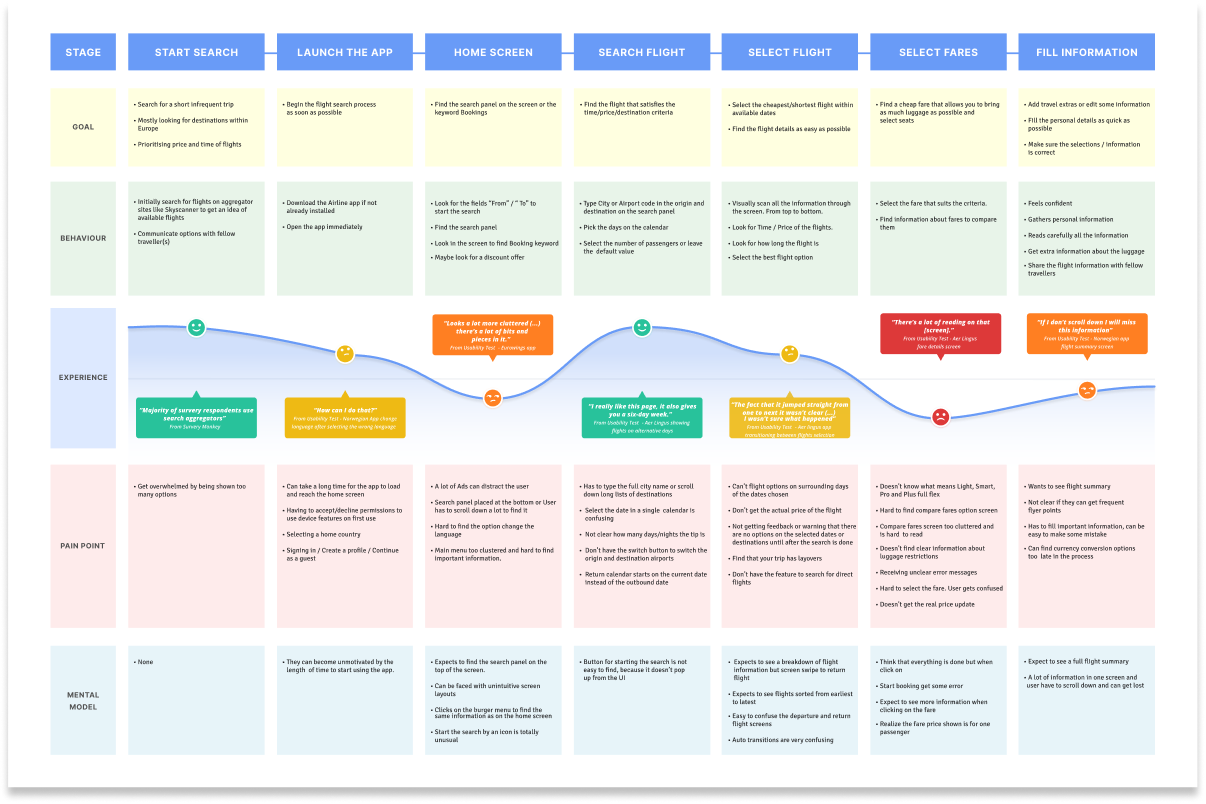
The purpose of the customer journey diagram was to continue shaping and structuring the data previously obtained, and to create a visualization. To achieve this, I put myself in the mind of the user and attributed their positive and negative points to each steps of the flow.

Tasks to complete:

From the customer journey diagram I now know the key user goals and more importantly the common pain points and mental models that prevent the user from having a smooth booking experience. They are:

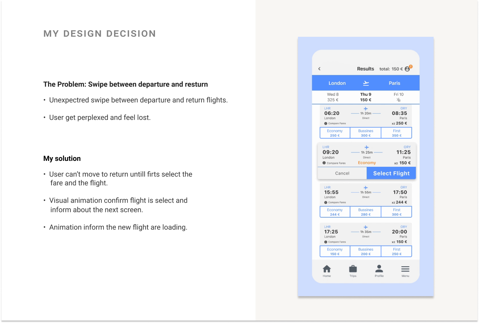
  • Unexpected transition between departure and return flights.
  • Selecting different fare types
  • Unclear information about whether the flight is direct or not.

My hypothesis

Going through this process allowed me to understand that a user’s experience depends on their goals. These goals are not always global and each step can have its own mini goals. The mini goals can either improve or dis-improve the user’s experience.

Go to full journey map
Why I used this tool:
Figma: To create and edit templates that I can share easily

Define

Framing the problem - gathering evidence

Affinity Diagram

Why I used this methodology

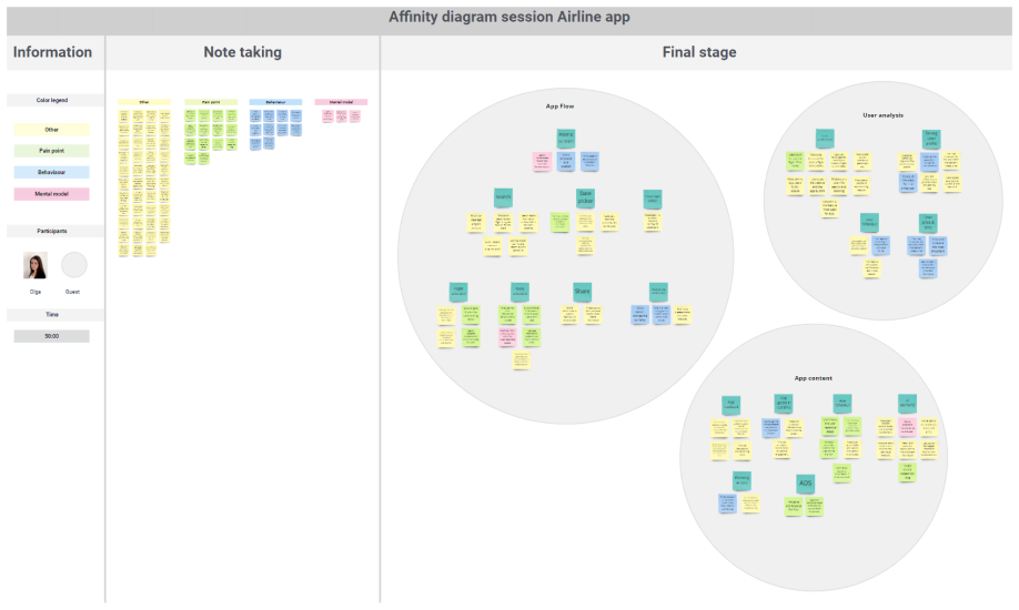
To review all the notes and insight I gather till now to organize the research findings from a large set of ideas into clusters working in collaboration, with the goal of creating awareness of usability issues and design challenges and to gain empathy towards the users.

Process

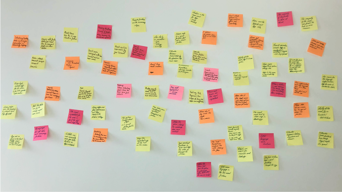
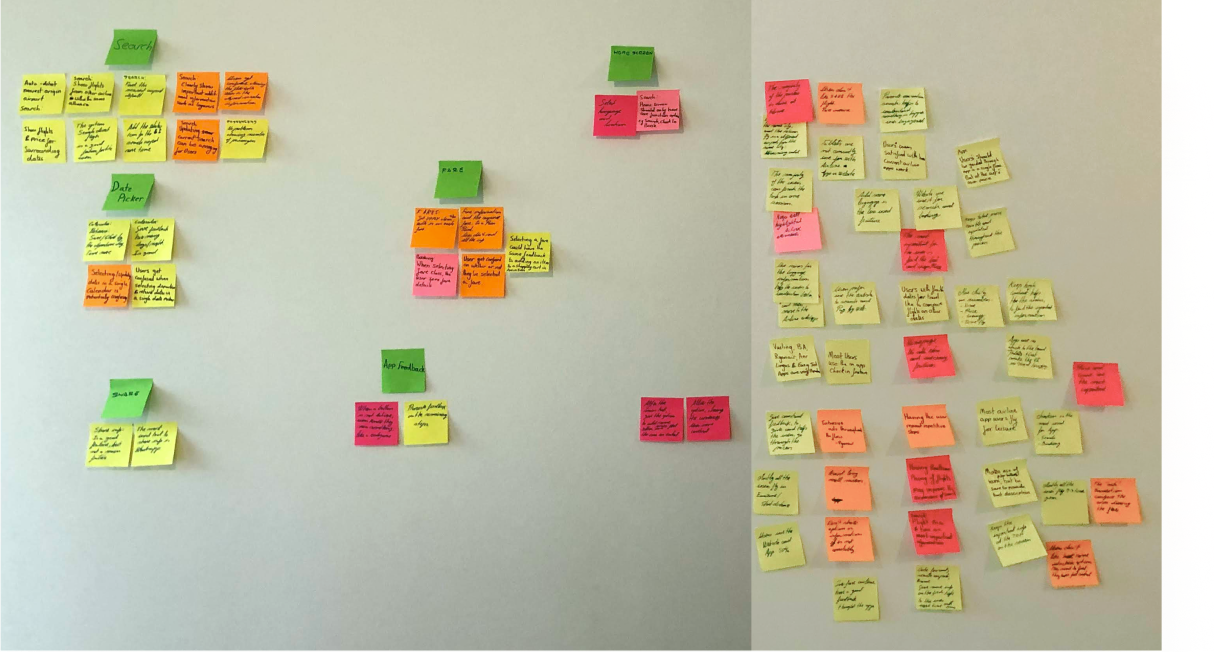
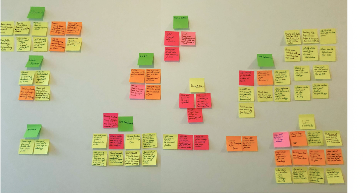
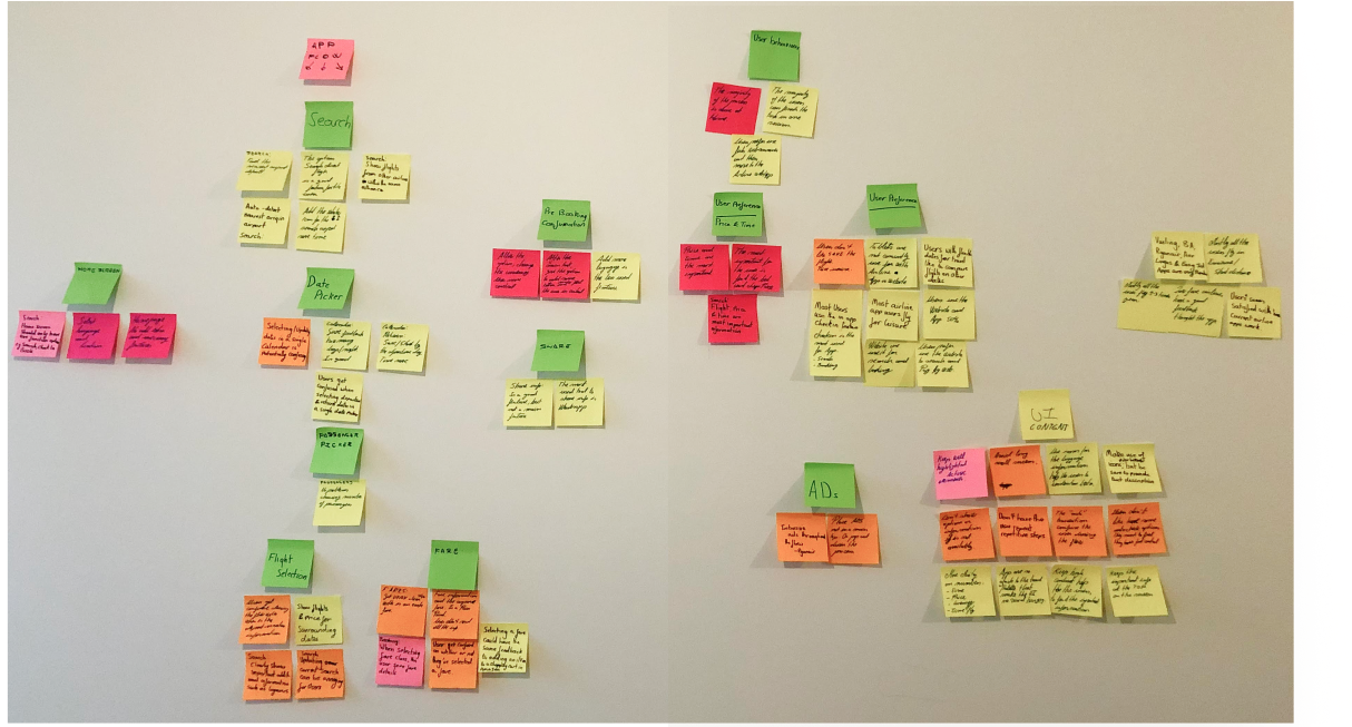
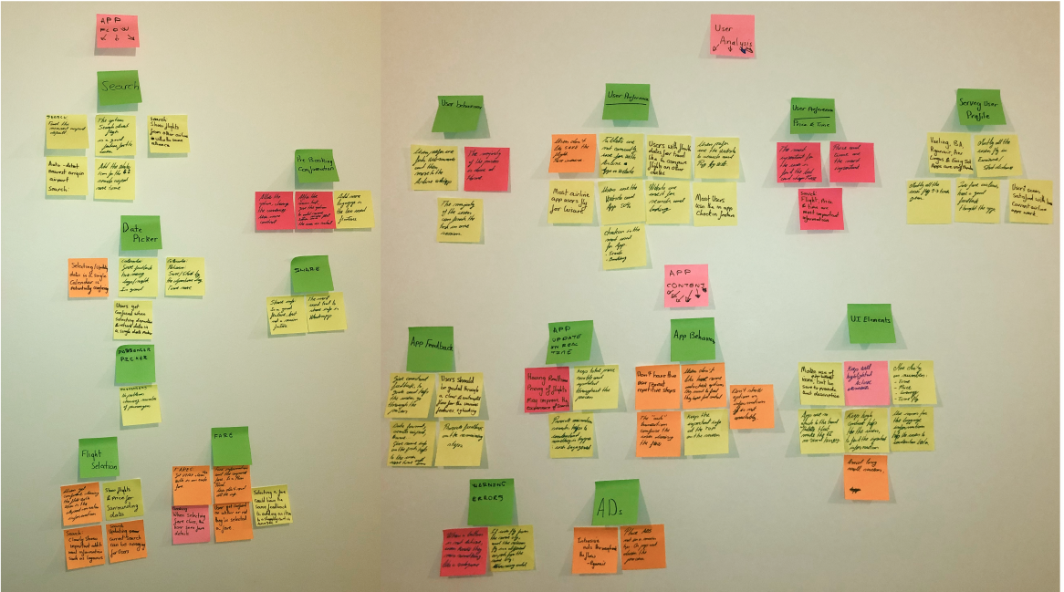
After obtaining the raw data from the Research phase, I began to analyse it. I enlisted someone to help me with this phase, we reviewed the data gathered, took notes on Post-It notes, and then clustered them together into groups and subgroups on a wall. This helped me at structure to the data collected in the previous steps.

Findings

  • The main goal of the Home screen is to start the flight search.
  • Users get confused when navigating between the departure and return screens.
  • It is important to inform if the selected flight is direct or has a layover.
  • Selecting fares is confusing and the Compare Fares screen has too much information.
  • Giving constant feedback helps users to stay in the flow.

    My hypothesis

    Working with someone else, we were able to take the unstructured data and clustered it together into a structured format and then we were able to identify logical theme patterns.

Go to full Affinity Diagram
Why I used this tool:
Pen and paper: Traditional mode.
Miro: To keep a digital version for the future that I can easily share.
PROBLEM STATEMENT

The booking flow needs be friction-free in all stages and put on the front all the information because the user feels confused or cheated and leave the app.

Ideate

Generating Ideas

User Flowchart

Why I used this methodology

To describe the back-end process and the user task flows. To map out the website flow and stages.

Process

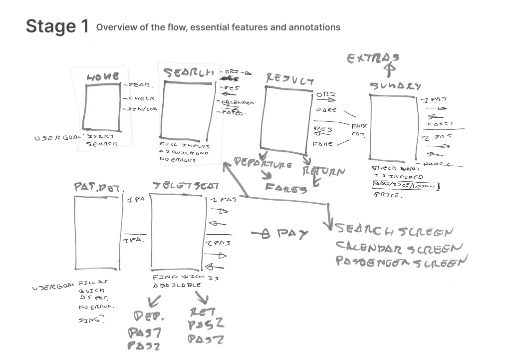
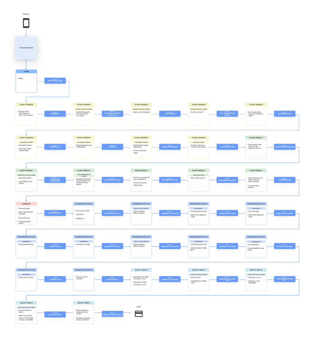
The objective of this phase was to create a high level flow of the booking process. For this project, my main focus was on one primary use case. To achieve this I split the flow into more detailed tasks.

Tasks to complete:

Book a flight for a City break. Fly from Copenhagen to Paris from November 9th to 11th but flexible with departure dates. The trip is for two people. The flow stops before the seat selection.

What did I find?

  • For me, this process helped me to identify the main and sub screens. It also informed me which screen the content will go on.

    My hypothesis

    This step allowed me to further organize the data I collected and I was able to start designing a more concrete architecture for the booking process.

Go to User Flowchart
Why I used this tool:
Pen and paper: To create a sketch and put ideas together.
Figma: To create a digital version that I can share.

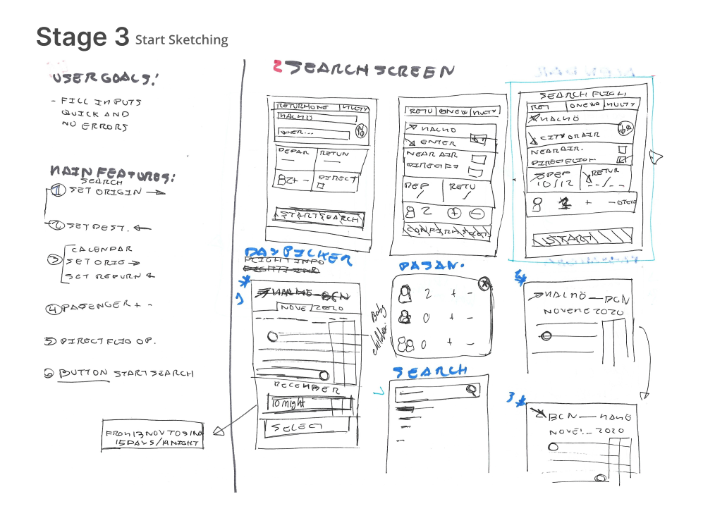
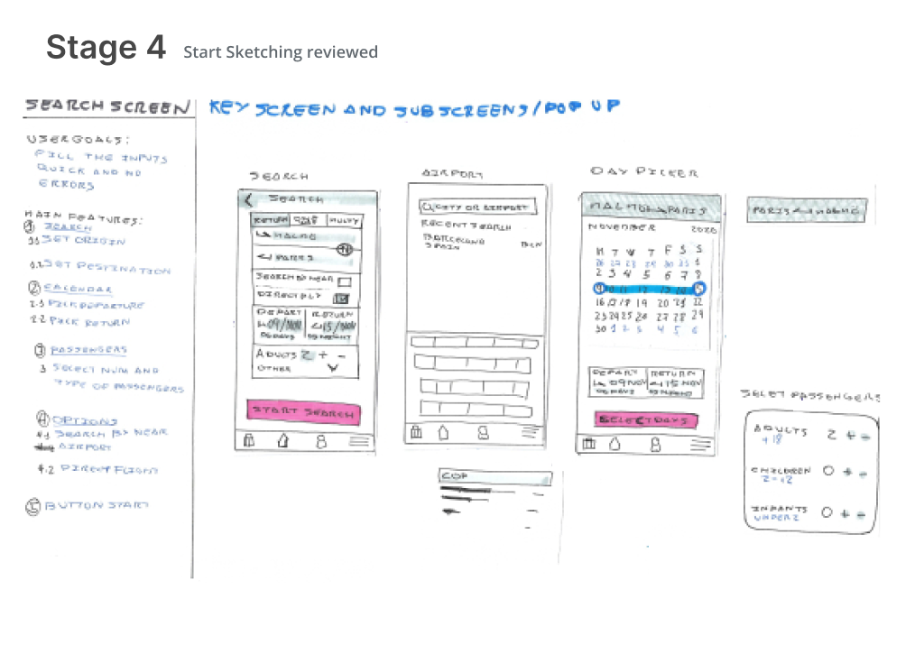
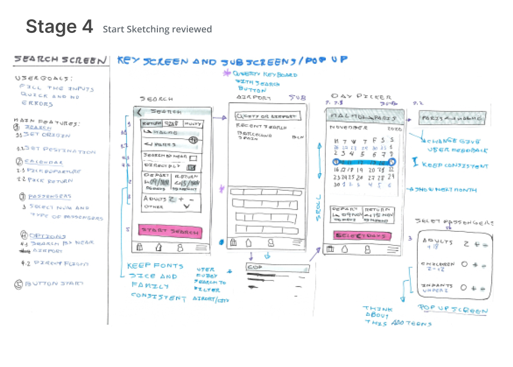
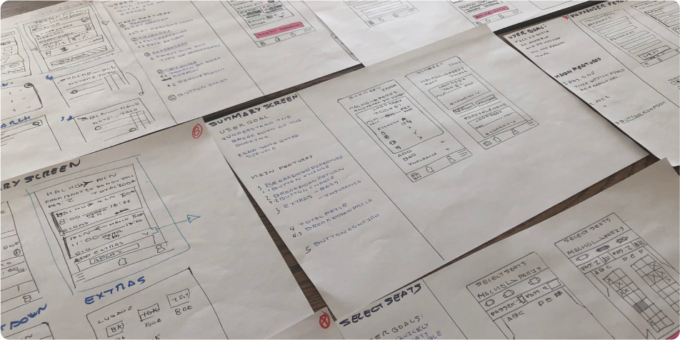
Sketches

Process

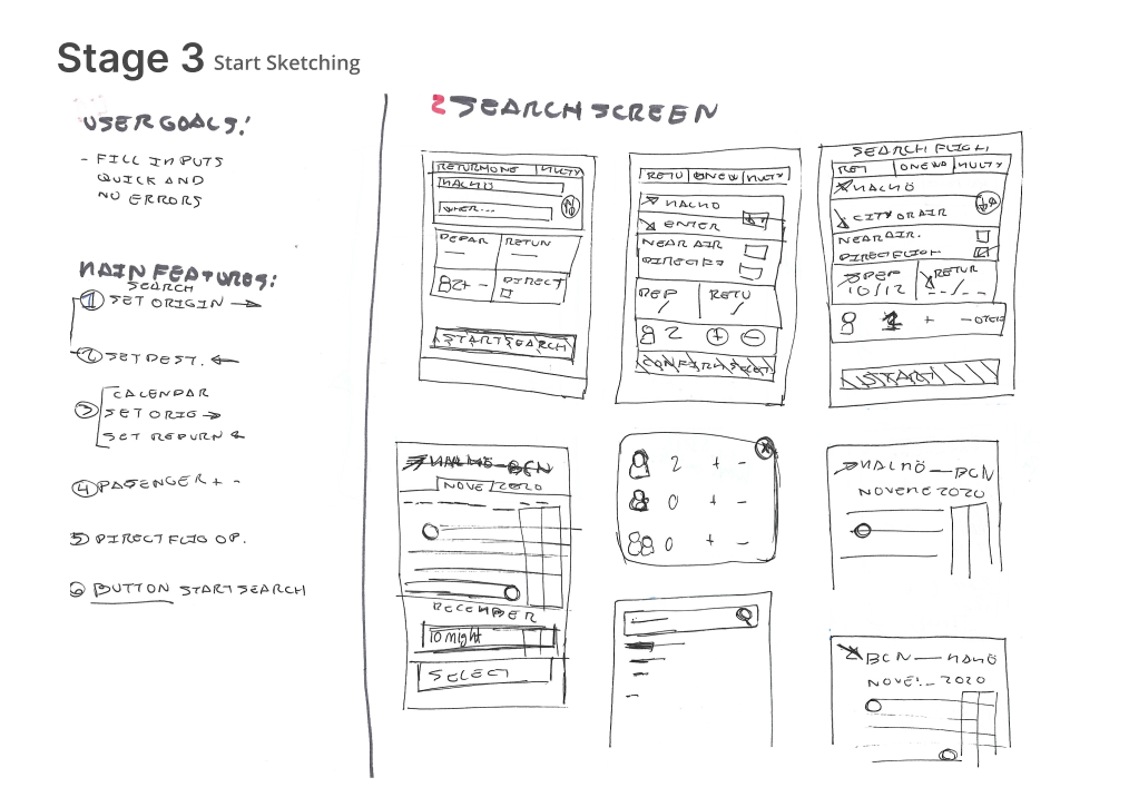
At this point I began to develop a solution to the problem. This involved creating sketches of the screens that would form part of my solution. To achieve the initial design I followed the methodology below:

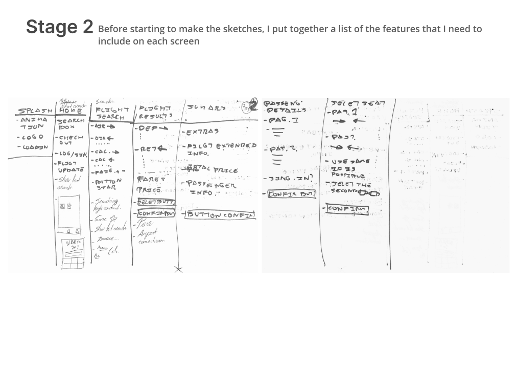
  1. Using the flow diagram I identified the key screens I needed to design.
  2. Create a list of key features for each screen.
  3. I focused on a single screen, where I put the user goal first.
    Then I took the feature list and sorted it by priority to achieve that goal.
  4. With these criteria I made several variations that tried to solve this problem.
  5. I reviewed each of these variations, and I selected the one that best satisfies the user goal. And making sure that I included all the key features.
  6. Once I identified the best sketch for each screen. I brought the sketches together to validate that the solution satisfies the user’s end goal of booking a flight.

My hypothesis

By listing the key features and the user’s goal for each section, I was able to design UI elements that have purpose in mind.

Why I used this tool:
Pen and paper: To quickly put my ideas into a visual state.

Prototyping

Creating solutions

Medium fidelity prototype

Process

With the sketches I was able to begin creating an interactive prototype of my solution.

This medium fidelity prototype focused on taking the sketches I created and making a realistic and intuitive prototype. Where you can see how the end to end booking process worked.

At this point I didn’t focus on the theming or branding of the app, since I wanted to focus on building recognizable UI elements with different states.

Go to medium fidelity prototype
Why I used this tool:
Figma: To design the UI prototypes

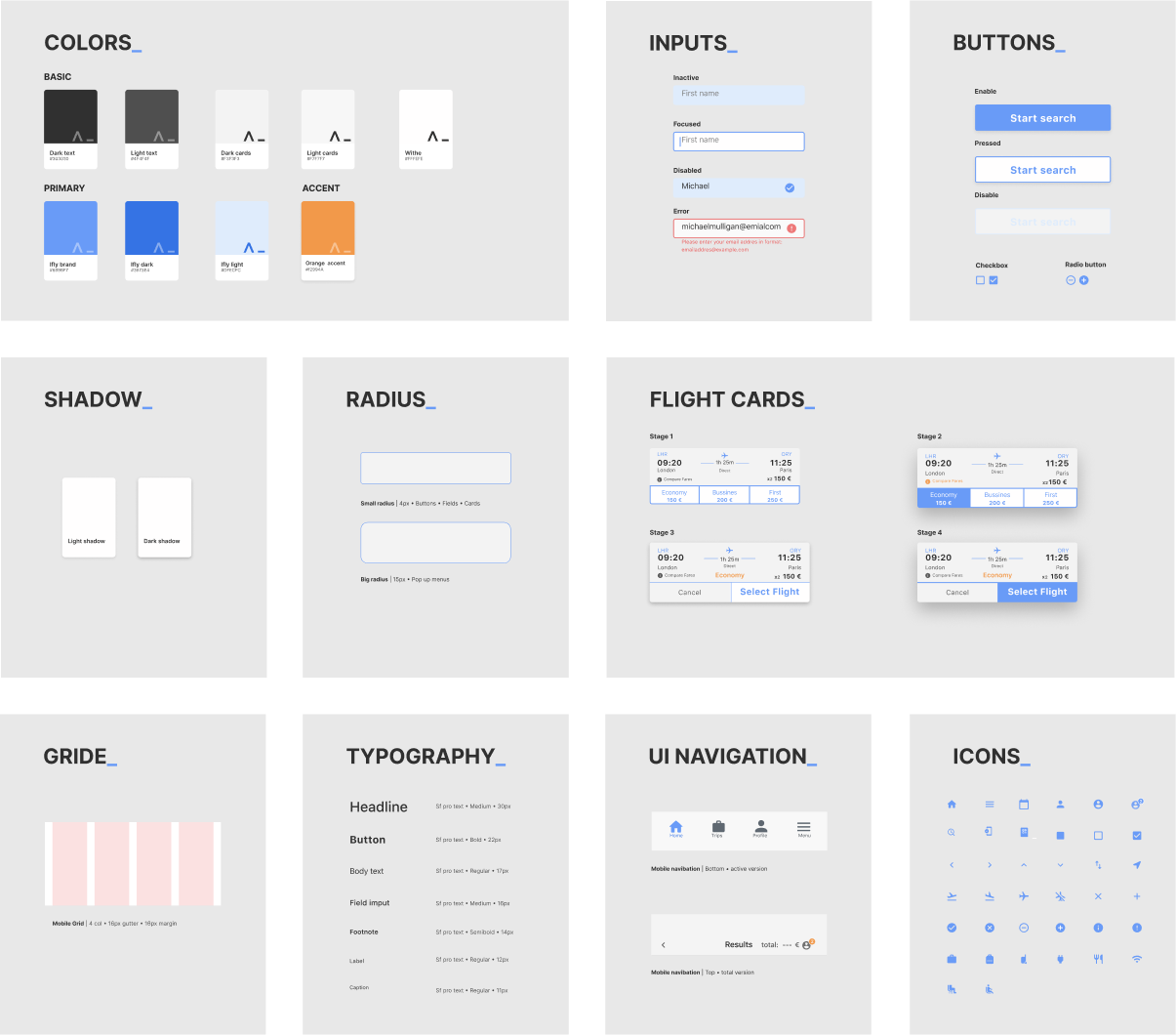
Design System

Why I used this methodology

After the design and I had developed a strong framework from the lo-fi prototype and in preparation for the high fidelity prototype I need to create the UI design system in order to maintain consistency through all the experience and improve the usability.

Process

After having a clear vision of what the website should look like I decided to create some foundations like colour palettes, typography and icons. With that having done I started to build the most important components for the website which are:

  • Grid
  • Buttons
  • Input fields
  • Flight Cards

Conclusion

Setting up components made it fast and easy for me to create a hi-fi prototype with a consistent product styling.

Why I used this tool:
Figma: To design the UI prototypes

High fidelity prototype

Process

As an extra step I decided to create a more realistic prototype. My focus was to improve the look and feel of the prototype as well as include small animations.

Conclusion

From creating this prototype I was able to identify areas of improvement within the solution. As well as validate design decisions with the UI elements.

Go to high fidelity prototype
Why I used this tool:
Figma: To design the UI prototypes

Delivery

Handoff the solution

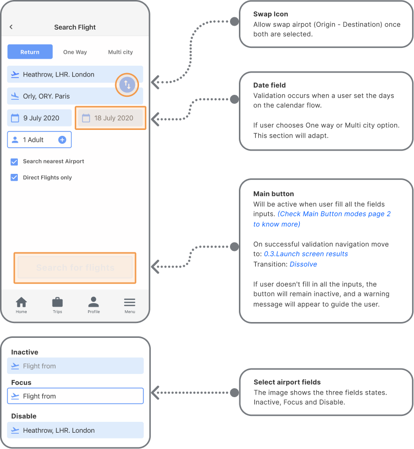
Handover document

Why have I used this methodology

This was the final project for my UX course. The focus here was to create a handover document that provided detailed information to the software engineers and other stakeholders on how to build this solution.

Process

This was the last project I had to do for the course. In it I included extra information, such as the states of the buttons and form. Also extra to help navigate within the figma file, as well as font and color systems. –For its development I had to detail all the information to hand over to the developers.

Conclusion

To develop this wireframe I had to go through the entire flow. It was useful to reflect on the work and see what could be further improved.

Why I used this tool:
Miro: To work more efficiently editing an existing template and easy to share

My Solution

The solution depicts the improved booking process. It reduces the dropout rate and improving the selection process of fares and solving the unexpected swipe between departure and return.

Take Away

Project review and final thoughts

Things that went well

I found the usability test to be a very useful and meaningful tool that helped me gain a better understanding of the user and their real difficulties.

Things I would have doen differently

I would have applied more methodologies along the research process, and the Definition Stage, such as Brainstorming, How my we?..... and a Problem Statement.

What I found difficult

Although I have previously commented that the usability test was positive, I must admit that doing it myself was a great challenge and that it is a skill that I must practice more, to achieve greater fluency and know-how and when to get out of the script to be able to achieve more input from the user without making him feel uncomfortable.

What I enjoy more and why?

If I were to continue working on this project, I would start doing usability tests on the final prototype from this project and begin to further refine this solution.

Project Overview

I found that this project really highlighted to me the importance of how each stage in the process feeds into the next and how it informs my decision-making throughout the process. It was interesting how I started with a very abstract problem of just improving the booking experience. But as I worked through the process I was able to gain a deeper understanding of the industry conventions when it comes to booking a flight through the app. I was able to identify the user goals, behaviours, pain points and context in those conventions and the actual problem to solve. Which was a rewarding experience.

Next Steps

If I were to continue working on this project, I would start doing usability tests on the final prototype from this project and begin to further refine this solution.

Thank you for reading.