blinkin

How can we optimise the search filters process using customisation?

Project Overview

Blinkin is an e-commerce website that allows its users to consciously customize their search filter options. This case study is a personal project where I will apply new learnings from the online platform Interaction Design Foundations and other self-learning research.

Project By

Self project

My Role

UX Designer / UX Researcher

Duration

6 Weeks

Key tools

Miro - Figma

The problem

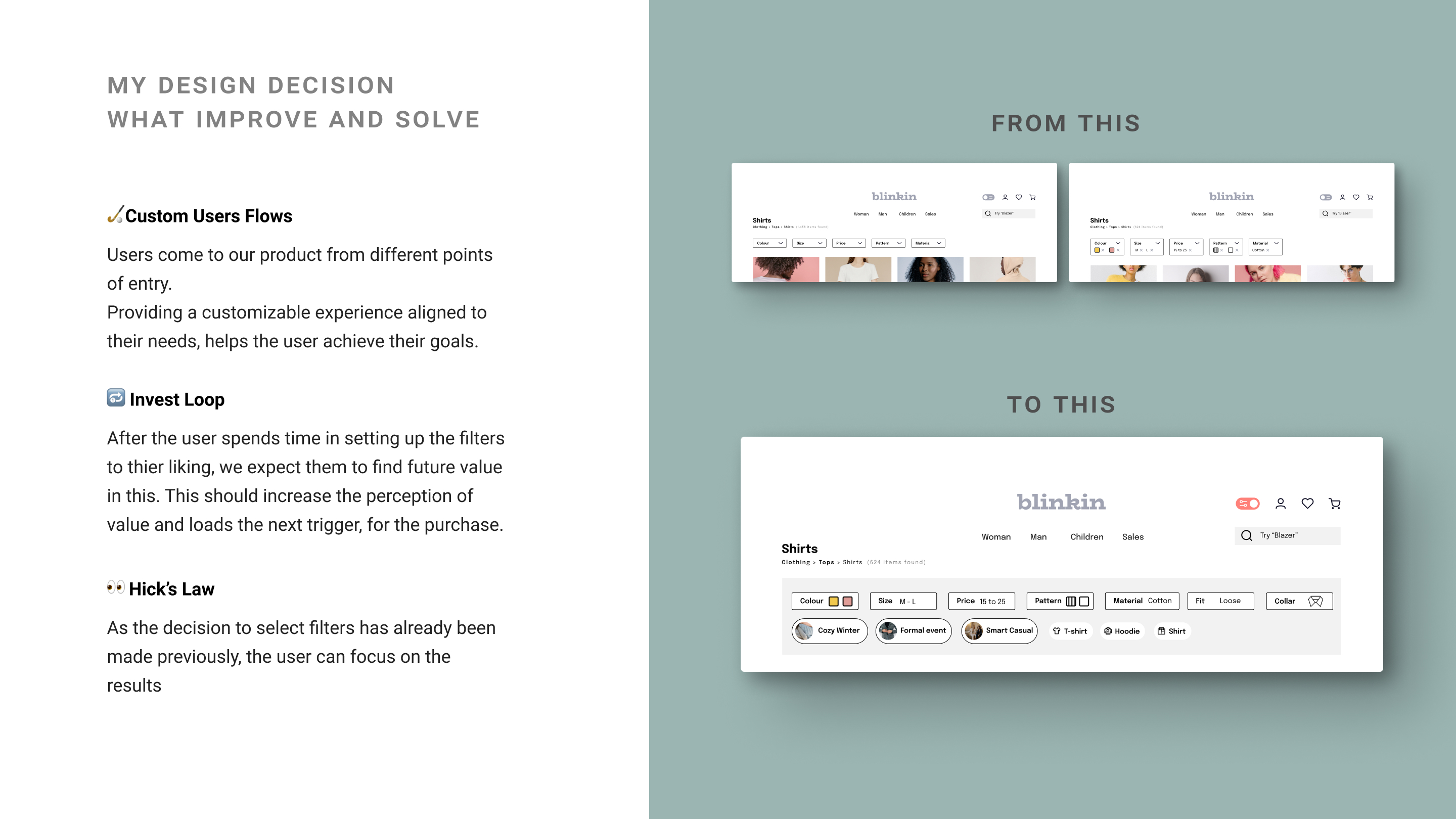
Currently, in an e-commerce website when users search for a product, the filters return results that are too broad. The filtered information is vague and does not help the customer's decision to buy a product. Users want more accurate results when searching for a product, so it helps them in their buying decision.

Hypothesis

I think that providing more efficiency in finding the relevant products, would improve the search experience. It would ultimately increase the user's retention and the business would also benefit from an increase in sales rates.

The Solution

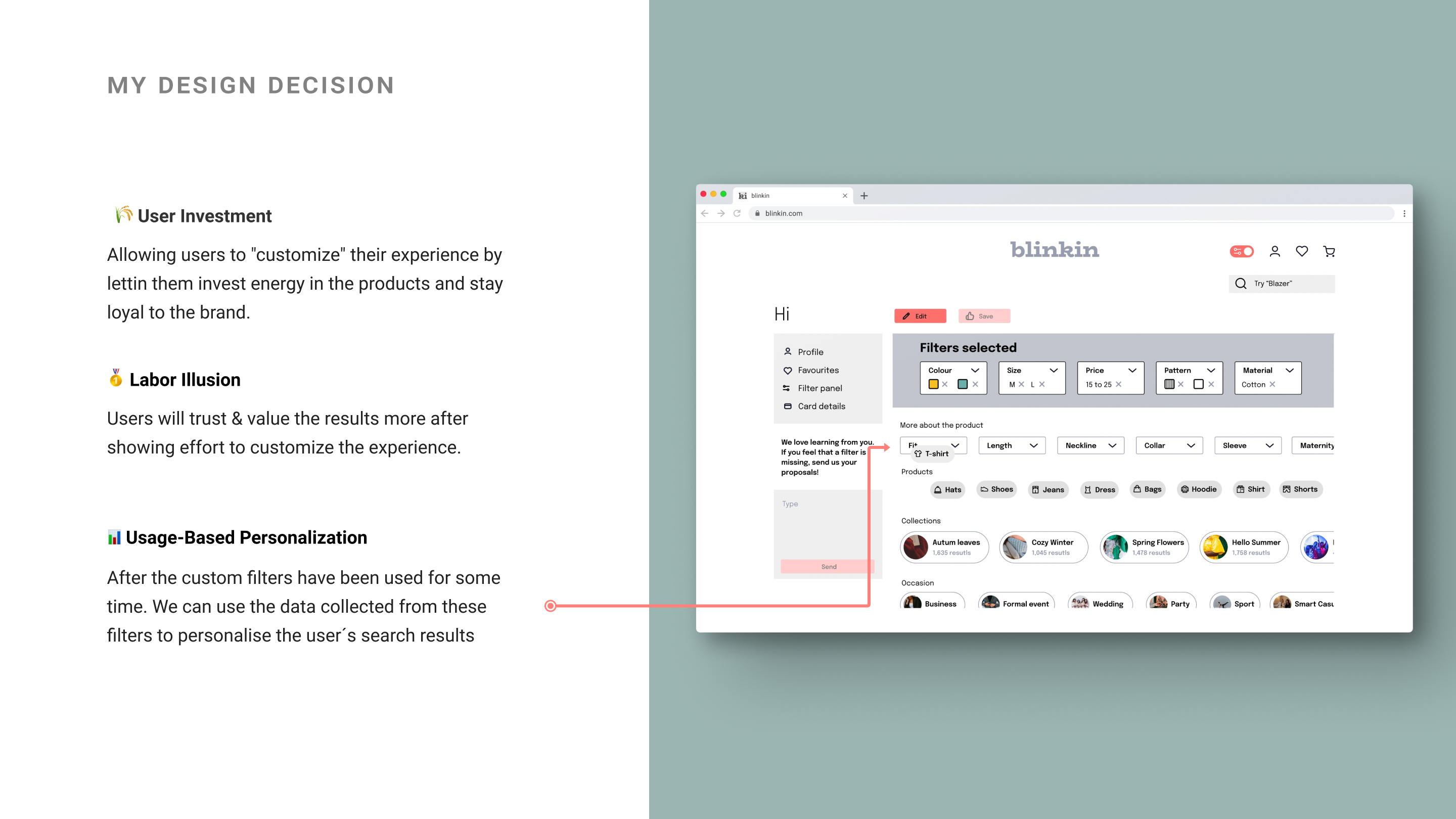
Provide a tool that users can deliberately choose between options designed to make the user experience more personal and also get better search results.

Learnings

I really enjoyed working on this project, it made me want to continue learning more about how the Cognitive Bias and Psychology can help to create user experience and understand the user from a new point of view.

Study Case Goals

1

The user

Finding out user habits in doing online shopping

2

The product

A solution that aims to maintain user engagement when searching for a product.

3

Personal

Apply UX methodology to find a solution that improves the User experience.

About Blinkin

What is Blinkin?

It is an e-commerce website that allows its users to consciously customize their search filter options to achieve a faster and more efficient user experience. Fast because they don’t have to fill the filters over and over again. Effective because you can provide results that really align with the user’s style.

What I'm doing in this project?

This is a personal project, where I wanted to improve my UX skills, and apply new learnings. Like user centered design, and psychological bias. I also focused more on defining technical details.

What is the product I worked on?

The product is an ecommerce Website. Where the focus is on the product search process. Therefore, we’ll go through these stages: App Landing - Home - Product search - Filter search.

Defining the project:

Goal

Understand which problems are being faced.

Challenge

Create a solution that always give to the user the best results that match user expectations.

Constraints

To offer a solution that satisfy customers with different needs.

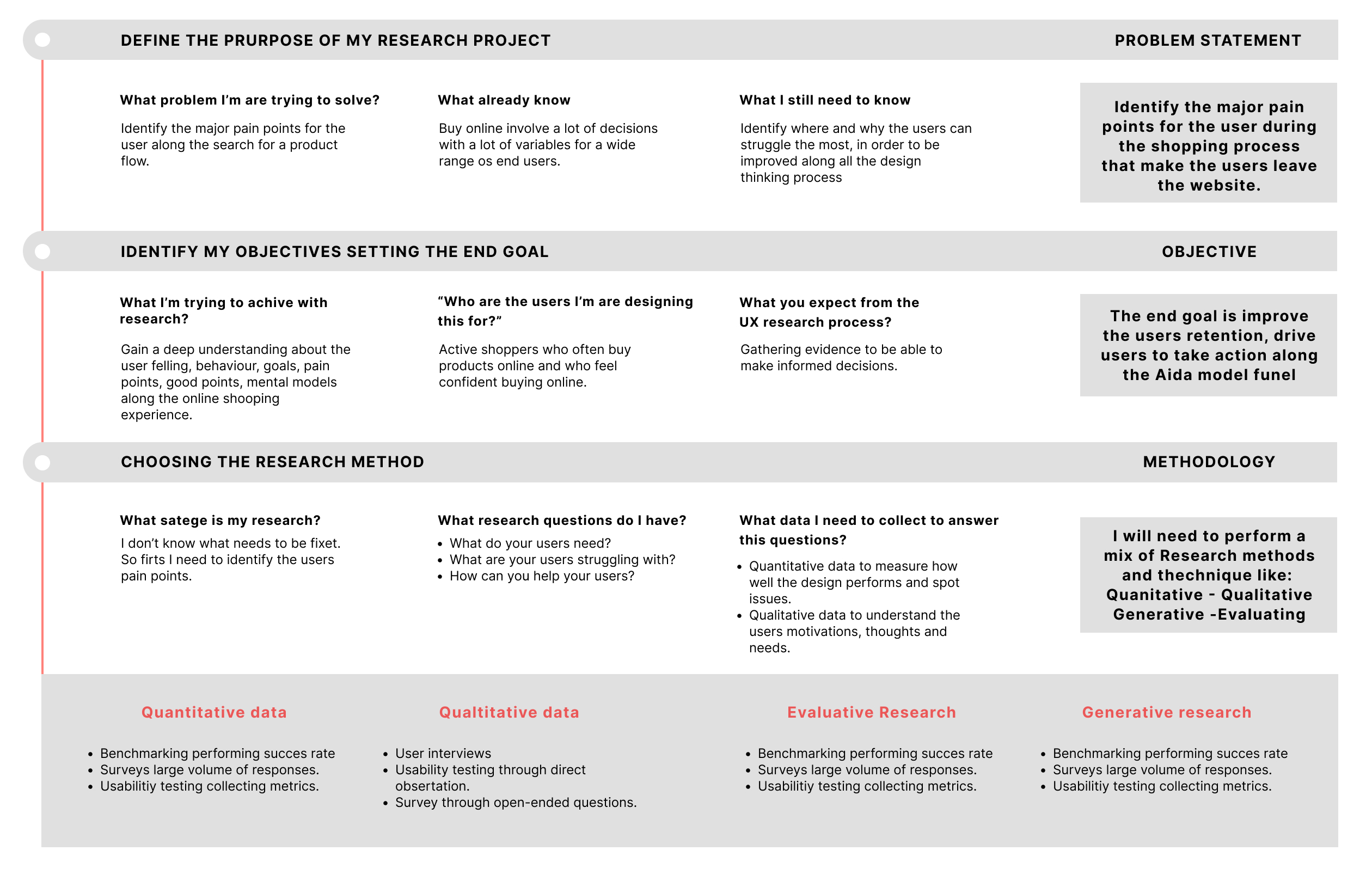
UX process plan

How I'm going to work

Why a Project research plan?

To help me to have an overview and define the key steps I need to go through to in order to start this project with a clear goals in maind, and know from where start, and the most important, knowing why.

What data you will collect and how you are going to analyse it.

Qualitative and quantitative data across different methodologies. I will analyse the data using Affinity diagrams and Empathy maps.

What I’m aware that I’m missing?

I’m aware that in this study case I will miss the interaction and opinions of the Stakeholders and also work under a strict timeline.

Project research plan for blinkin

My design thinking process

Research

Using empathy to understand the user's problem

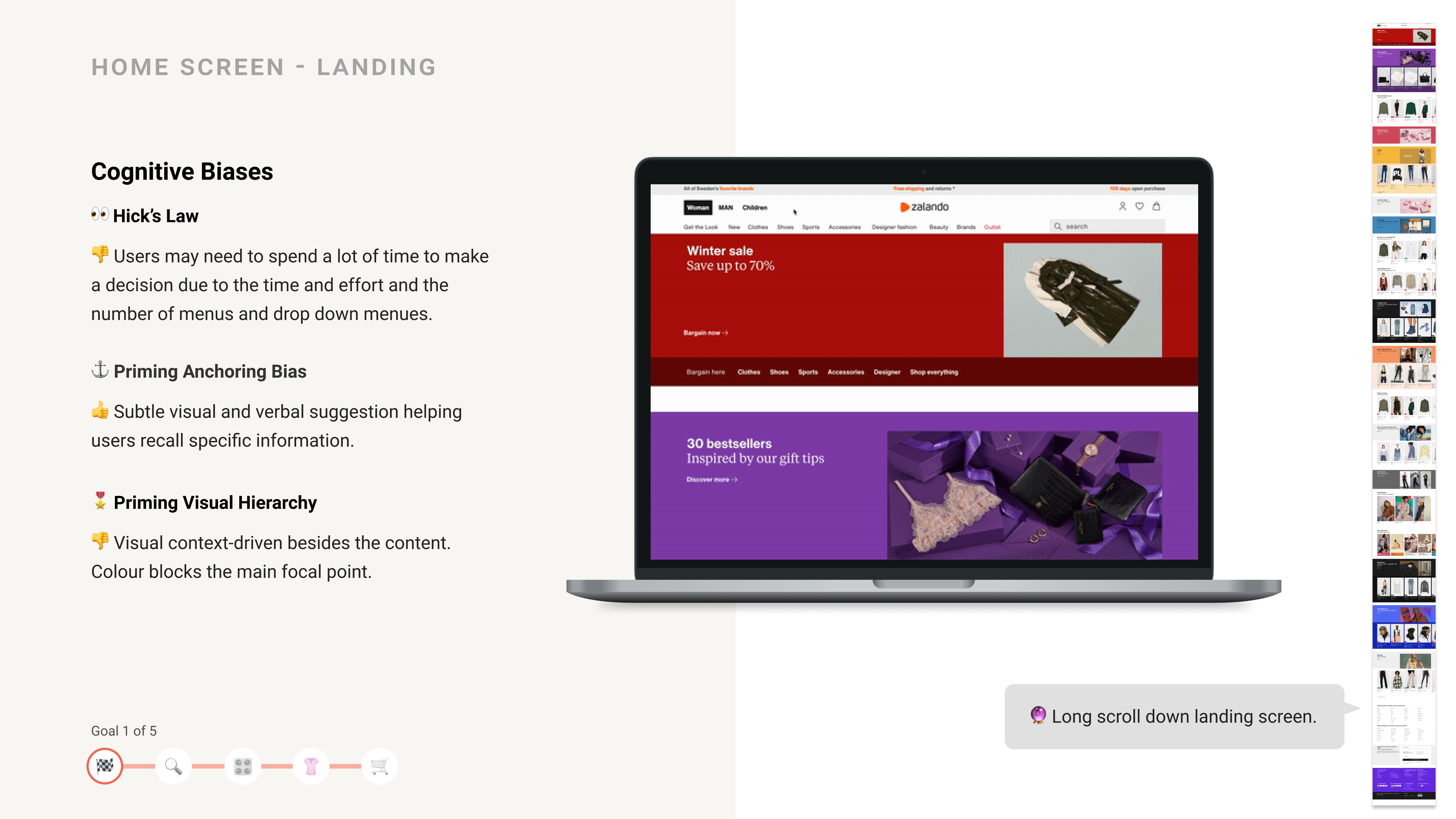
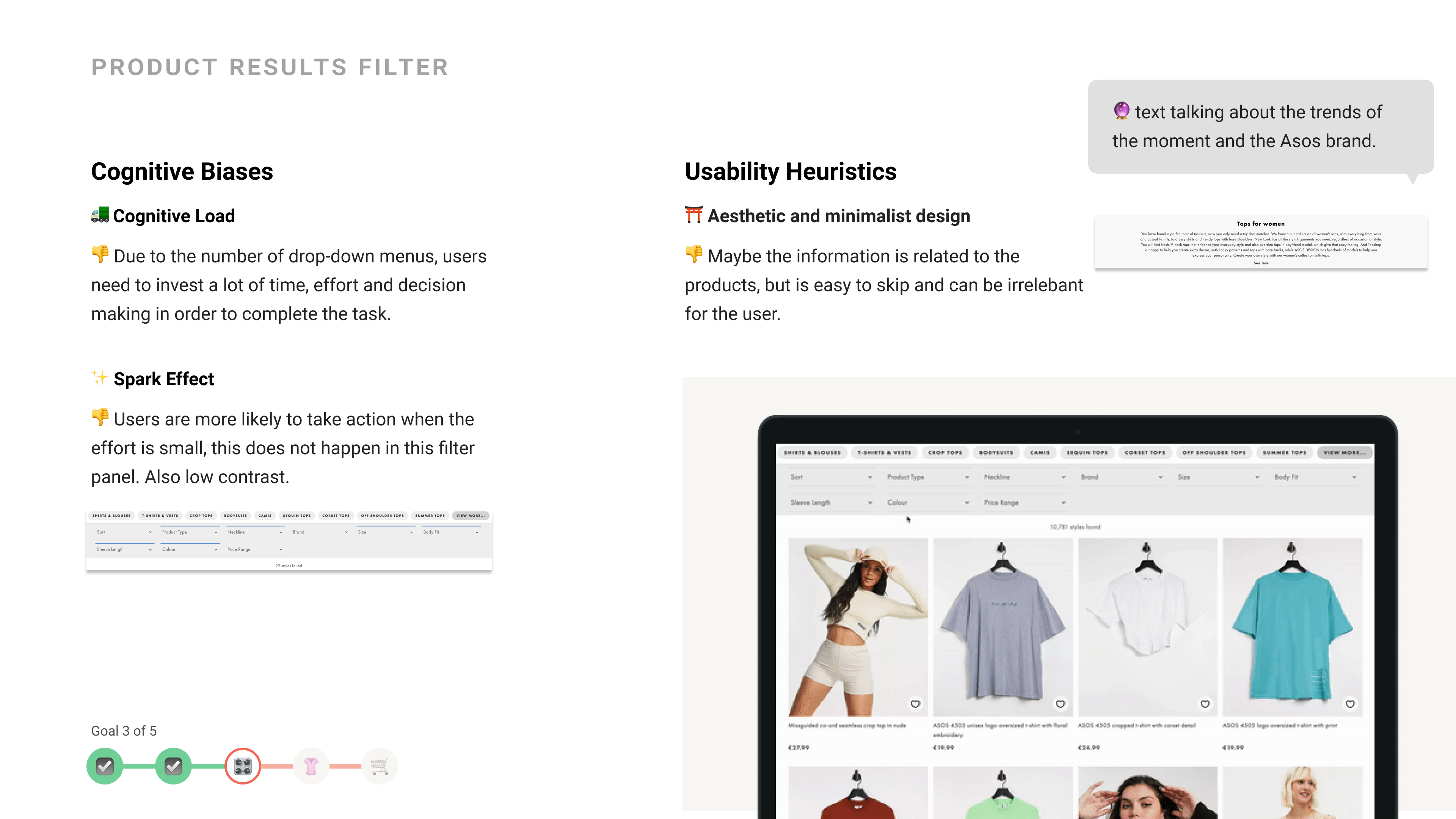
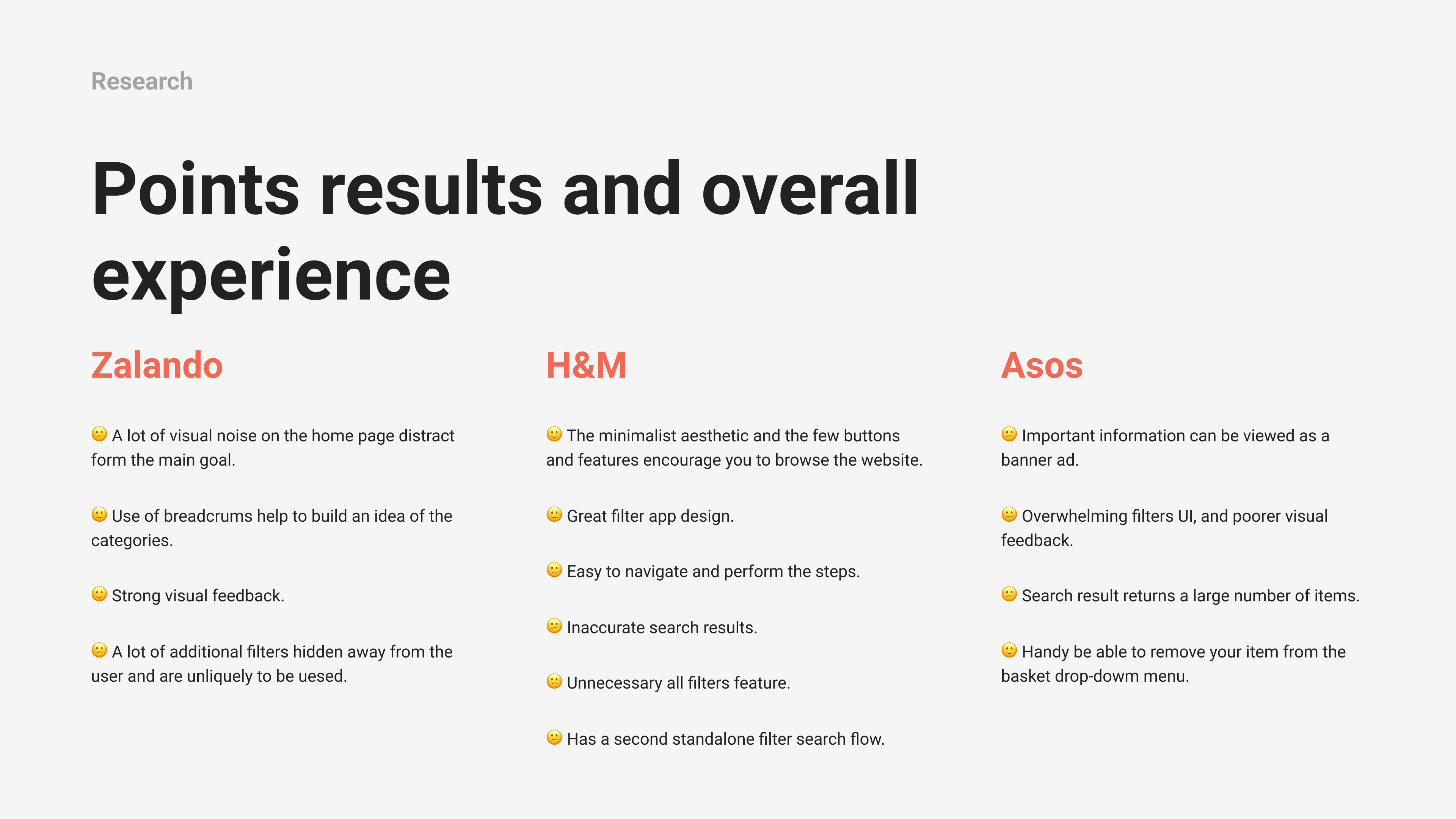
Competitive Benchmark

Why I used this methodology

To evaluate the current online e-commerce by using metric relative to the performance and understand the standards.

Process

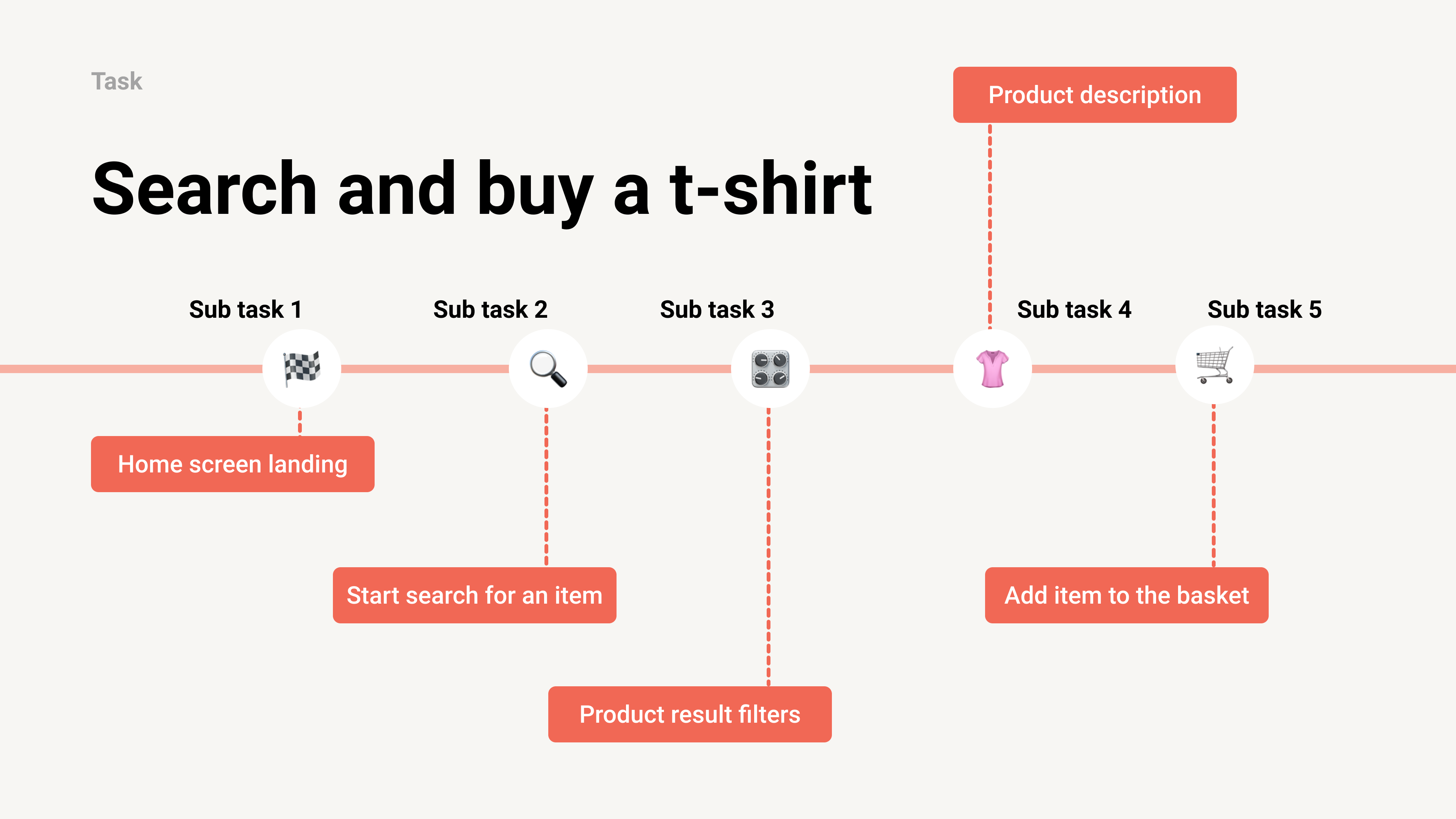
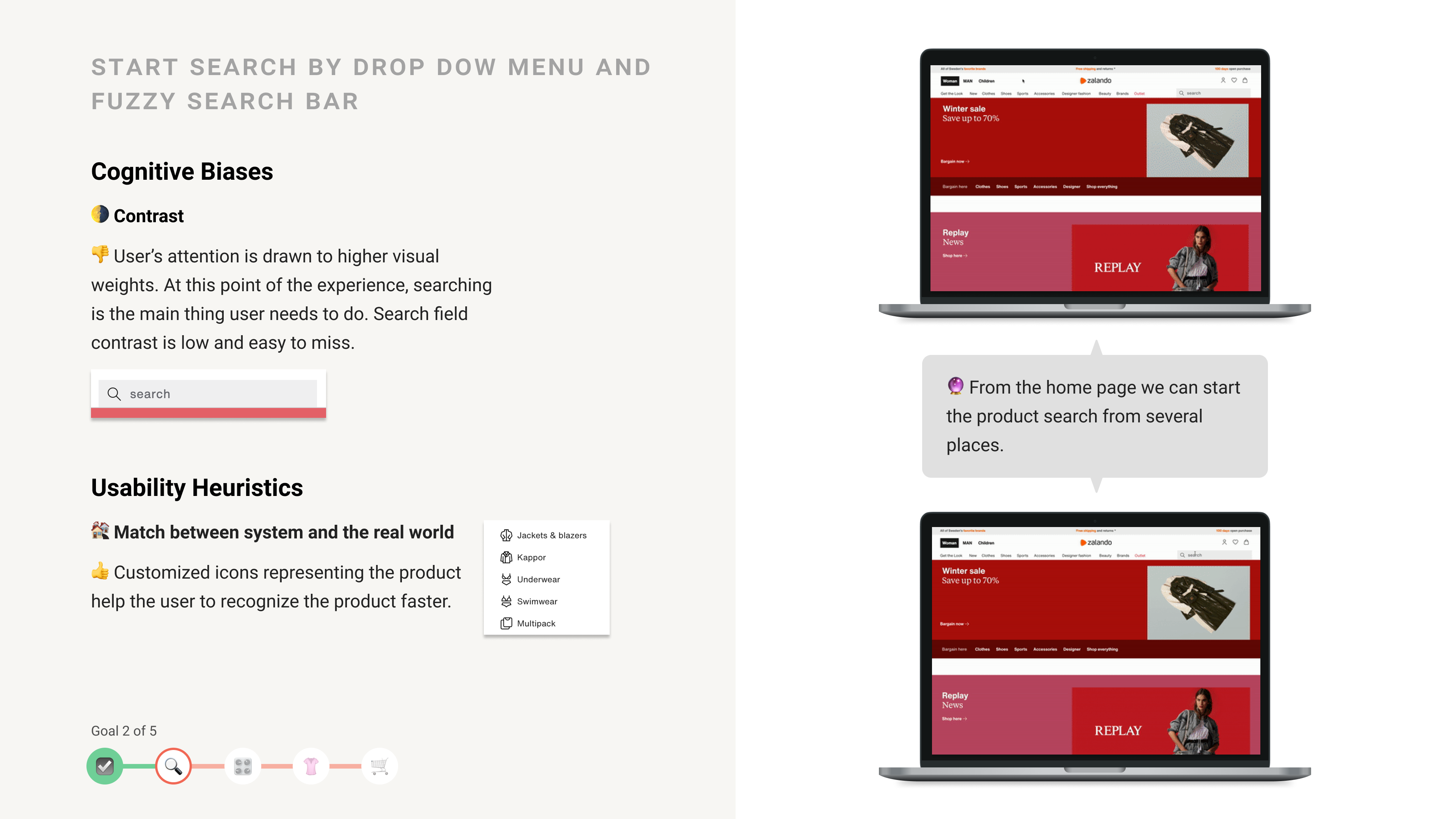
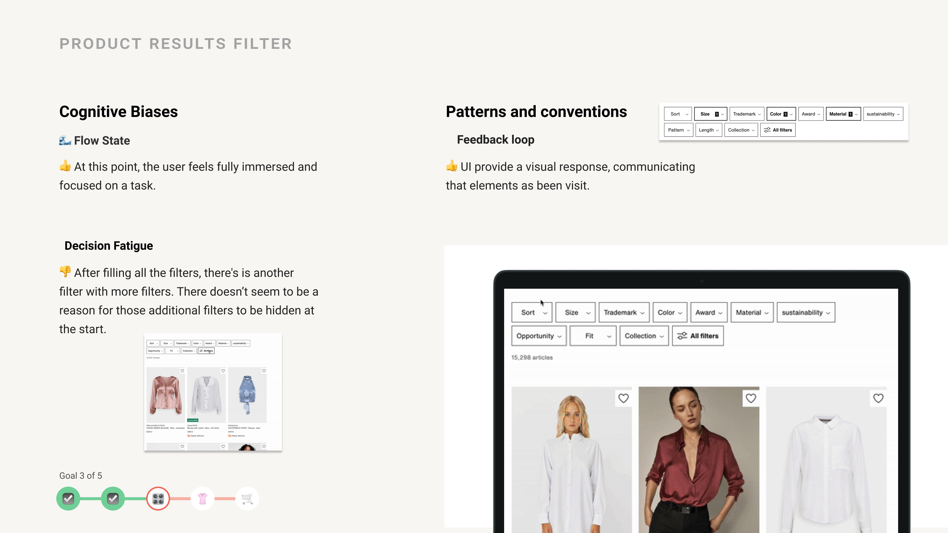
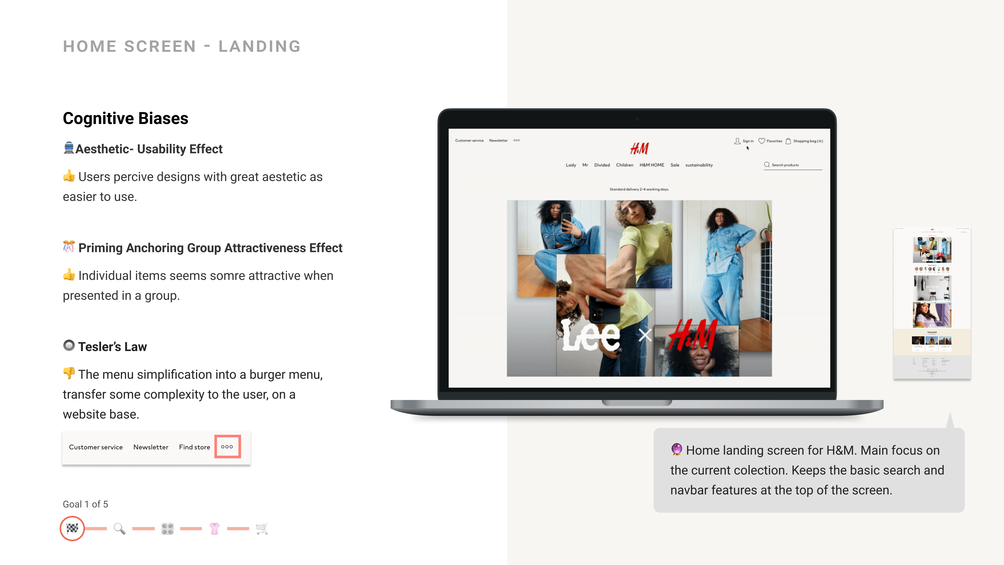
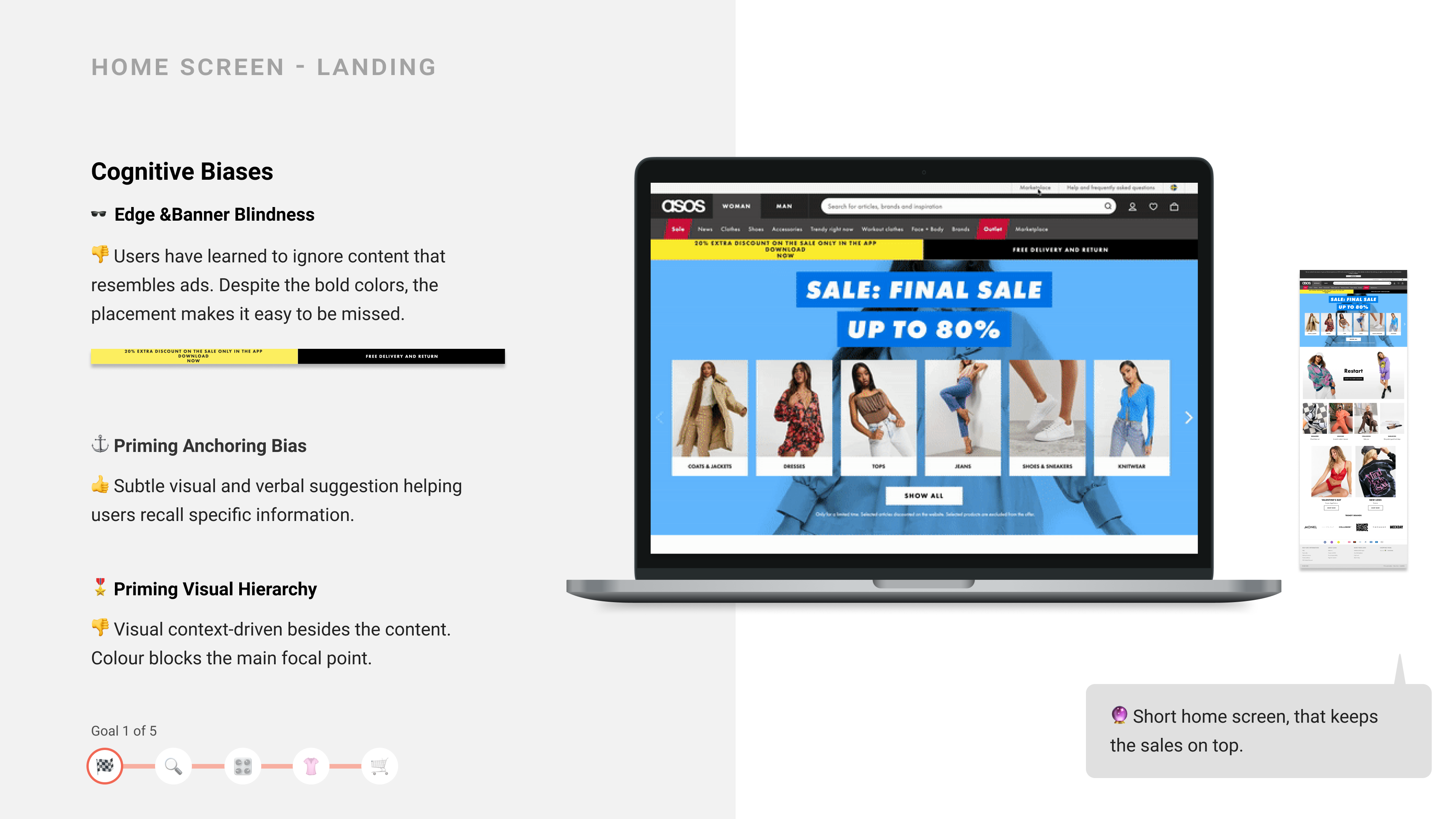
As a starting point, I reviewed retail websites, and I set myself the task of understanding the basics that are generally involved when people searching and buy online clothes.

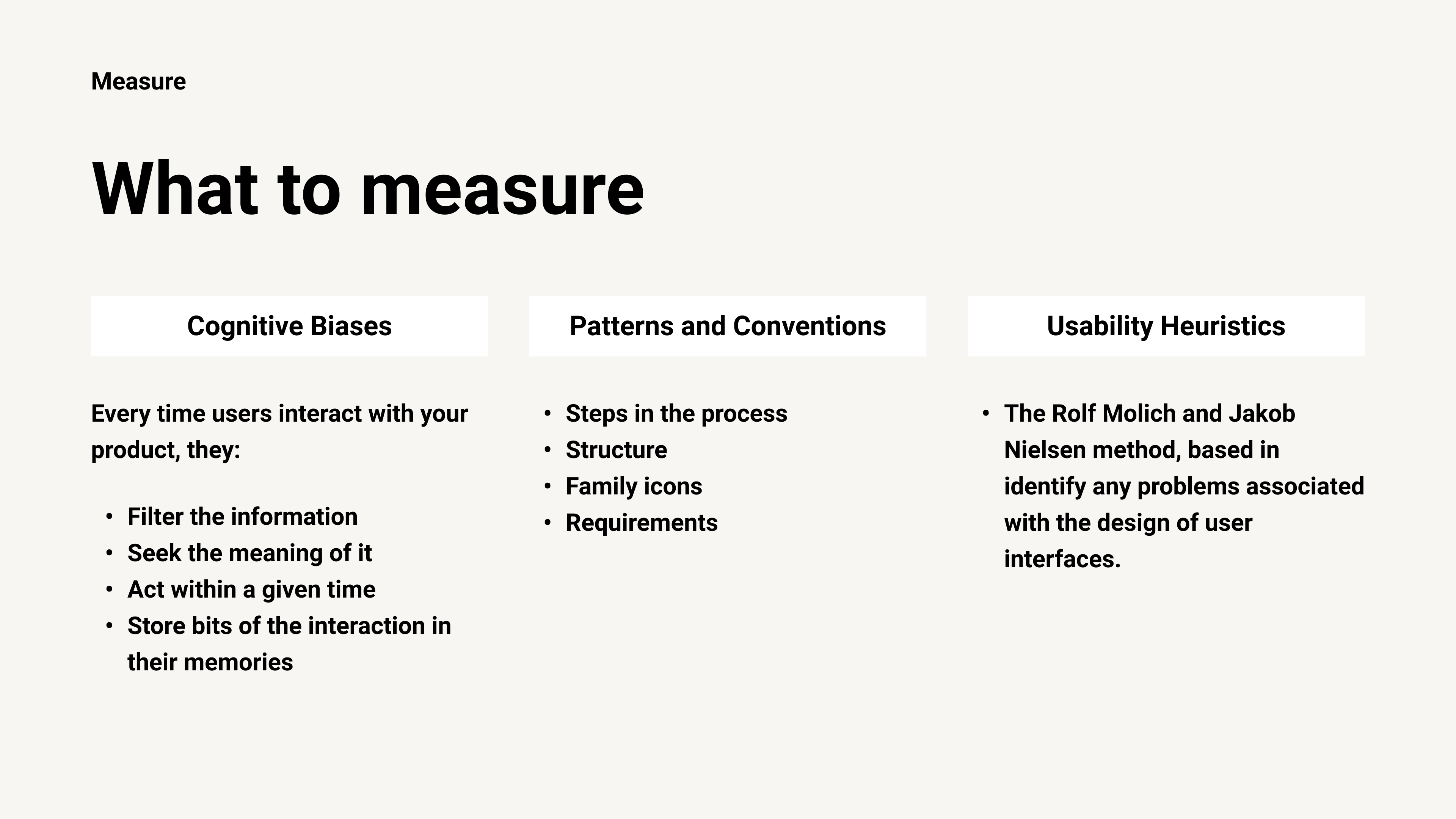
For this benchmark, I applied these measures:

  • Cognitive Biases
  • Patterns and Conventions
  • Usability Heuristics.

Findings

  • The e-commerce retail websites are about search products and apply filters in order to find what the user needs.

My hypothesis

During my desk research, I came to realize that for a relatively simple task as finding and buying a t-shirt many solutions exist across retail websites. This made me wonder how users are interacting with the different shopping experiences.

Go to full Benchmark
Why I used this tool:
Notion: To organize my files (text, images, links, etc).
Figma: To create a template and to easily edit. Easy to search for the file
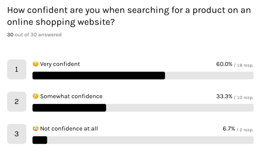
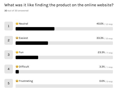
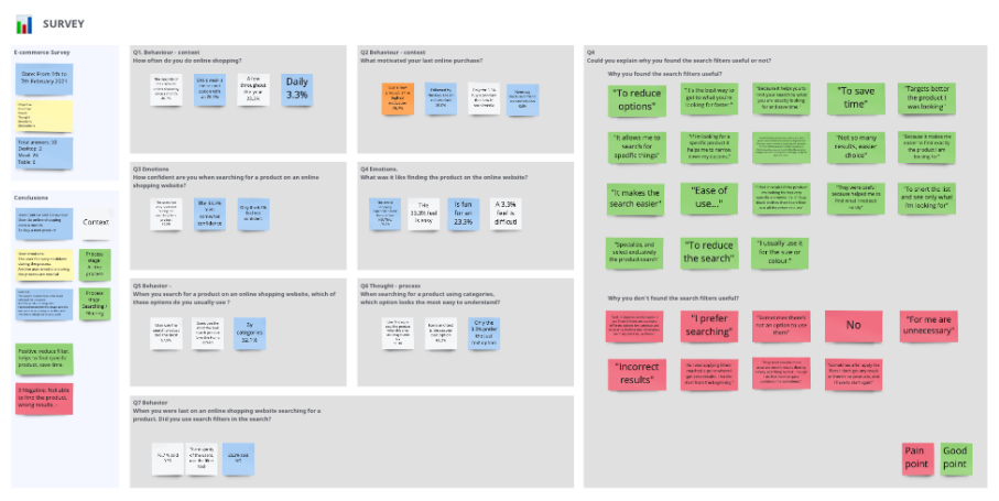
Online Survey

Why I used this methodology

It’s a easy way to gather a lot of user data, its cheap and relatively fast .

Process

The first step was to define the purpose of the Survey. What I want to know to form the users and to get more valuable data about the user’s Needs, Thoughts, Emotions, Motivations

In order to get this data I was very thoughtful about how to ask the questions to get input I was looking for, and at the same time get quantitative and qualitative data.

Findings

  • The Users know what they are looking for on a website.
  • The experience of searching doesn’t mean anything to them
  • They know well the process to the level that is not a challenge or a funny thing to do.
  • They want to save time and use the tools that make the searching more fast and effective.

    My hypothesis

    There’s a lot of different opinions about the search process and the filters. But what about enjoying the experience?

Why I used this tool:
Typeform: More options for customizations and aesthetically pleasing interface.
Miro: Easy and quick to put my thoughts together and make in a visual way easy to understand and communicate.
What the users said

Could you explain why you found the search filters useful or not?

Survey Answer

“Sometimes after apply the filers I don’t get any result or there’s no products, and I have to start again”

Survey Answer

“Because it helps you to limit your search to what you are exactly looking for and save time.”

Survey Answer

“Well, it depends on the search. I use filters if there are too many options for a product and to select a clothing size. Otherwise, I normally don’t to use filters.”

Remote usability test

Why I used this methodology

To learn about the user context, goals, behaviours. Also, to upskill how to conduct interviews and draw insights from the users.

Process

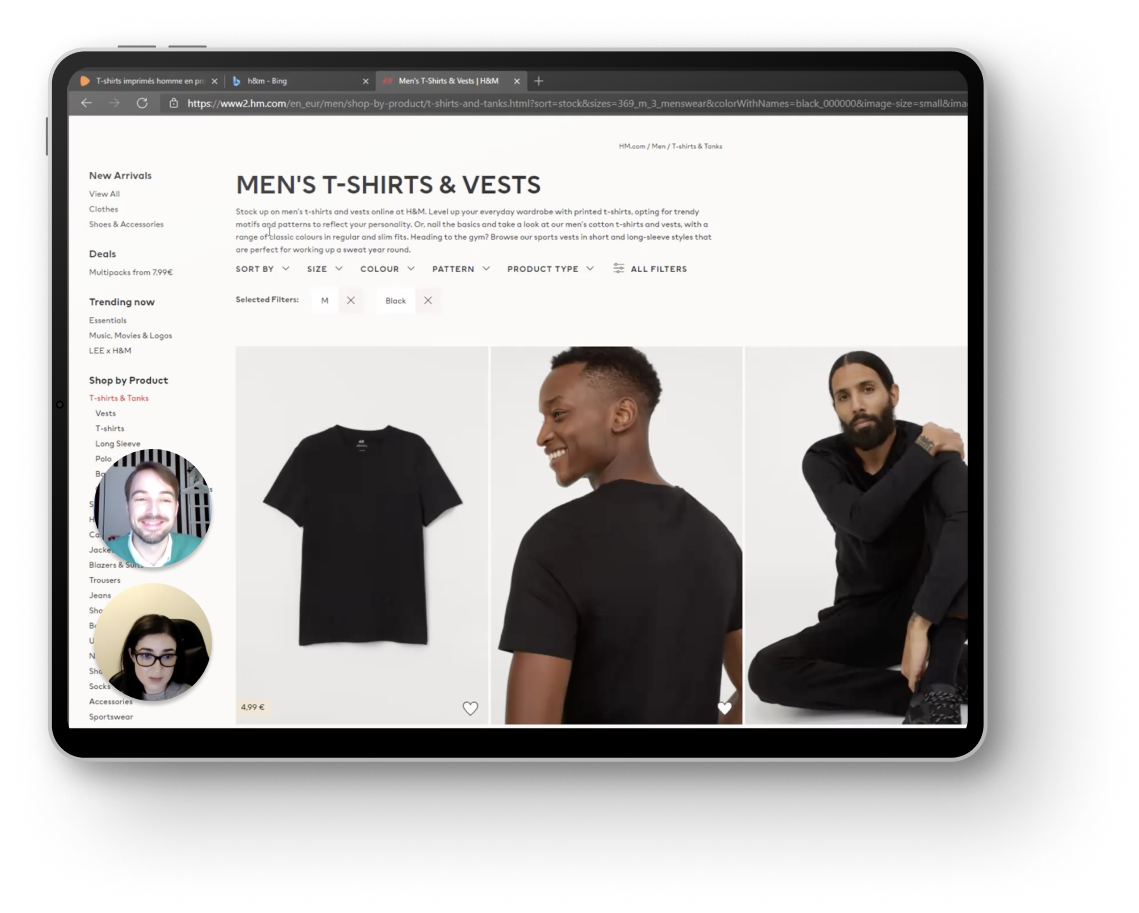
To understand how real people experience and engage with the sites I ran a Usability Testing to show me their experience, where I can pick up on issues and insights they weren’t even aware of.

Comparative usability testing perform in:

Zalando and H&M website.

Tasks to complete:

Search for a T-shirt for a casual party and add it to the basket. Zalando and H&M website.

What did I find?

  • Is my navigational system really as intuitive as I think it is?
  • Is my value proposition really as clear, concise and
    compelling as I think it is?
  • Is my lead funnel simple and clear? Is the next step obvious
    and non-intimidating?

My hypothesis

The search bar tool provides very broad and un accurate results. Doesn’t matter if the user is more precise in selecting the words, the results are unexpected and break the mental model and the user feels very confused.

Go to remote usability test
Why I used this tool:
Notion: To prepare the script.
Zoom: Easy to share screen and performance is good.
Note-taking

Why I used this methodology

To take notes to highlight the key insights observed, during the session and watching the recording. Also to create a bank of insights for the next stages.

Process

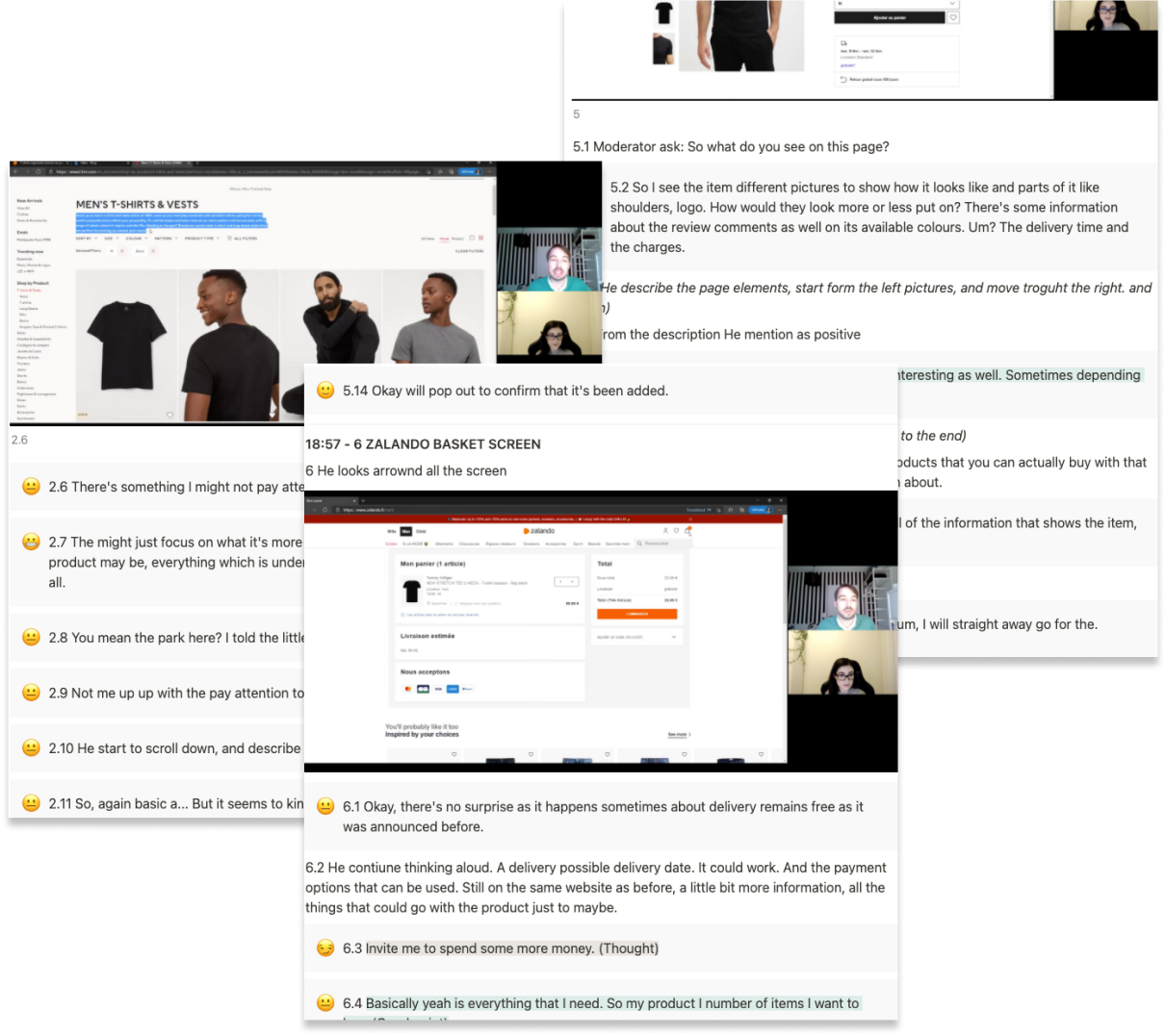
During this phase, I reviewed the usability test I recorded. My mission was take the most detailed notes a possible, focusing on built the user empathy detecting the:

  • Needs, emotions, thoughts,motivations, what said and what do. And also the user’s:
  • Goals, behaviour, pain points and mental models.

Findings

  • What they are unable to find on your site.
  • What is missing from your site.
  • What is unclear or vague.
  • What is causing friction or preventing them from converting.

    My hypothesis

    Different search methods give very different results. By categories and filters it is the most accurate for the user, but also the one that consumes the most time. How can we make the search faster and more precise?

Why I used this tool:
Notion: More options for customization and easy to edit.

User test 1

Zalando Search Filters

“But it seems I have less options available if I do that kind of search and Filter than the previous one.”

User test 2

Zalando Search Toolbar

“I wouldn’t expect to have a shorts instead of a T-shirt or other product, or just and ad for other things but.”

User test 3

H&M Search Toolbar

“I will have to use additional filters to narrow the search for what I’m looking for.”

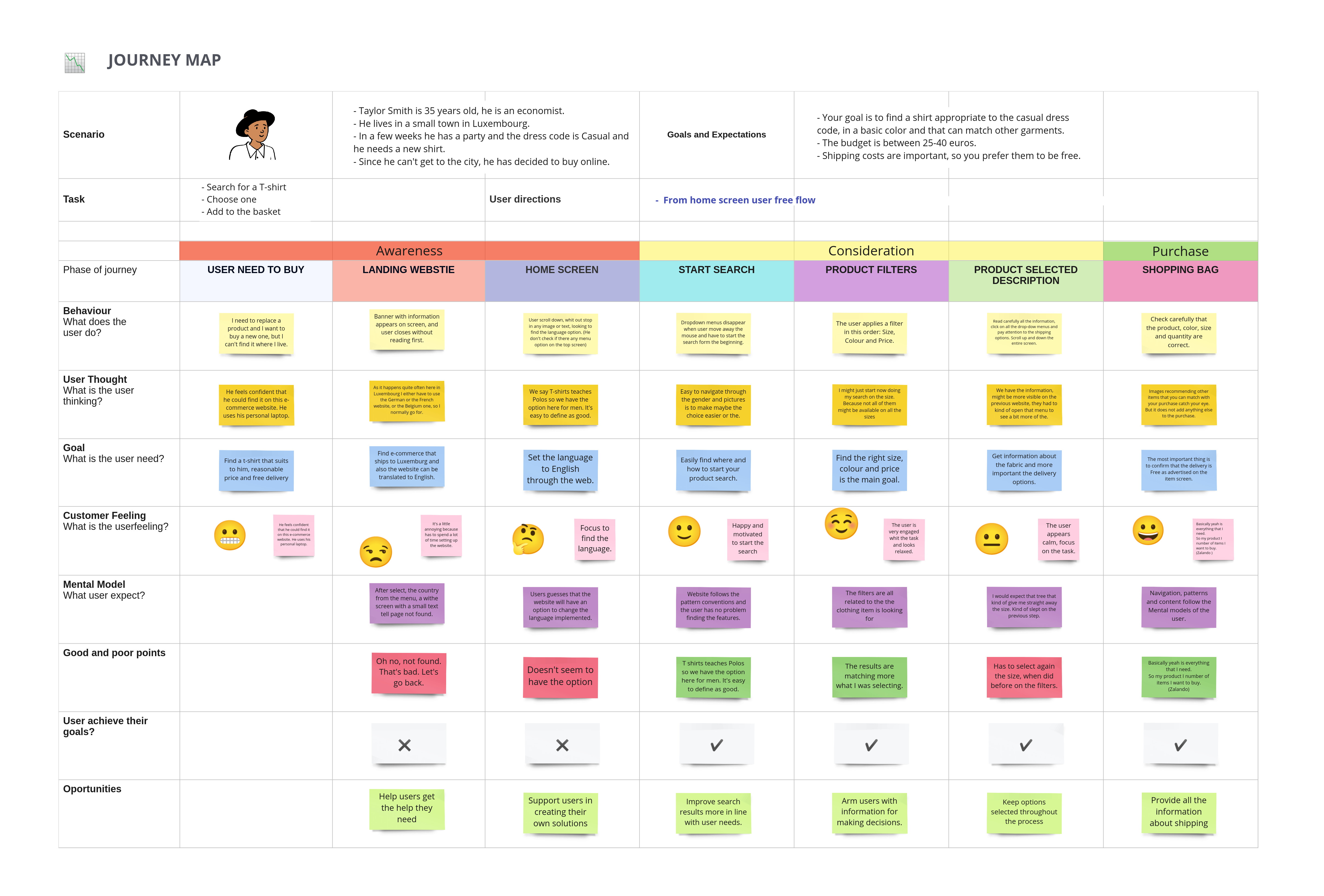
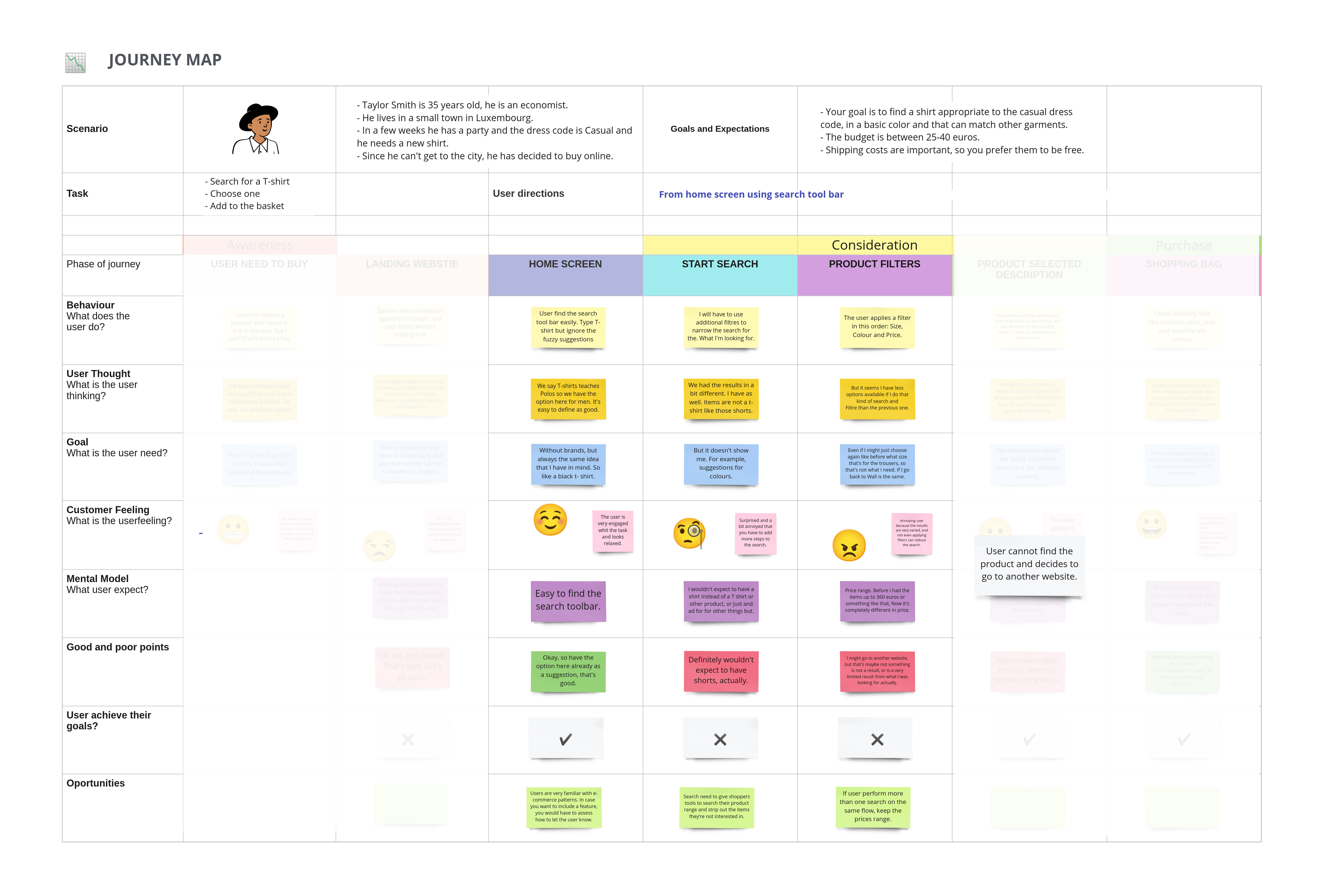
Journey map

Why I used this methodology

To crystallize where customers get stuck or frustrated on their path to purchase and beyond. It’s a visual representation that synthesizes data on personas and user behaviour.

Process

The goal of this Journey map was to create a diagram that reveals exactly where the sites were helping visitors succeed—or letting them down.

In this step, I visualize two flows that I was able to identify during the usability testing. The journey maps are focus on one persona in one scenario. This map helps me to was to visualize the sequence of the events and identify the task and goals implied in each one.

Tasks to complete:

  • The search tool provides more random results. As we can see in picture 2, when the user has to search using that tool was unable to find the products and move to another website.

  • Besides, the process is funny o enjoyable, if it’s not efficient and helps the user to find the product and applying wisely the filters, all the process doesn’t matter.

    My hypothesis

    If the experience does not create happiness, at least we are going to make it memorable for its effectiveness and simplicity.

Go to full journey map
Why I used this tool:
Miro: To work more efficiently editing an existing template and to easily share it.

Define

Framing the problem - gathering evidence

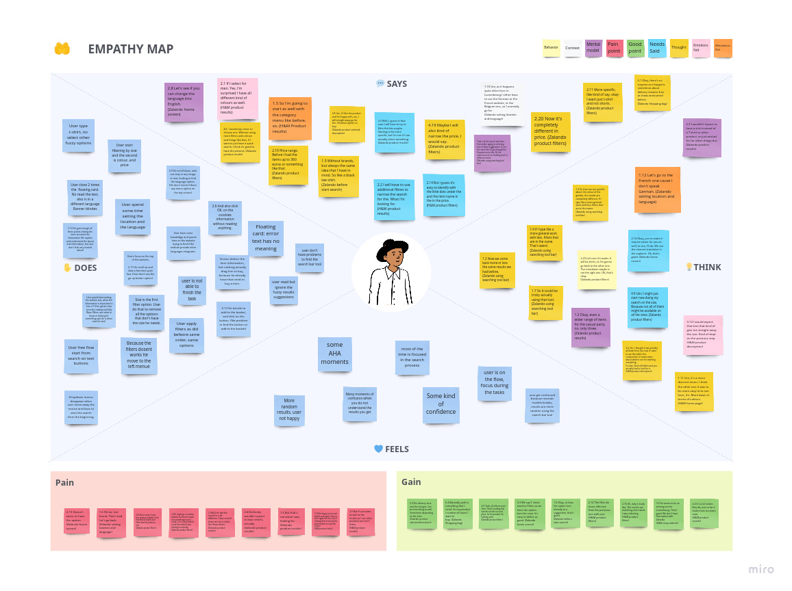
Empathy map

Why I used this methodology

To help me to align on a deep understanding of the end-user. To articulate what I know, find holes in the data. And also to help me to share this information for more collaborative Stages.

Process

Visualizing user attitudes and behaviours in an empathy map helps me to align on a deep understanding of end-users. The mapping process also reveals some holes in existing user data, like the actual feelings and user mood during the experience.

Tasks to complete:

  • The actual online shopping process experience is not enjoyable.
  • Users can apply a free flow, go and back till some external or internal drag the trill to buy.
  • Users know well the steps, they repeat automatically.

My hypothesis

If the experience does not create happiness, at least we are going to make it memorable for its effectiveness and simplicity.

Go to full empathy map
Why I used this tool:
Miro: To work more efficiently editing an existing template and to easily share it.

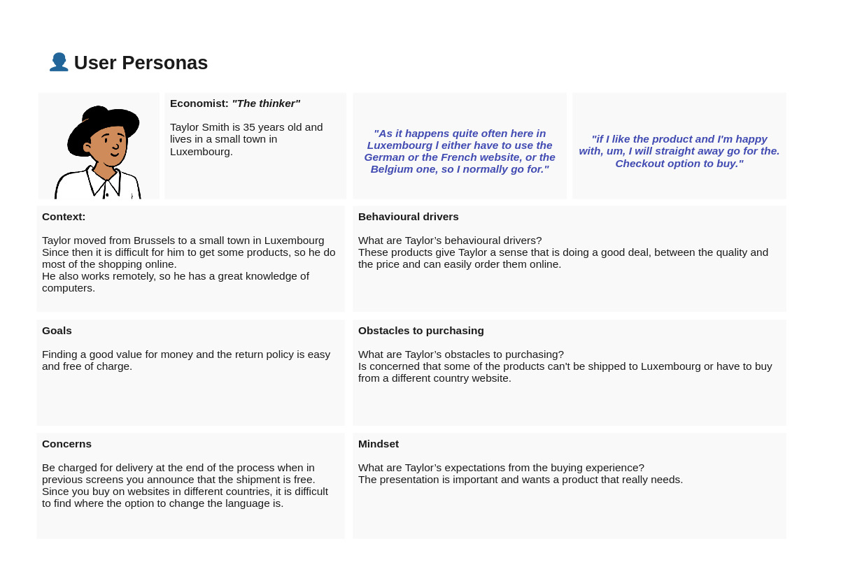
User Persona

Why I used this methodology

A customer journey map helps me to crystallize where customers get stuck or frustrated on their path to purchase and beyond. It’s a visual representation that synthesizes data on personas and user behaviour.

Process

Fueled by data-driven research I create a user persona representing one segment of the target audience in order to insights from user personas that can help improve copy, tailor targeting and inform product development to make informed decisions base on the persona and the research.

Tasks to complete:

  • Understand fundamental motivations: Free shipping and free return policy.

  • Understand fundamental concerns: The product is shipped to my country.

My hypothesis

My user persona build based on my research is focused on the free charge shipping process, and that is something that escapes from my control. I’m on the right direction, but I need more participants.

Go to user persona
Why I used this tool:
Miro: To maintain and organize my notes, files and links.

Affinity Diagram

Why I used this methodology

To review all the notes and insight I gather till now to organize the research findings from a large set of ideas into clusters working in collaboration, with the goal of creating awareness of usability issues and design challenges and to gain empathy towards the users.

Process

Having a good amount of data from my user research allowed me to collaborate with a friend to get to the root of my findings. During the affinity diagram session, we worked together to put structure on the large volume of qualitative data from my research.

Findings

  • Using images or icons helps the user to find information.
  • Filters are widely used to narrow down search results.
  • It is always going to offer some content to users, or they will leave when they find nothing.
  • Searching through the toolbar provides very random results. And after that step the user will use the filters

My hypothesis

How can we provide users with better results when looking for a product?

Go to full Affinity Diagram
Why I used this tool:
Miro: To work remotely and collaborate, and also to keep a digital version to share.

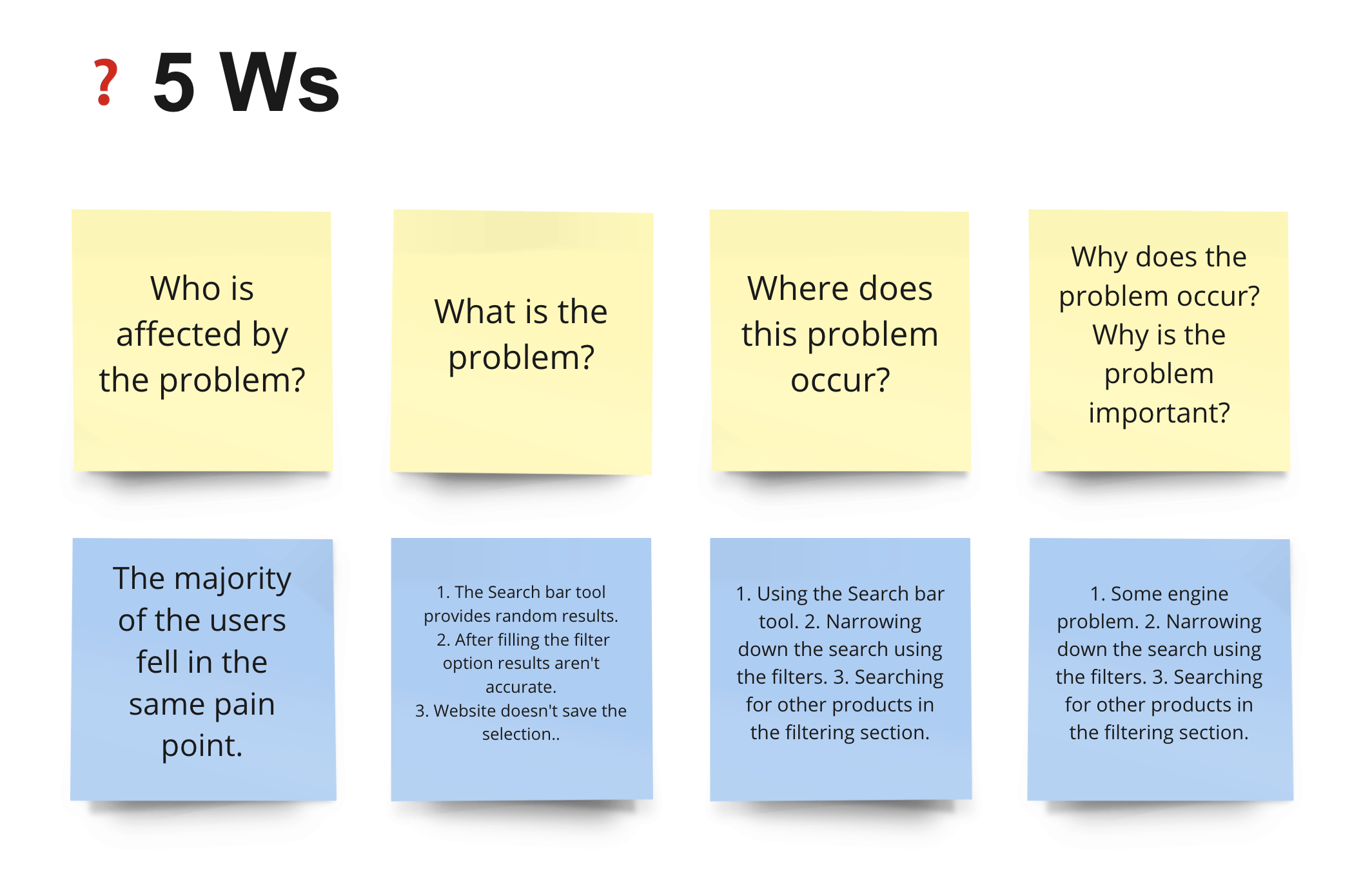
5WS

Why I used this methodology

To gather relevant facts, for the problem statement

Process

Review all the notes and paid attention to where the users feel the pain points.

Findings

  • The main problems are focused on the search results.

My hypothesis

I will need to work on a solution for that stage, but don’t forget what the others stage and section may need attention.

Why I used this tool:
Miro: Easy to edit, alot of templates and shareable

PROBLEM STATEMENT

Tailor a remote economist connected to the city needs to efficiently and confidently narrow down the search in order to spend find the product that suits perfectly all need.

Ideate

Generating Ideas

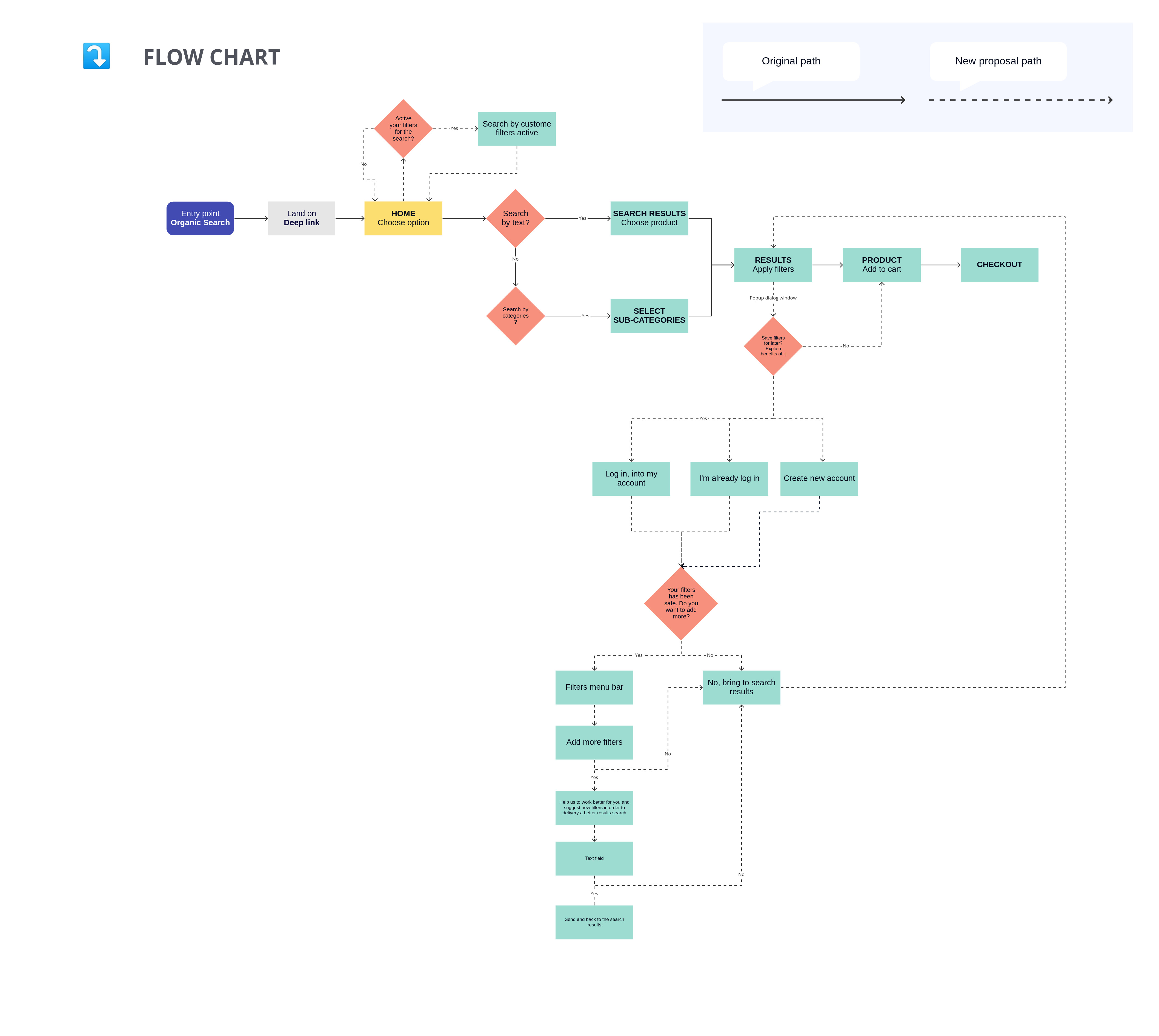
User Flowchart

Why I used this methodology

To describe the back-end process and the user task flows. To map out the website flow and stages.

Process

I built a User Flow that matches with the user’s needs. The goal is to map user’s paths from the entry page through the conversions funnels, towards the final actions.

Bussines objetives:

Get users sing up, purchase products and join an email list.

Users objetives:

Find the right product and do the check in as quick and save as possible .

What did I find?

  • I was able to map out all the steps a user needs to take in order to use the new custom feature.

    My hypothesis

    If the experience does not create happiness, at least we are going to make it memorable for its effectiveness and simplicity.

Go to User Flowchart
Why I used this tool:
Miro: To easily customise a template.

Sketches

Why have I used this methodology

At this point I began to develop a solution to the problem. This involved creating sketches of the screens that would form part of my solution. To achieve the initial design I followed the methodology below:

Process

The main goal of these sketches was to flesh out different solutions until the best fit was found that would improve the user’s overall experience

Findings

  • You would have to add more steps in the process, such as onboarding, to be able to explain the new system well.

My hypothesis

If the experience does not create happiness, at least we are going to make it memorable for its effectiveness and simplicity.

Why I used this tool:
Pen and paper: To quickly put my ideas into a visual state.
Medium Fidelity Prototype

Process

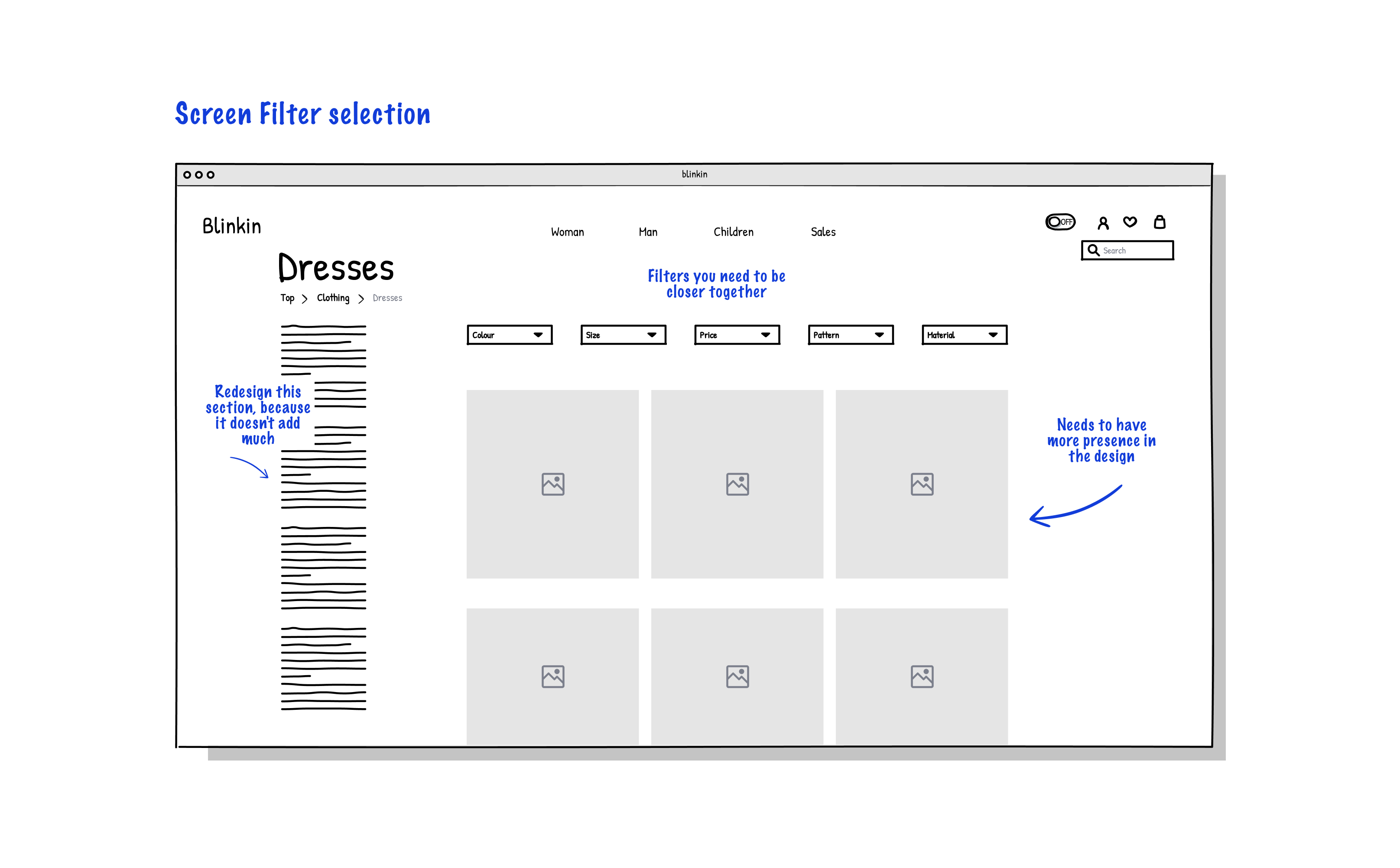
Once I had a visual direction for the website layout, I started to add more details and precisions to the sketches by turning them into mid-fidelity screens. On these screens, I included elements that directly address user goals, needs, frustrations, while incorporating common design patterns seen on other airline websites

Why I used this tool:
Figma: To create a template that I can easily edit and work on.

Design System

Why I used this methodology

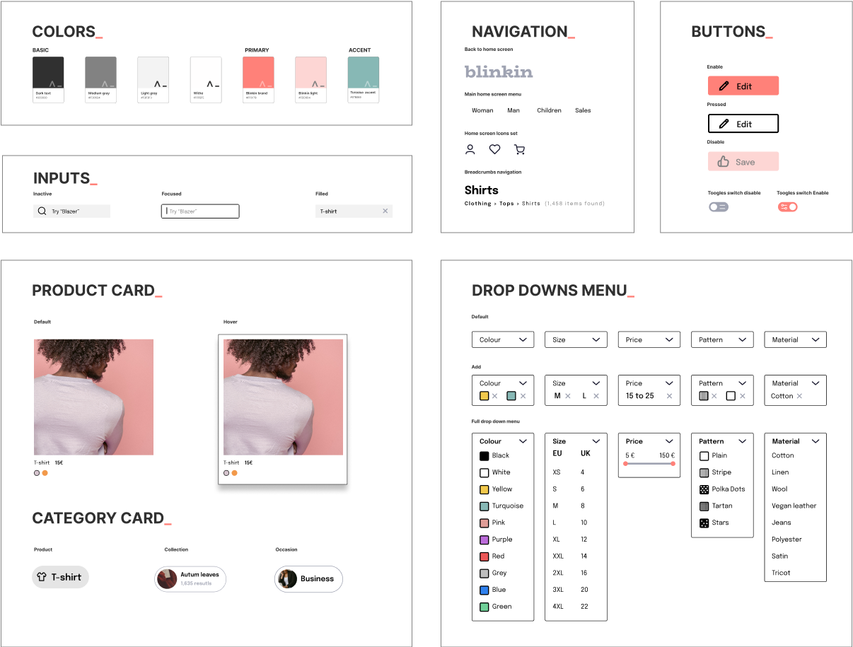
After the design and I had developed a strong framework from the lo-fi prototype and in preparation for the high fidelity prototype I need to create the UI design system in order to maintain consistency through all the experience and improve the usability.

Process

After having a clear vision of what the website should look like I decided to create some foundations like colour palettes, typography and icons. With that having done I started to build the most important components for the website which are:

  • Buttons
  • Input fields
  • Drop-downs
  • Product cards
  • Category cards
  • Navigation

    Conclusion

    Setting up components made it fast and easy for me to create a hi-fi prototype with a consistent product styling.

Why I used this tool:
Figma: To design the UI prototypes

Prototyping

High fidelity prototype

Process

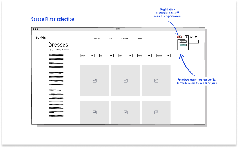
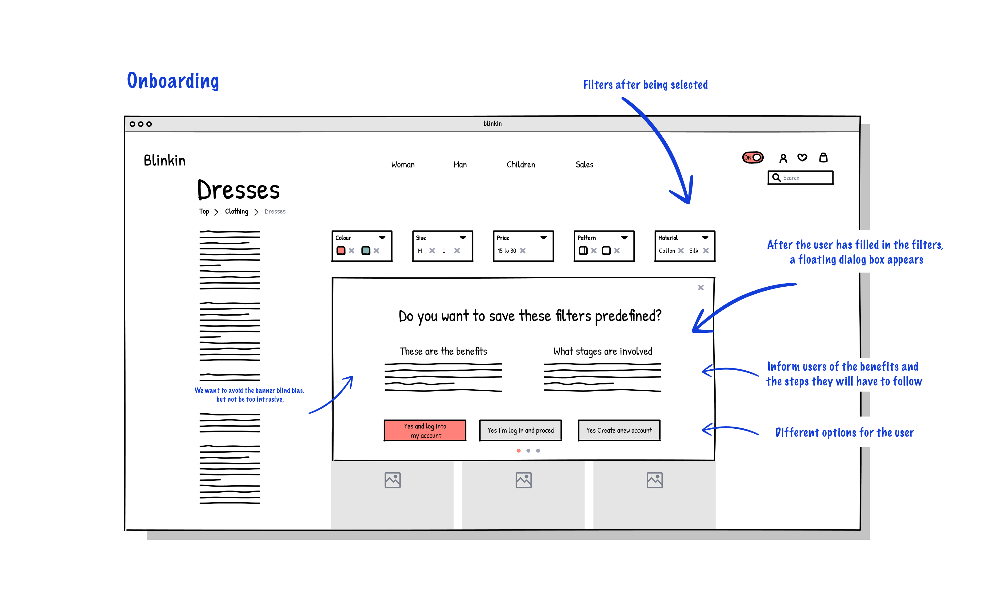
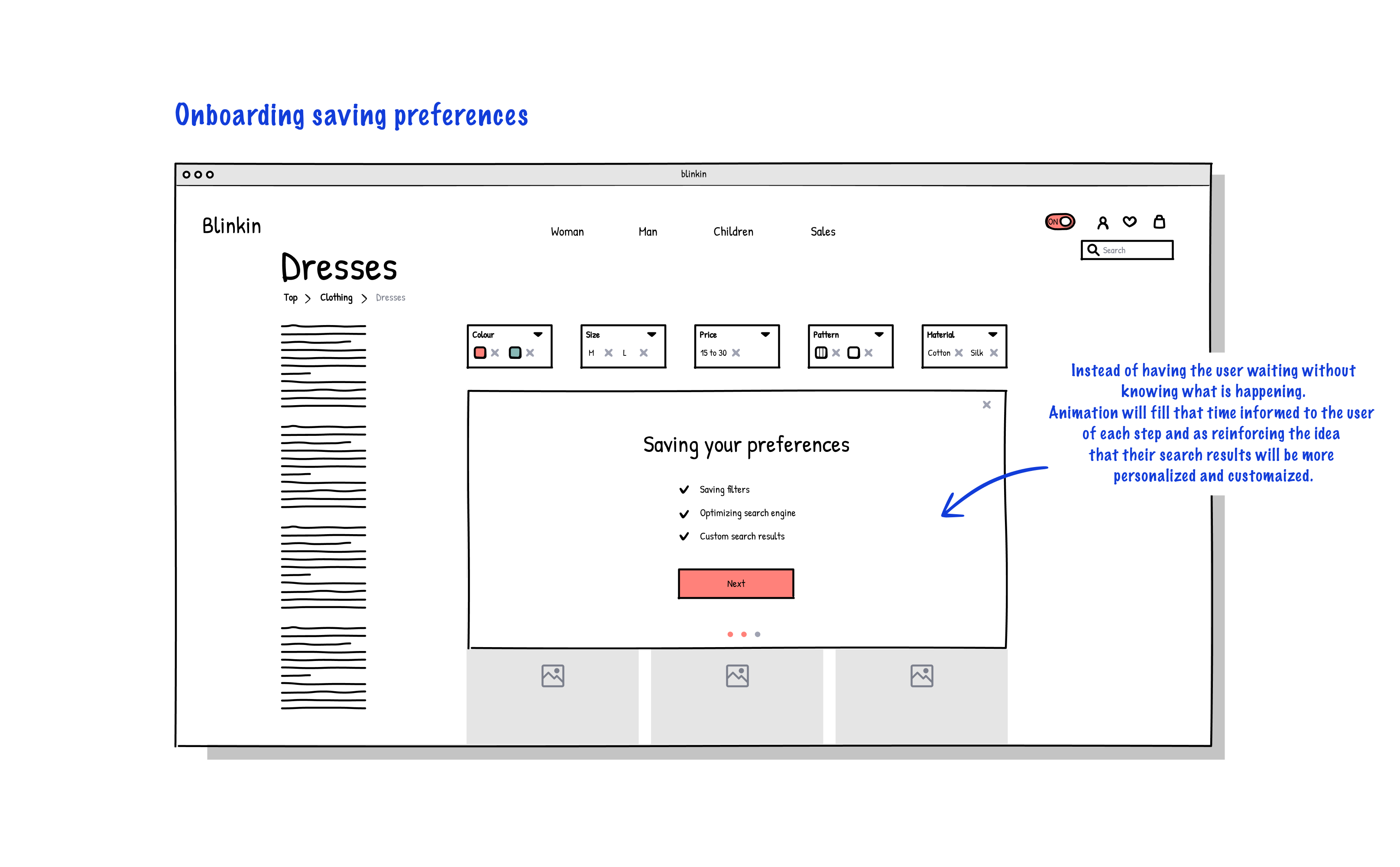
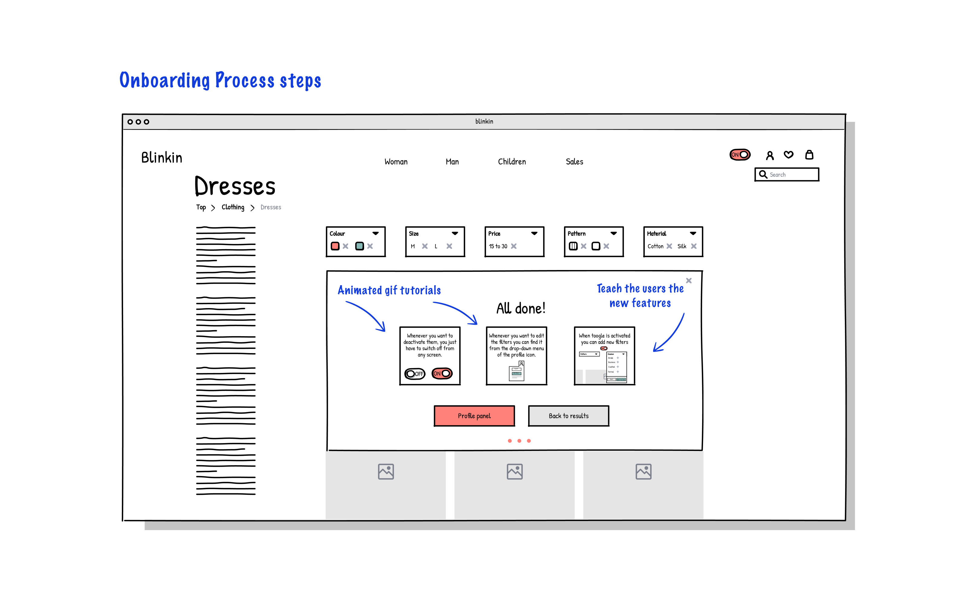
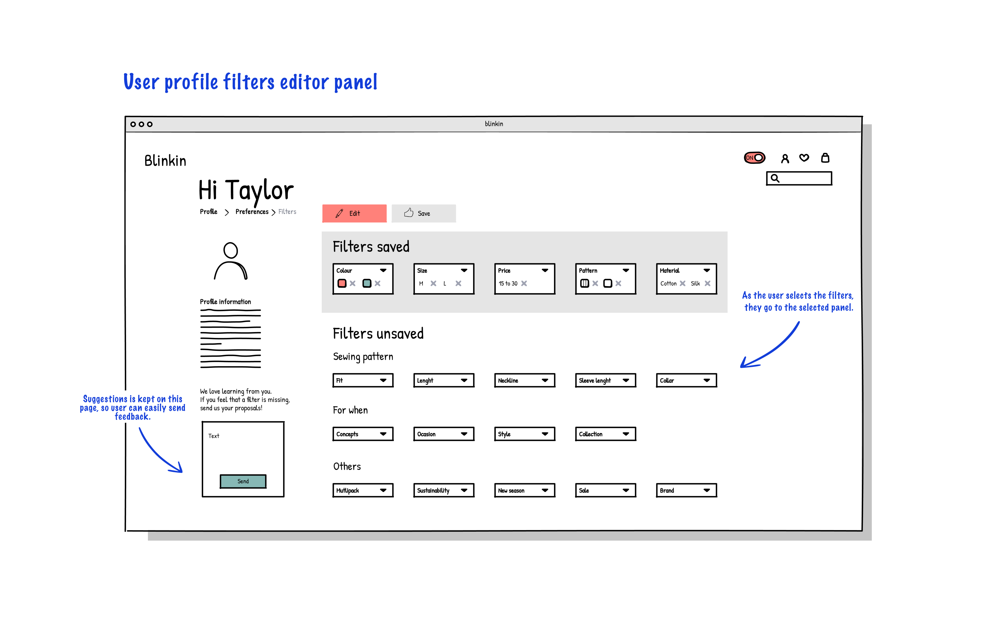
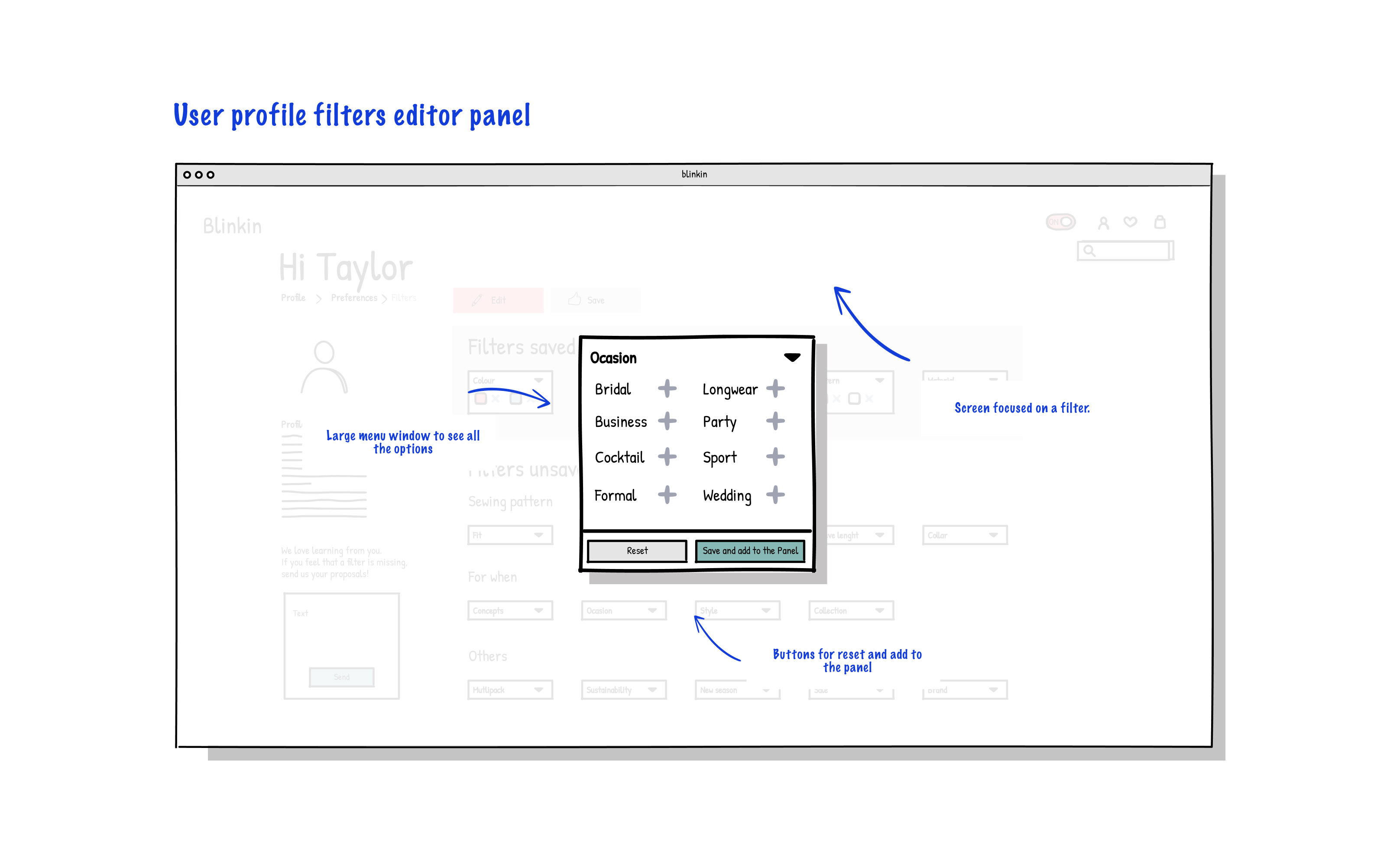
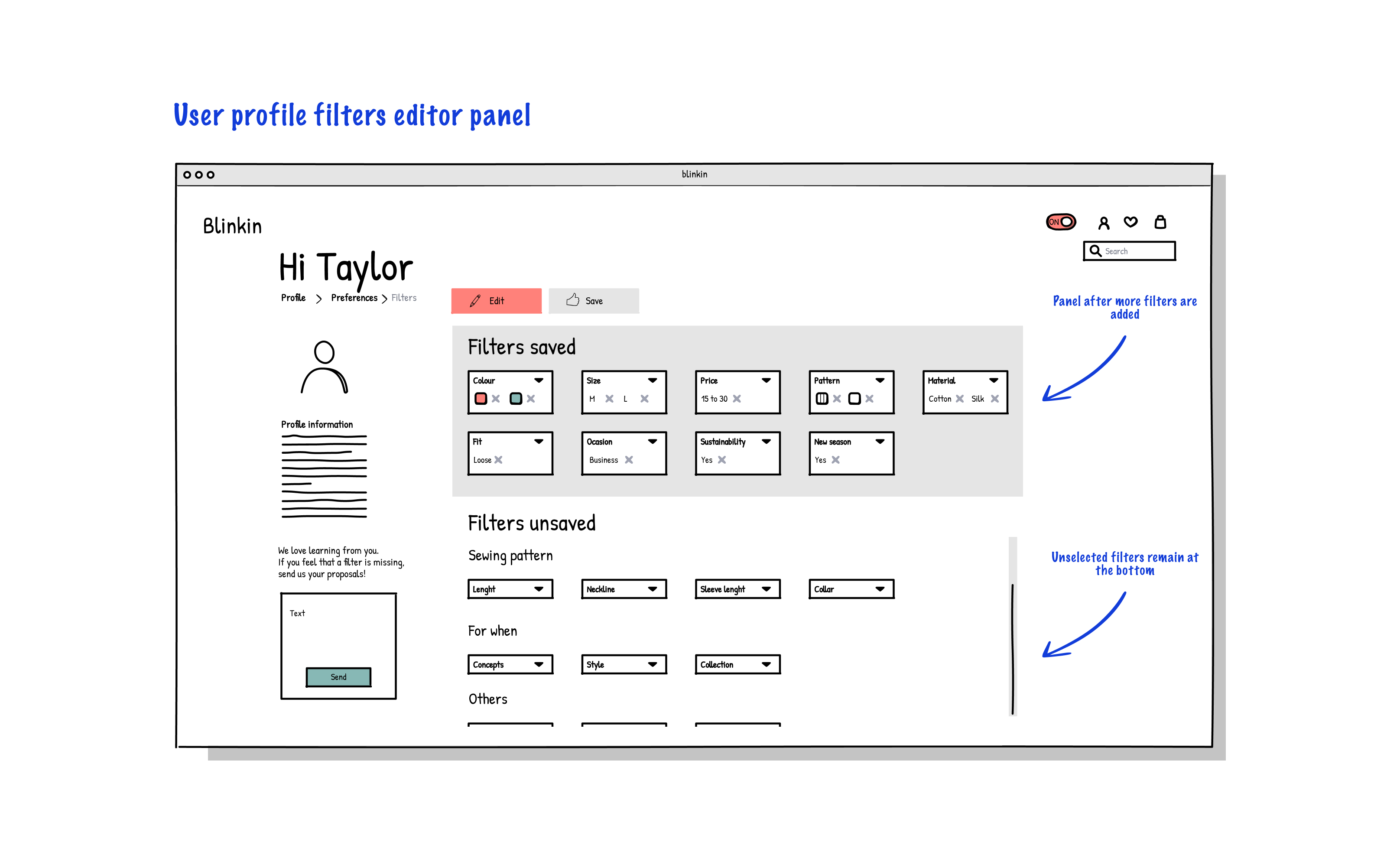
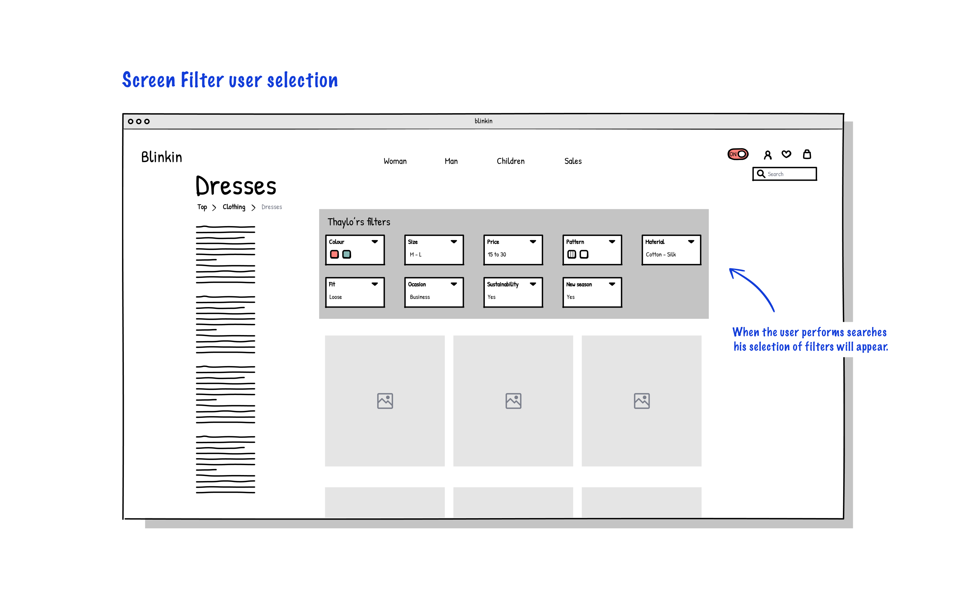
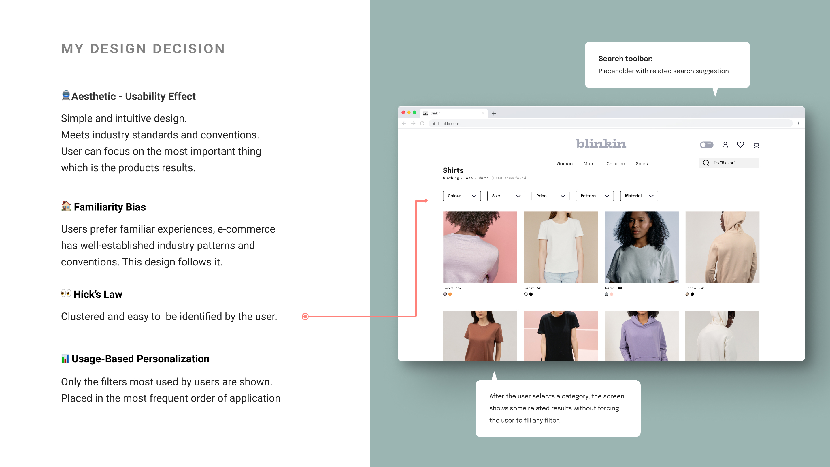
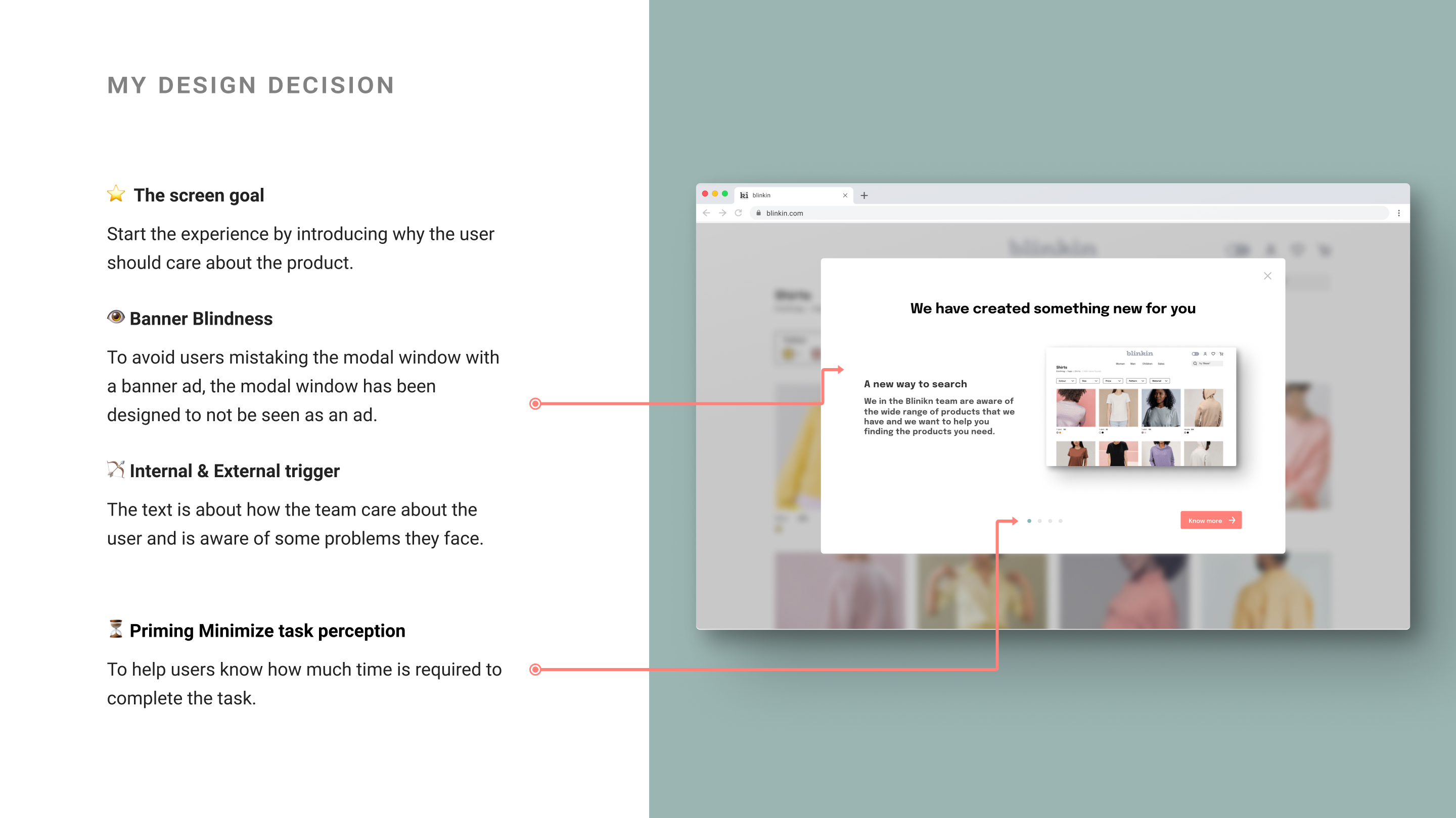
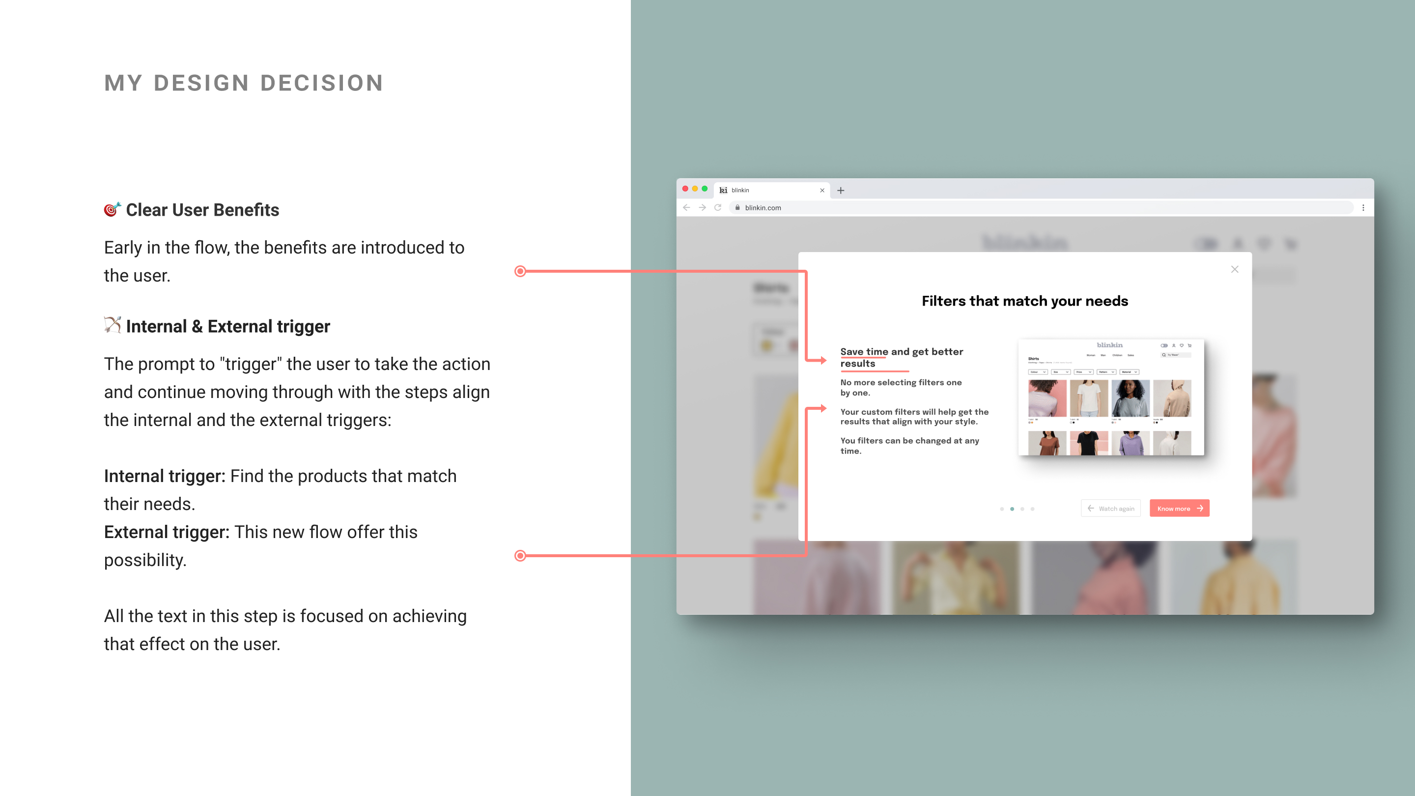
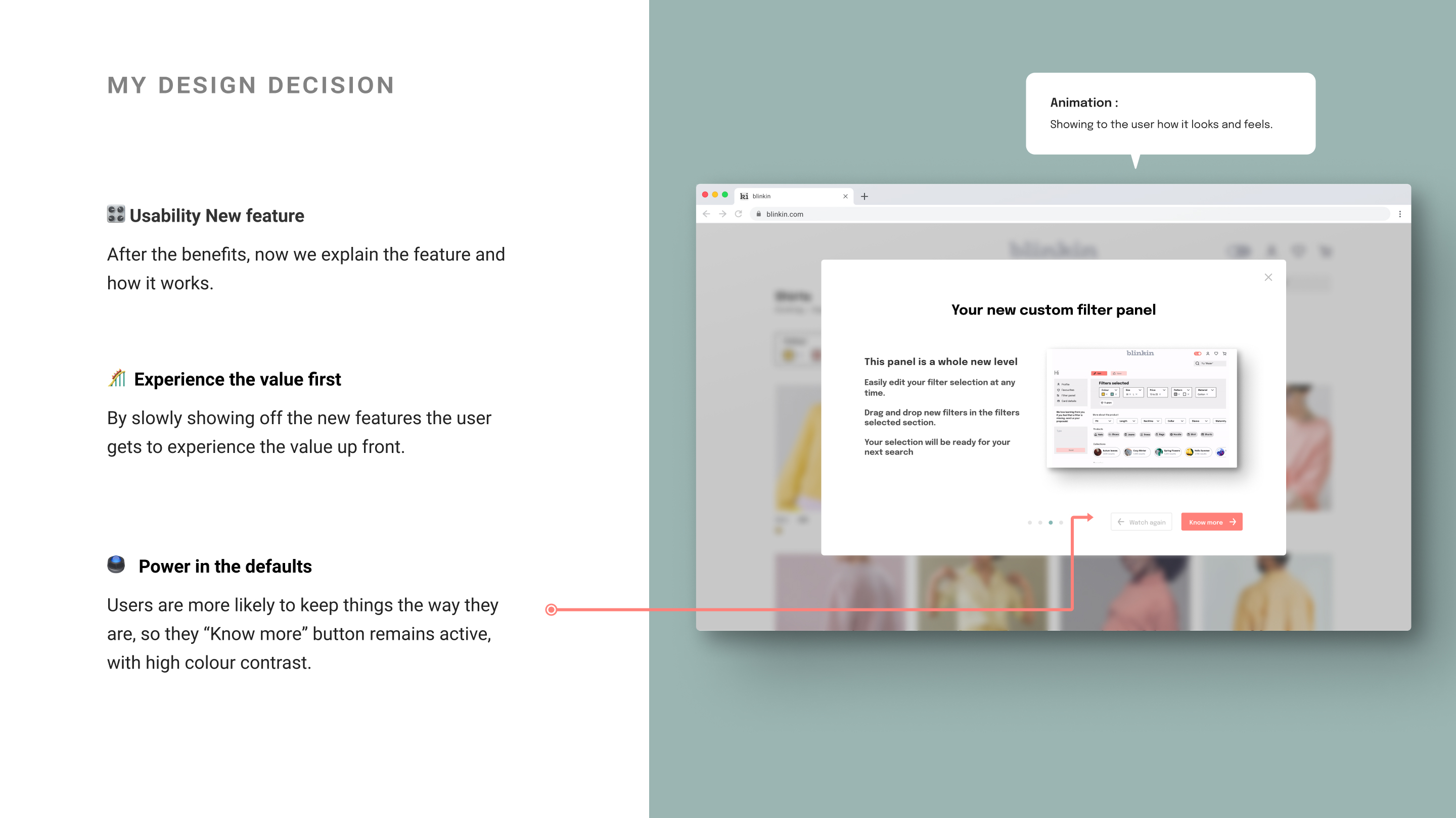
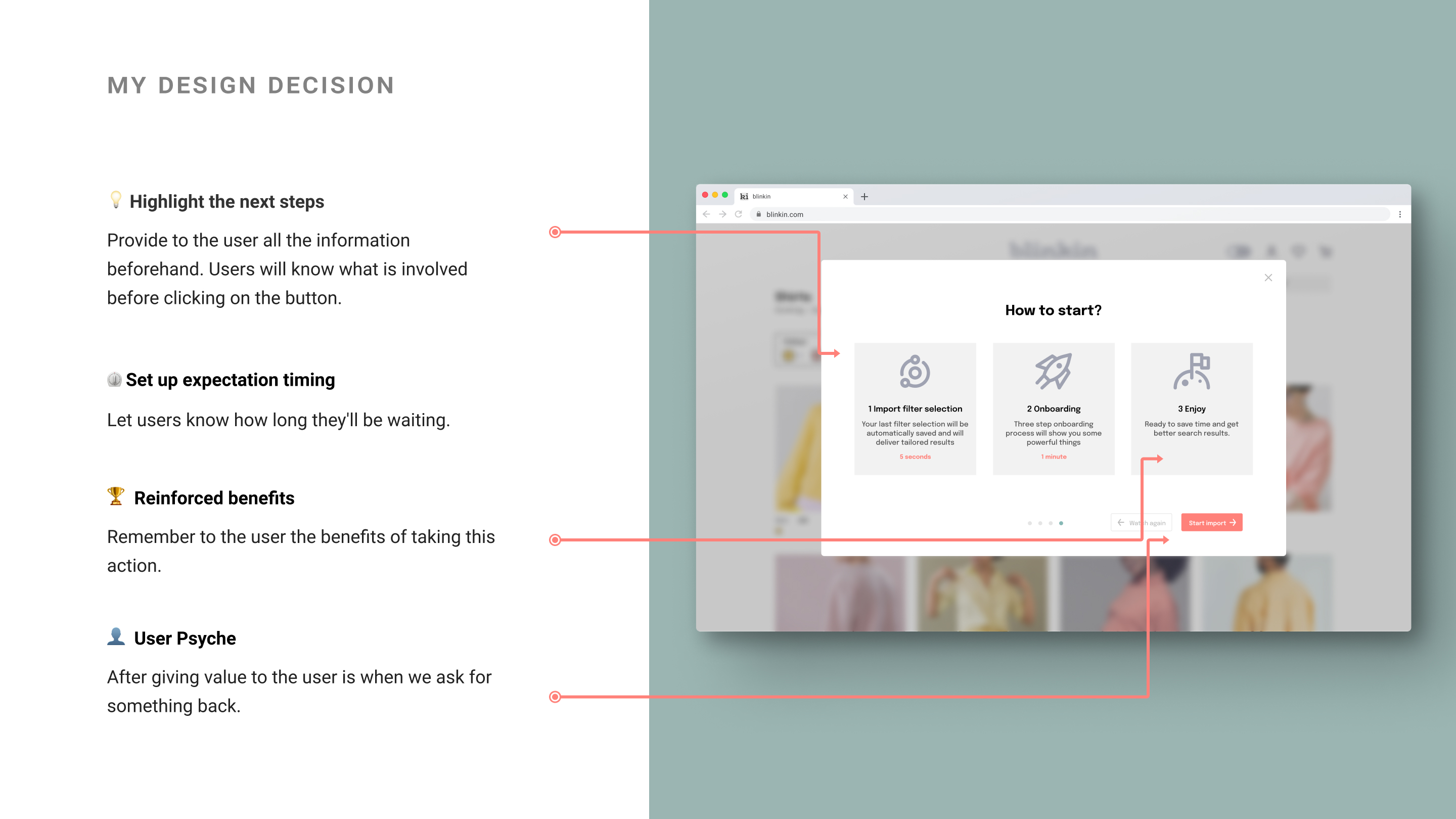
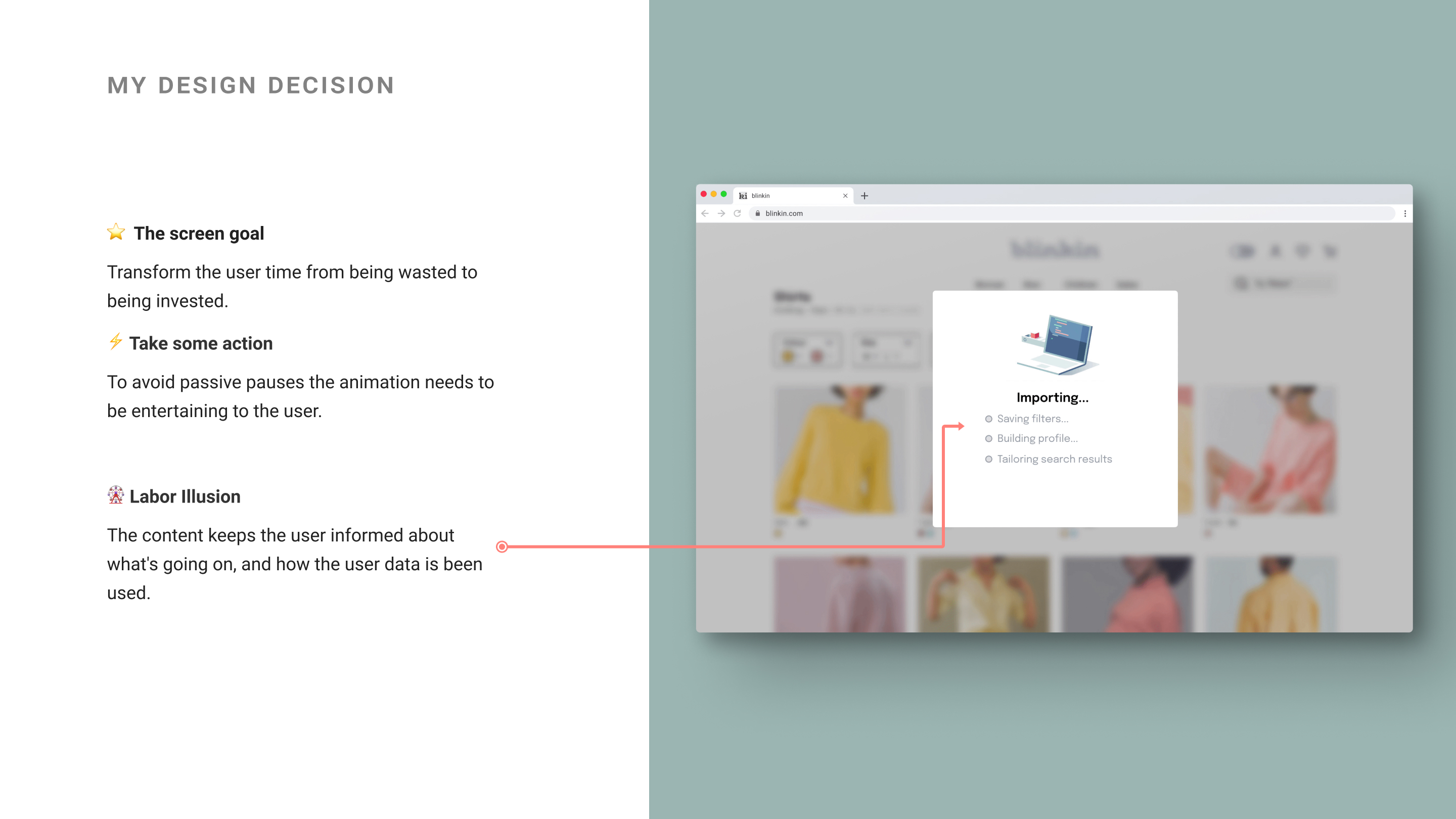
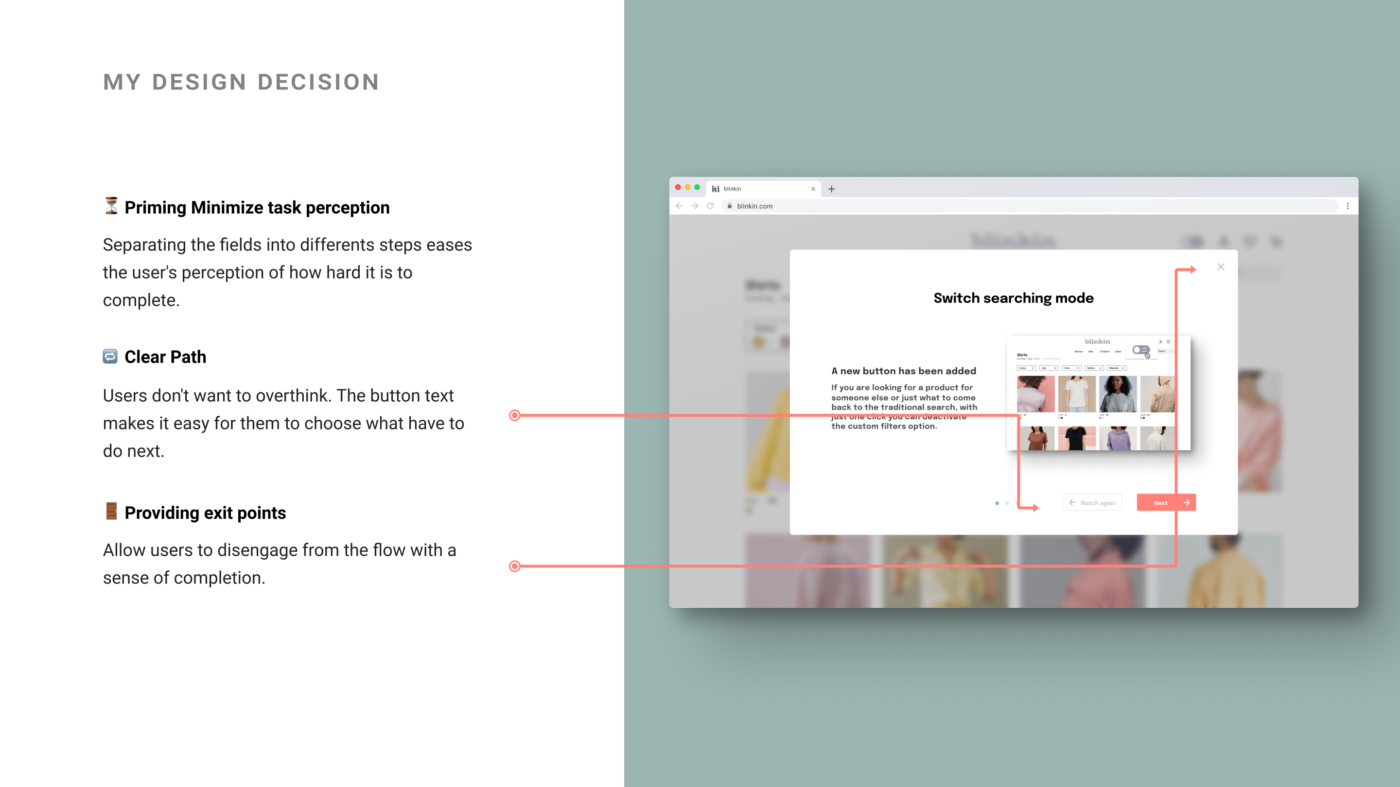
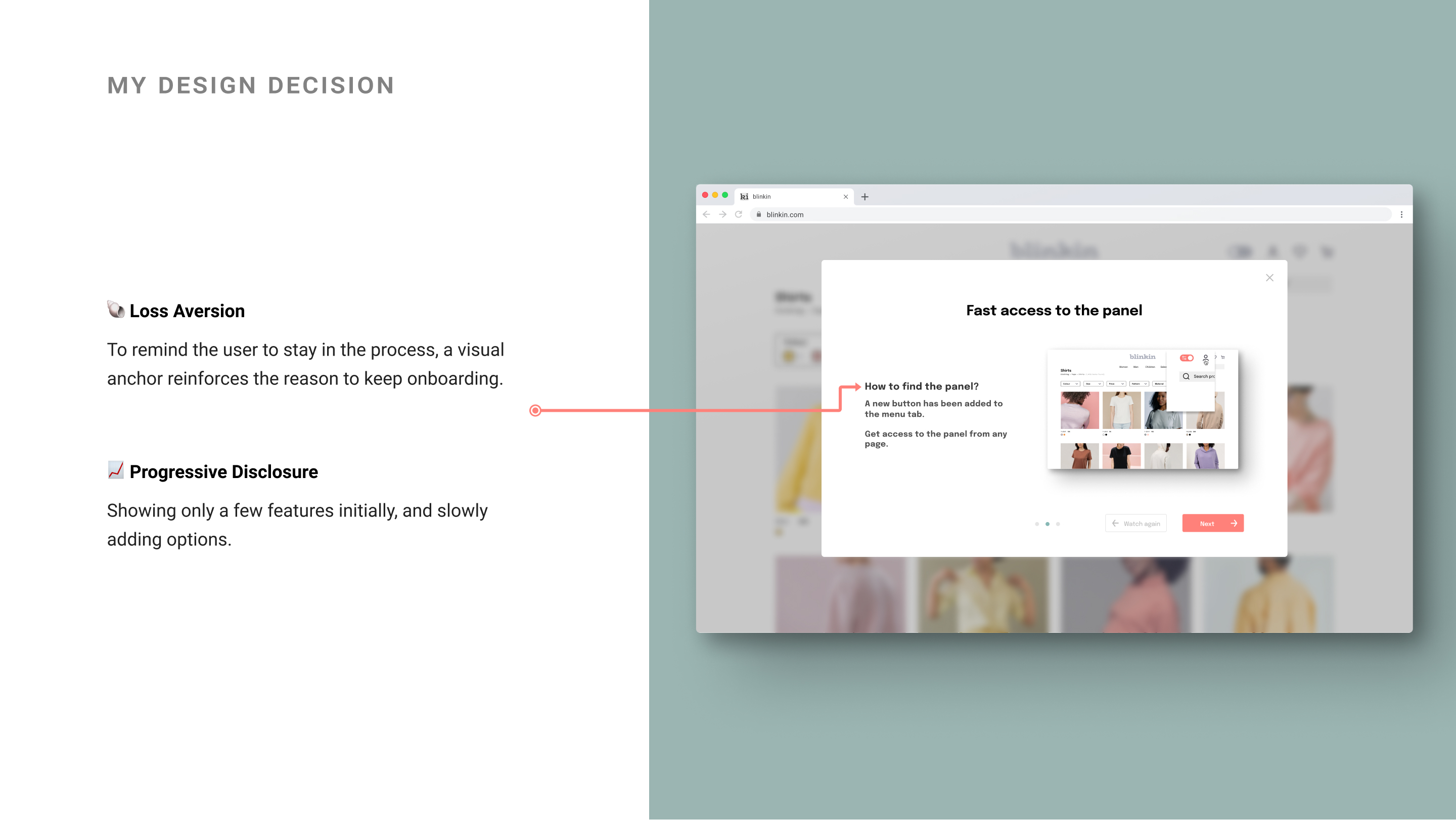
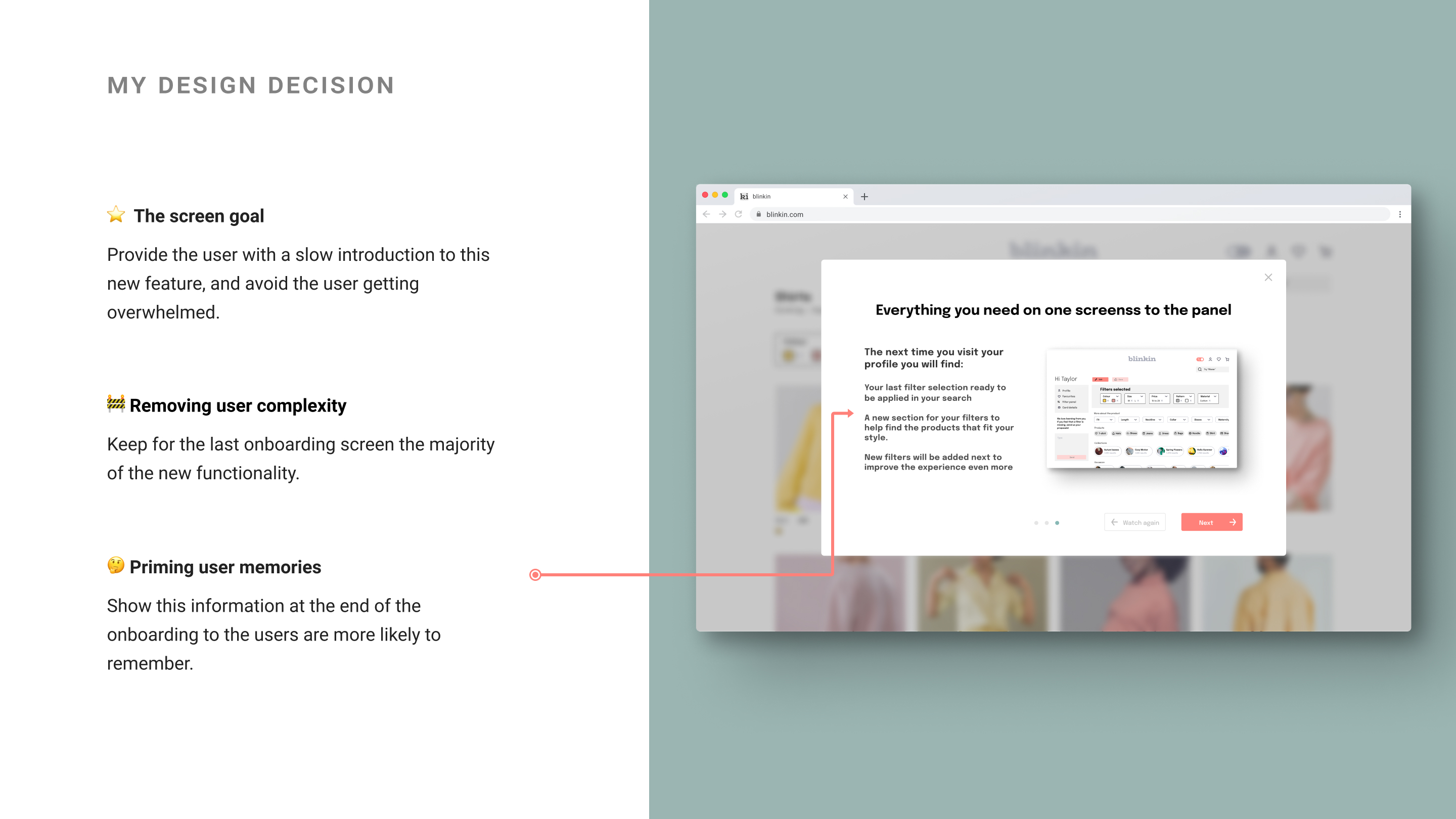
My final solution is based on creating an onboarding to immerse users in this new feature, which is the possibility of customizing filters.

Throughout the screen modal windows explain:

  • What is it?
  • What are the benefits for the user?
  • How does it work.

This flow focuses on only one part of the online purchase process. But it is the part that my research and analysis have indicated to cause the most friction and frustrating for the user.

Go to prototype
Why I used this tool:
Figma: To design the UI prototype

My Solution

My solution is based on creating an immersive onboarding experience to the new feature, which is the possibility of creating customizing filters. Modal windows are used to guide the user on how the feature works.

Go to full solution

Take Away

Project review and final thoughts

Things that went well

Investing some time in designing the search plan and knowing why I was going to carry out each step, helped me to focus on each step knowing what the goal was to achieve.

Things I would have doen differently

If I were to continue working on this project, I would start doing usability tests on the final prototype from this project and begin to further refine this solution.

What I found difficult

Find a solution. I felt that I had to look for more ideas and ideas, but in the end I couldn't think of more. I would have liked to be able to share my discoveries and ideas with more UX designers in order to create a better product.

What I enjoy more and why?

What I have enjoyed the most has been taking from 0 a sector that I only knew how to use and seeing myself able to dissociate myself from that mentality and put myself in the mind of a UX designer and see the experience from another point of view.

Project Overview

I consider this study case in an ongoing stage. I'm just finishing the Build stage, and I will conduct a series of further usability tests to continue refining and improving the design. My key takeaway was that trust the research and analysis process, listen to your users and don't be afraid to learn new insights you never know how you can apply to your work.

Next Steps

The next step for this project is to test and design and currently missing steps of the prototype: When user login?, How this process is affected if the user is not login? Or if they are not registered.

Thank you for reading.